Skip to content
Get App

The stupid simple way to learn UI/UX design in exactly 10 minutes

Learn UI/UX design in 10 minutes with a practical 28-day plan, focusing on design fundamentals, pattern recognition, and building real skills.

Key Takeaways

  • Train your design eye by dissecting existing designs to understand layout and hierarchy.
  • Copying designs exactly helps notice small details and build pattern recognition.
  • UI focuses on visual style and feel, while UX focuses on user flow and design thinking.
  • High-quality curated visuals and examples accelerate learning and inspiration.
  • A structured 28-day plan can effectively build UI/UX design skills from beginner to intermediate.

What the video covers

  • The video starts with the creator's first design and reflects on how to learn design effectively from scratch.
  • It emphasizes training the design eye by analyzing common layout zones: main text block, navbar, stats, and image.
  • Key design principles such as spacing, hierarchy, proximity, contrast, and consistency are explained with examples.
  • The creator advises copying designs exactly to learn details rather than redesigning immediately.
  • Common layout patterns for hero sections and text/image arrangements are discussed.
  • The importance of high-quality visuals and curated design examples (like Mobin) is highlighted.
  • The difference between UI (visual flavor) and UX (design thinking and user flows) is clearly explained.
  • An onboarding flow example illustrates UX decision-making and branching user journeys.
  • A 28-day learning roadmap is proposed to build UI/UX skills progressively.
  • The video encourages hands-on practice by cloning real designs and understanding user experience.

Answers

Questions about this video

What is the first step recommended before starting to design?

The video recommends training your design eye by analyzing existing designs to understand layout, spacing, and hierarchy before jumping into tools like Figma.

Why does the creator suggest copying designs exactly instead of redesigning?

Copying designs exactly forces you to notice all the small details such as spacing, padding, and layout patterns, which helps build a strong foundation and pattern recognition.

How does the video differentiate between UI and UX design?

UI design is about the visual style and feel of a website, adding 'flavor,' while UX design focuses on the thought process and structure behind user flows and interactions.

Full Transcript — Download SRT & Markdown

00:00
Speaker A
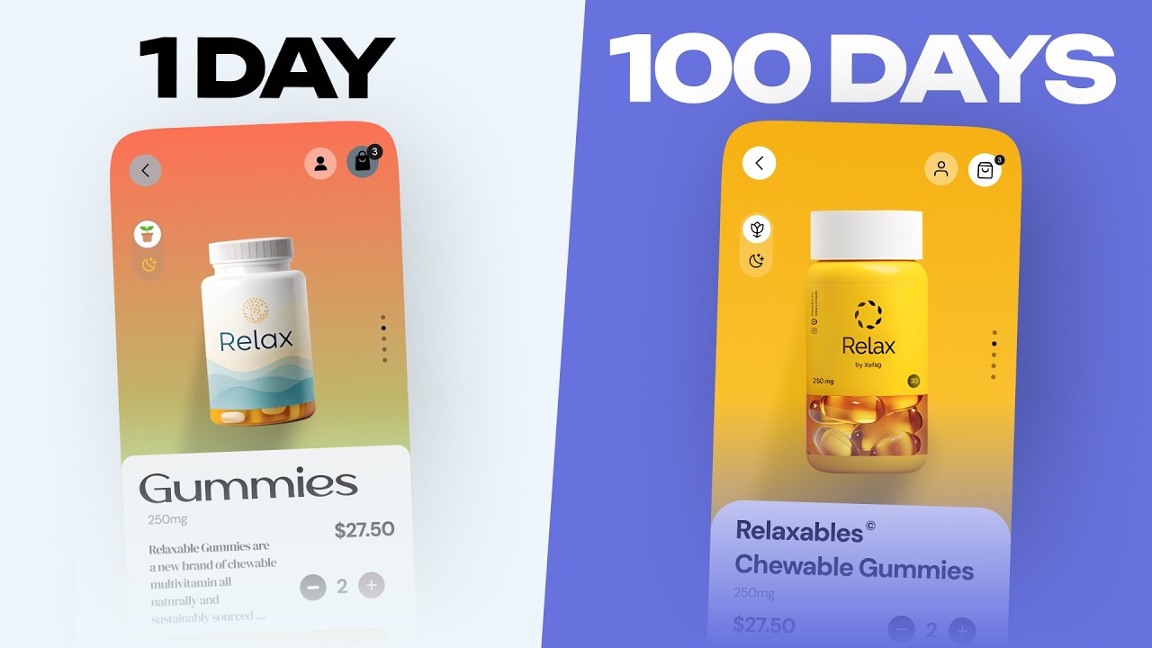
This is the first design I ever made, and it's awful. Eight years later, here's exactly how I'd learned design if I had to start over. Broken down into a 28-day plan that I would actually give myself. Before we get to designing, we
00:14
Speaker A
need to start by training our design eye, which might sound stupid, but take a look at this. Now, these designs might look totally different to you at first glance, but every single one of them has the same skeleton. They all break down
00:28
Speaker A
into the same four zones and the same flow. And once you understand it, you're going to start seeing it everywhere.
00:34
Speaker A
Those main sections consist of the main text block, the navbar, the stats below, and the image itself. So, let's start with the main text block. Notice how it doesn't dominate the page, and the spacing around it is very intentional.
00:48
Speaker A
The subtext is only 8 pixels away, while the eyebrow text above is 12 pixels, and the buttons are 32 pixels away. That creates a grouping where we associate the heading and subtext most closely, then the eyebrow, and finally the
01:02
Speaker A
buttons below that. And notice the text itself. It's only seven words in the header and 14 below to communicate the message as quick as possible. Next up, the navbar has become a member as its most prominent feature, but otherwise
01:16
Speaker A
it's pretty small and stays out of your way just like most modern navs. Coming on over to the image. Having a high-quality asset is what makes or breaks most landing pages. You'll notice that the focal point of the image is
01:29
Speaker A
never obstructed since everything sits above, below, or to the left of it, leaving the center and right wide open for some imagery. Also notice that the background of the image isn't too busy.
01:41
Speaker A
If we swap it out for an image like this, things get a little more chaotic and the text is harder to read. And then with this, the text is basically gone on the left. Finally, the stats down below
01:53
Speaker A
are a great example of using color, not just size, to create some hierarchy. These two font sizes are the same 15 pixels, but the second line, of course, doesn't jump out as much because it only has 55% opacity, blending it into the
02:08
Speaker A
background a little bit more. [music] The point of this entire exercise was before you ever even get into Figma, it's important to take a look at all of these tiny design details that often get glossed over. For yourself, pick any
02:21
Speaker A
site you like and pull it apart the same way, and you'll start to see the decisions behind the design. And with each of these, the pattern recognition of things like proximity, contrast, consistency, and hierarchy start to become a whole lot easier to see. Now
02:36
Speaker A
comes time to actually start building. This is where everyone starts. At least that's what I tell myself. But hopefully this should speed things up. The most common advice is to take an app or a website you like and redesign it. And
02:48
Speaker A
personally, I think that's pretty bad advice. We instead want to learn how to create good design. And all the best creation comes from stealing. So pick a design you like and don't redesign it.
02:59
Speaker A
Literally copy it. This is essentially the same exercise that we did with that superpower website, but now you're forced to notice all the little details.
03:08
Speaker A
How far apart are the cards? How tall is the nav? And what's the padding on these buttons? Once you do this on a few websites, you should start to see some patterns emerging that there are only a handful of options at any point when it
03:21
Speaker A
comes to layout. If we start with the hero section, we might start with an image and text pair. Text on the left, image on the right, or image full screen underneath the text. More modern designs sometimes have the text up top and the
03:34
Speaker A
image below, too. We can even in rare occurrences put the text below the image as well. So with the text up top, image down below. Then we can focus on the text. This can be centered most commonly. We could left align or we can
03:48
Speaker A
kick the body and CTA out to the right. Then we focus on the visual. Well, what do we want? We could have the image where the borders are defined. We can go full width with an image that bleeds
03:59
Speaker A
into the background. Or we can have a carousel of images. Maybe it even slowly rotates through them. But all of these layout decisions come down to one thing, and that is what is the content trying to do. For example, if you're trying to
04:12
Speaker A
have a profound statement, you'd center the text, bump up the font size, and you give it a lot of space to breathe. But if you're trying to display a features list, the text is really just there to support the visuals. But if there are
04:25
Speaker A
many features that run off the screen, you would want them all to be seen by the user. So, you'd swap this out for a bento grid so nothing is lost as the user scrolls down. And to start identifying those patterns, having
04:36
Speaker A
high-quality curated visuals at your fingertips is super useful, which is exactly what Mobin, the sponsor of today's video, does. You can browse hundreds of thousands of screenshots from websites and apps you might not even know exist and easily export them
04:50
Speaker A
out to Figma. And I use this exact flow when I work with clients or create these videos. For example, if you get stuck on a section like features, just search for it and browse through over 3,000 examples to see how designers from top
05:04
Speaker A
companies are approaching the same problems. If you are interested in checking out Mobin, you can use the very first link down below to get yourself 20% off. Now, let's get back to the video. Now that we have the design down,
05:16
Speaker A
we need to start thinking like a designer. And to do so, we need to untangle the two very distinct parts of design, UI and UX. UI is all about adding the flavor to a website. How the same layout can have a dramatically
05:30
Speaker A
different look and feel. And then there's UX. This is more about the thought process of design. For example, how you would structure something like this onboarding process. Let's start with UI. If we were trying to make this feel very friendly and welcoming, we
05:44
Speaker A
might add a nice warm background, some very colorful visuals, round out all the corners, and make the buttons large and bubbly. But if you wanted to make the same site more modern and professional, the corners would be much less rounded.
05:56
Speaker A
The imagery would change substantially to something with less color and a more premium feel. And maybe we'd add in some noise to the background. The product is technically the same. The layout is basically identical, but we've transformed how the website feels at the
06:11
Speaker A
same time. This is exactly what I mean when I say flavor. Being able to take a few words and turn it into a feeling when you land on a website is a very special skill to have. And then on the
06:22
Speaker A
other side of the spectrum, we have UX, which you might also refer to sometimes as product design. And onboarding might seem like a fairly simple set of steps.
06:31
Speaker A
So, let's walk through one and actually see. You'll probably start with asking them for their name and email address.
06:37
Speaker A
Many people end up on this page unintentionally, so we'll have an escape hatch to the login page. Now, you'll probably want to verify the user's email by sending them a link or a code. As the product designer, you can either block
06:49
Speaker A
them from finishing the process until they've input the code, or you can give them a gentle reminder and allow them to continue. And neither of those decisions is wrong. Next, we might invite the user to create their workspace and at the
07:02
Speaker A
bottom ask them what their team size is. This is important because it's going to shape how the next steps of our onboarding function. From there, we split into two flows. One where the user has identified as being part of a team
07:15
Speaker A
and the other where the user is identified as an individual. For the team, the next step could be to invite team members whereas the individual would completely bypass this step altogether. Hopefully, this illustrates that there's a lot of design thinking
07:27
Speaker A
behind just the five screens we went through. And each of these decisions wasn't abou
07:38
Speaker A
map, the biggest mistake that you could make as someone learning design right now would be to go and start your portfolio right now. It's exciting to think about, of course, but this is my portfolio from about 3 years ago. Very
07:51
Speaker A
in-your-face. Huge animations, giant text, everything had to move. Compare that to what I have now, which is a little more refined with some smaller, more tasteful animations. Neither is wrong, but the point is the huge difference between the two. Just imagine
08:07
Speaker A
how your taste will start to change over the next one to two months as you start learning. So considering that, here is a rough road map if you're just getting into UIUX and product design. It's 28 days broken into four main stretches.
08:20
Speaker A
Week one is all about training your eye. Start by building yourself a swipe file, 20 or so hero sections and feature sections that really inspire you, pulled from Mobin, Dribble, Pinterest, or wherever. Once you've got that, pick a
08:32
Speaker A
couple and actually annotate them the way we did with superpower, spacing, hierarchy, and what's grouped with what.
08:39
Speaker A
Then comes actually building the skill. This is where you pick one design you genuinely love from the swipe file and clone the hero section exactly. After that, do the feature section from that same site and then grab a second site
08:53
Speaker A
with totally different layout and go ahead and clone that too. And then finally, it's time to think like a designer. First, on the UI side, take one of the layouts you've already built and restyle it twice. Once warm and
09:05
Speaker A
friendly, kind of like how we did it, and once modern and premium. That's how you develop different flavors of website. Then we'll switch to the UX side. Take that onboarding concept that we broke down earlier and design the two
09:18
Speaker A
screens where the user journey splits. The first screen will be the invite your team page for the manager and then the second screen will be the setup page for the solo user. And that's it. After 28 days, you should be well on your way to
09:32
Speaker A
learning design. And don't worry about your portfolio yet. Just focus on creating the skill. And with that, you should have a very solid plan for how to learn UIU, UUX, and product design in 2026. If you are interested in checking
09:46
Speaker A
out Mobin, it'll be the very first link down below. And the link to all of the Figma assets used in this video will be down there, too. Thank you so much for watching, and I will see you in the next
09:55
Speaker A
one.
Topics:UI designUX designdesign learningdesign principlespattern recognitionFigmaonboarding designvisual hierarchydesign workflowproduct design

Get More with the SozAI App

Transcribe recordings, audio files, and YouTube videos — with AI summaries and speaker detection. 30 minutes free.

Or transcribe another YouTube video here →