Learn how to design a clean, functional dashboard UI from scratch in 8 minutes, focusing on usability and aesthetics for beginners.
Key Takeaways
- Effective dashboards prioritize simplicity and usability over complexity and excessive features.
- Sidebar design is crucial for navigation and should reduce cognitive load by grouping relevant links and using clear icons.
- Data visualization must be clear and informative, avoiding confusing or overly complex charts.
- Micro-interactions and contextual UI elements like modals and toasts enhance user experience without overwhelming the interface.
- Using curated design resources like Mobbin can inspire better UI decisions and understanding of real-world app flows.
What the video covers
- Dashboards often fail due to disorganization rather than poor aesthetics; this video teaches building a simple, usable dashboard UI.
- The sidebar acts as the spine of the product, housing navigation, profile management, and search, with tips on icon use and grouping links.
- Dashboard design requires smaller fonts, strict grid layouts, and prioritizing the most important user information in the main section.
- A two-column, two-row grid layout is used for link management and key metrics, with simple data display and micro-interactions like bulk actions.
- Charts should be simple, informative, and aesthetic, with examples of line and bar charts including grid lines, labels, and date selectors.
- Mobbin is recommended for UI inspiration, offering curated screenshots from real apps across industries and elements.
- Functional dashboard elements include modals, popovers, toast notifications, and navigation to new pages with back buttons or breadcrumbs.
- Four main dashboard components are lists/tables, cards (charts and notifications), modals/popovers, and navigation elements.
- Good lists rely on separation by space, lines, or color; tables need functionality like search, filter, and sort to be interactive.
- Card design should maintain well-spaced margins and appropriate use of borders or background colors depending on the theme.
Full Transcript — Download SRT & Markdown
Speaker A
Dashboards are a staple of any design portfolio, but most suck.
Speaker A
Not because they're ugly.
Speaker A
But because they're disorganized and messy.
Speaker A
So, in this video, I'm going to show you how to design your very first dashboard UI.
Speaker A
Completely from scratch in a way that's simple, aesthetic, and actually usable.
Speaker A
And by the end, you won't just have a great looking layout, you'll understand why the best dashboards feel effortless to use.
Speaker A
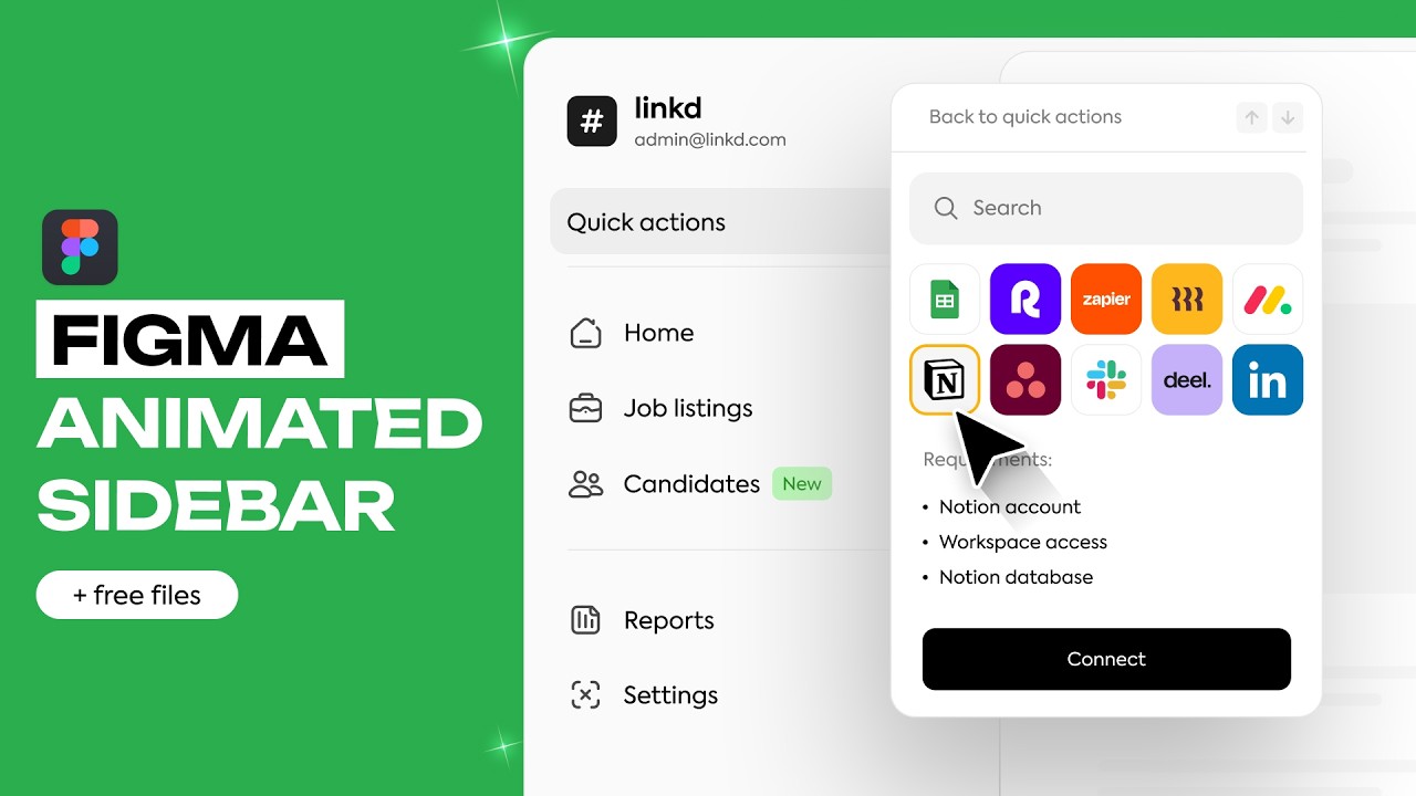
It starts with the sidebar, which houses most of the persistent and globally relevant elements.
Speaker A
Think about it as the spine of your product.
Speaker A
Elements like navigation, profile management, and search are typically in here.
Speaker A
But sometimes profile management and search can go in the top bar too.
Speaker A
Starting from the top, sometimes a logo is put up here.
Speaker A
But I find this a more convenient spot for profile management.
Speaker A
A profile picture makes it easy to identify and the arrows indicate that this is clickable.
Speaker A
Next, links.
Speaker A
We want to start with a recognizable icon and a short title.
Speaker A
This is especially helpful if you plan on making your sidebar collapsible like this.
Speaker A
And it's also helpful if you want to add a notification number or a new chip to it.
Speaker A
Navigation is all about reducing cognitive load.
Speaker A
To do that, we'll want to group our links by what's relevant.
Speaker A
And then since settings and help center are rarely used, we can send them down to the bottom.
Speaker A
As the amount of links expands, you'll want to start nesting links into dropdowns.
Speaker A
And make sure to have an active state.
Speaker A
We're using this rectangle as an indicator.
Speaker A
This is optional, but if you want to highlight features, search, or integrations, this would be a good place to put them in.
Speaker A
Finally, also optional, but with all this empty space, we could add in some notifications.
Speaker A
Companies like Dub and Linear have already started doing this sort of thing.
Speaker A
And just like that, you've built an aesthetic but also functional sidebar super easily.
Speaker A
If it wasn't clear already, we're building a link tracking software for this demo.
Speaker A
So, let's get into it.
Speaker A
Sidebars are relatively hard to screw up.
Speaker A
The same cannot be said about dashboards.
Speaker A
This dashboard feels like someone emptied a drawer onto the screen.
Speaker A
If your dashboard looks like it requires a PhD to operate, then it's too complex.
Speaker A
Just do one thing well with your dashboard.
Speaker A
First, I want to point out a few important considerations.
Speaker A
If you compare a dashboard to a landing page, you'll see the features of a dashboard are much smaller.
Speaker A
Because we're trying to shove in many more things.
Speaker A
These are the text styles for the landing page and these are the text styles for the dashboard.
Speaker A
We've got a lot of smaller font sizes without much spacing in between sizes.
Speaker A
Grids and layouts are also much more strictly followed for dashboards than landing pages.
Speaker A
Because we're using most or all of the space on screen.
Speaker A
Third and final, what you put in this main section of the dashboard reflects what is most important to the user.
Speaker A
For example, if you're building a project management dashboard, displaying the project status would be very useful.
Speaker A
Or if you're building a financial dashboard, you should show investments right at the top.
Speaker A
Taking all of that into consideration, we'll be using a very simple two-column, two-row grid with link management at the top.
Speaker A
And a few important metrics down below.
Speaker A
The very top of the dashboard is generally reserved for important page actions or simple navigation.
Speaker A
For our relatively simple dashboard, we'll have a dropdown and a button to make a link.
Speaker A
Which seems pretty important.
Speaker A
For any data displayed on the homepage, you want to keep it super simple.
Speaker A
So, we'll just have the favicon, the shortened link, the actual link, and when it was made.
Speaker A
We'll also add how many clicks each link has gotten.
Speaker A
Since we still want to have a good amount of space in the middle, we can add a brief description.
Speaker A
Kind of similar to GitHub.
Speaker A
If we wanted visual separation, we could make each link have its own border.
Speaker A
But for less clutter, we'll stack them into a list.
Speaker A
This layout also makes it easier to add an empty state when there are no links displayed.
Speaker A
Which is important to be thinking about.
Speaker A
Now, this static list is looking great.
Speaker A
But in real-world applications, we need to manage data efficiently.
Speaker A
This is where a small micro-interaction comes in, letting the user select multiple links.
Speaker A
Which reveals a new contextual button, bulk actions.
Speaker A
Moving on to the charts below, let's do it properly.
Speaker A
First, don't make weird shit like this.
Speaker A
I don't know what these are and neither does anyone else.
Speaker A
Instead, let's start with a basic line graph.
Speaker A
Add some grid lines and numbers since everyone forgets those.
Speaker A
Pop in a quick summary and date selector and we're good to go.
Speaker A
For the other one, we'll have a bar chart to break down by each link with the favicon on the side to make them easily identifiable.
Speaker A
We'll add the same range selector and give users access to signups and conversion on this chart too.
Speaker A
There's no reason that charts can't be simple and informative.
Speaker A
But also aesthetic.
Speaker A
But sometimes you need some inspiration first.
Speaker A
And one tool I use all the time for this is Mobbin.
Speaker A
Who curates hundreds of thousands of beautifully organized screenshots from real apps.
Speaker A
Things like project management tools, banking dashboards, and even admin panels.
Speaker A
You can search by element like charts or even filter by industry or device type.
Speaker A
And it's not just pretty UIs.
Speaker A
It helps me see how real teams design flows, like how they onboard users or structure complex settings pages.
Speaker A
You can check out Mobbin using my link in the description to get 20% off.
Speaker A
However, most of the functionality of a dashboard isn't actually here in what we've built.
Speaker A
We're displaying a lot of information.
Speaker A
But we can't do anything yet.
Speaker A
That's where modals, popovers, and even new pages come into play.
Speaker A
A popover is something like this and best used when the context is simple.
Speaker A
Like these display settings.
Speaker A
And are non-blocking, meaning the user can click away without any consequences.
Speaker A
A modal is best used when the context is more complex, but you still want to keep the user on the same page.
Speaker A
This is because creating a link is directly related to the links that are displayed on screen.
Speaker A
A modal is considered blocking because you need to click create or cancel before dealing with other things.
Speaker A
And since you can't see the page when the changes are being made, a toast notification confirming the changes is generally a good practice.
Speaker A
Speaking of toasts, they're the notification system of your dashboard.
Speaker A
Anytime you want to make the user aware of something without taking over the entire screen or prompt them to take action, use a toast.
Speaker A
We talked about empty states earlier, but toasts are great for warning or error states, which frequently get missed.
Speaker A
Finally, if the context is more permanent or is very large, like clicking on an existing link, it's reasonable to direct the user to a new page.
Speaker A
If you're going to do that, having a back button or breadcrumb is pretty much required.
Speaker A
We've just built the bulk of one page on a dashboard.
Speaker A
But laying out other pages are fairly trivial.
Speaker A
Since there are really only four main dashboard components.
Speaker A
First, lists and tables.
Speaker A
These are the most common.
Speaker A
And we've used several of them already.
Speaker A
From our link table to link details or even the sidebar.
Speaker A
Making a good list mostly comes down to separation with three ways to do it.
Speaker A
The first is just space.
Speaker A
The second is lines or dividers and the third is with color.
Speaker A
But making a good table is more about functionality where displaying the data is only half the battle.
Speaker A
Giving the user the options to search, filter, or sort the table transforms it into an interactive tool.
Speaker A
Next is cards.
Speaker A
This includes our charts and toast notifications.
Speaker A
Most dashboards are comprised of many cards together.
Speaker A
Keep the margins well spaced so content isn't too tightly packed.
Speaker A
Also, you can choose between a border or background colors.
Speaker A
I prefer outlines on dark modes and background colors on light mode, but that's totally up to you.
Speaker A
User input is another common one.
Speaker A
We've used these making our link modal and any sort of settings pages has them.
Speaker A
Or if you're lucky, you'll get tables with forms inside of cards, like here on Vercel.
Speaker A
Fourth and final are tabs.
Speaker A
These are fantastic for essentially adding new pages without cluttering the sidebar.
Speaker A
For example, in Notion, we get different views of very related tables without leaving the context of the page.
Speaker A
Breaking Notion settings down a little more, we've got mostly lists with some user inputs and some cards once we get to connections.
Speaker A
All inside of a modal.
Speaker A
So, once you master these four elements, you can build virtually any dashboard page.
Speaker A
Finally, animation and interaction on dashboards is pretty tame and user-focused.
Speaker A
When compared to some websites and landing pages.
Speaker A
Starting with our chart animations, here is where we can get a little more creative.
Speaker A
For example, on this chart, when we hover, we get the number as well as a bubble with the percent in it.
Speaker A
Or on our other chart, when we hover, all of the other bars dim out.
Speaker A
But what everyone wants is a snappy fast dashboard.
Speaker A
That's where optimistic UI comes into play.
Speaker A
For example, on Gmail, when I delete an email, it disappears instantly, assuming that the server request will succeed.
Speaker A
The app is optimistic that it will succeed, so you don't get these awkward pauses before your link disappears.
Speaker A
And with that, you have the majority of a functional, aesthetic dashboard, which is more than most designers can say.
Speaker A
If you're interested in checking out Mobbin, it'll be the first link down below.
Speaker A
And I also have the design files listed down there too.
Speaker A
Thanks for watching and I'll see you in the next one.
Topics:dashboard UIdashboard designsidebar designdata visualizationUI micro-interactionsbeginner friendlydashboard componentscharts designmodals and popoversuser experience