Will Paterson walks through designing a full brand identity for Krezi, a premium automotive modification brand, from moodboarding and keyword archetyping to sketching the K monogram, client presentati
Key Takeaways
- Defining brand archetype and visual mood through moodboarding must come before logo design to keep the project aligned.
- Getting client sign-off on creative direction early prevents costly rabbit holes later.
- Exploring many concept variations within one visual style helps validate the final direction.
- Geometric, minimal marks paired with a clean sans-serif can convey precision and luxury in the automotive sector.
What the video covers
- The project was a brand identity for Krezi, a premium automotive modification specialist focused on design, engineering, and emotional driving experiences.
- The first step is brand archetyping: defining the visual mood and feeling of the brand before designing the logo.
- Moodboarding is done collaboratively on infinite whiteboard tools like Miro, FigJam, or Canva, with a graphic designer on the team.
- Keywords derived from the moodboard included engineering, precise, modern, luxurious, stable, minimal, and simplistic.
- The visual direction was presented to the client as a PDF presentation and signed off before any sketching began to avoid wasted effort.
- Ideas were sketched on paper, iPad, and graph paper, producing many variations of a geometric K, with a starburst K ultimately chosen for precision, elegance, simplicity, and movement.
- A sans-serif display typeface (New House Protest Display) was selected for its clean, minimal, intentional character.
- The icon was designed to combine with the wordmark as a combination mark, and wide rectangular framing was used to evoke a widescreen feel conveying luxury and technology.
- Sub-brand marks were created for vehicle models such as the Road Blaze and Sport Blaze.
- Mockups were produced using AI tools to show the logo on vehicles and in real settings, and a brand book serves as the brand's 'genome' covering voice and application.
Chapters
- 00:00Project introduction and goals
- 00:57Brand archetype and moodboarding
- 02:06Collaborative moodboard creation
- 02:54Client presentation and visual direction sign-off
- 03:56Sketching and exploring K concepts
- 06:00Refining the chosen starburst K and typography
- 08:00Presenting concepts and mockups to the client
- 09:00Combination mark, sub-brands, and brand book
Full Transcript — Download SRT & Markdown
Speaker A
About this time last year, I landed a brand identity project, and just recently we finished it, and it's on our website.
Speaker A
And in this video, I'm going to walk you through the entire process of designing it from scratch. The goal was to design a precise identity for Krezi, the go-to place for design, engineering, and emotional driving experiences, making cars and vans exciting and desirable as
Speaker A
And in this video, I'm going to walk you through the entire process of designing it from scratch. The goal was to design a precise identity for Krezi, the go-to place for design, engineering, and emotional driving experiences, making cars and vans exciting and desirable as a premium modification specialist.
Speaker A
the brand. A brand archetype is essentially a way of categorizing the visual mood and feeling of that brand.
Speaker A
So me and my team's task was to design an identity that shows modernity, boldness, and precision within the automotive industry. The first goal I have when tackling a brand project isn't what the logo will look like. It's to archetype the brand. A brand archetype is essentially a way of categorizing the visual mood and feeling of that brand.
Speaker A
find those words, we need to do something called mooboarding. Moveboarding is taking images that inspire or invoke a feeling, a mood, or a vibe for something that you're working on. What I'm looking for is the key words to match the feeling and the
Speaker A
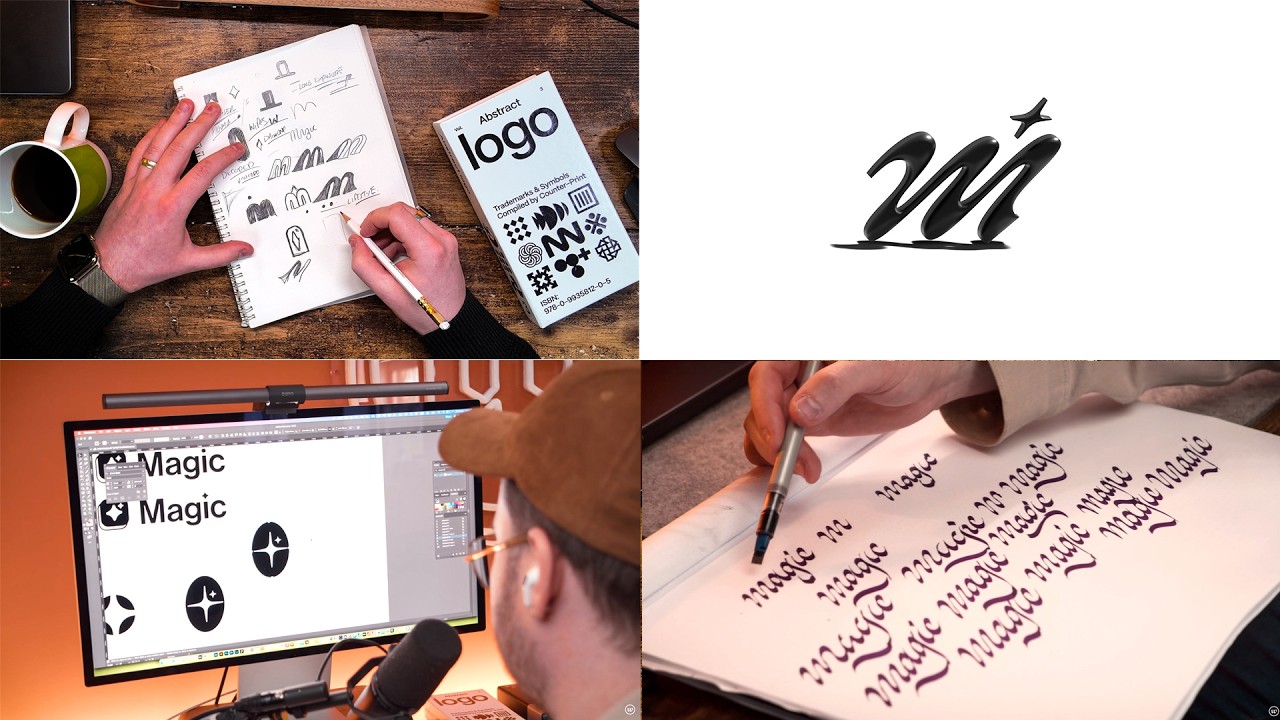
So for instance, Apple is very minimalistic and simple. Harley-Davidson has a bit of a retro vibe to it. If you look at Magic, it's kind of flamboyant and moving. These words really help us understand what the visual direction is. But in order to find those words, we need to do something called moodboarding.
Speaker A
like Milo. You could use Fig Jam, Canva whiteboards. And I invite Sam who's a graphic designer on our team to come and help mboard this to come and help find the visuals. We're looking to strike a good balance between modern and elegance
Speaker A
Moodboarding is taking images that inspire or invoke a feeling, a mood, or a vibe for something that you're working on. What I'm looking for are the keywords to match the feeling and the visuals. And in order to do that, we need to create keywords themselves. These keywords are engineering, precise, modern, luxurious, stable, minimal, simplistic. These words we can use as a keyword for our visuals.
Speaker A
references, mockups and everything and we present it to the client. And the way that I did this was to create a simple presentation in Affinity, export it as a PDF and I would go through it like this as I am now literally on a video
Speaker A
So what we do is we use infinite whiteboard software like Miro. You could use FigJam or Canva whiteboards. And I invite Sam, who's a graphic designer on our team, to come and help moodboard this, to come and help find the visuals. We're looking to strike a good balance between modern, elegance, and precision. And you'll end up finding strange images, whether that is textures, colors, fonts, layouts, or even logos.
Speaker A
before it's been signed off. So, we always make sure before we sketch anything that we have the visual direction solid with the client, that we're all together visually aligned. A few days goes past and we get an email
Speaker A
So during this moodboard stage, we're presenting a concept of a feeling. So we bring all those images in and all the references, mockups, and everything, and we present it to the client. And the way that I did this was to create a simple presentation in Affinity, export it as a PDF, and I would go through it like this, as I am now, literally on a video presenting it as I normally would on a live call.
Speaker A
and started sketching ideas for the K. We left nothing really out in the open.
Speaker A
This stage is vital because if we don't get the creative direction correct at first, then we could go into all these rabbit holes of designing a completely different style of brand before it's been signed off. So we always make sure, before we sketch anything, that we have the visual direction solid with the client, that we're all visually aligned.
Speaker A
The way that I drew them was mostly on paper, sometimes on my iPad and I used graph paper. This is going to be a geometric design, not a lettering piece.
Speaker A
A few days go past, and we get an email back saying, "Yep, we're all good. We're all aligned." He really liked the visuals and the feeling that it was portraying, and that gave us a massive confidence boost to go forward. So for the next two weeks, me and Sam went away and started sketching ideas for the K. We left nothing really out in the open.
Speaker A
out to us in the end. And this one got everything right from the mood board which was precision, elegance, simplicity, and movement. With that idea, it was important to get it into my software as fast as possible. And during
Speaker A
We just kept going until we found a direction that we liked. We must have drawn like a hundred different Ks during that time, and it was good fun.
Speaker A
versions and even completely different concepts but within the same visual style was so I could double check. I don't think there is really a limit on the amount that you can do. And be warned, designers will just go ahead and
Speaker A
The way that I drew them was mostly on paper, sometimes on my iPad, and I used graph paper. This is going to be a geometric design, not a lettering piece. So I wanted to make sure that it was quite precise. We had many different ideas, from funky Ks to very, very abstract starburst Ks, very geometric cases trying to play on the idea of geometry. But there was one that stood out to us in the end. And this one got everything right from the moodboard, which was precision, elegance, simplicity, and movement.
Speaker A
of concepts that we liked. We really liked this kind of urban clothing look of a K. One with the K inside of the box and we really liked some typography that we found as well. Normally the typography would be a completely
Speaker A
With that idea, it was important to get it into my software as fast as possible. And during this time I was using Affinity version 2 on the iPad, and I started designing that K and many other different components of the other Ks that I've drawn, inside there, straight on the iPad.
Speaker A
down the rabbit hole which we would have done and we will always do if we were doing this purely just for the fun of it, it was time to present them. I found the best way to present your work isn't
Speaker A
The reason for designing multiple different versions, and even completely different concepts but within the same visual style, was so I could double-check. I don't think there is really a limit on the amount that you can do. And be warned, designers will just go ahead and design as many as possible. They're never truly finished unless you put a restriction around them. So I wanted to see where we really could go, so I could present and back up this concept to the client.
Speaker A
the concept. And in those concepts, I showed mock-ups, different icons, different ways, and our work to back it up. Now, I'm not going to lie, I was a bit nervous of sending these concepts because it was quite radical. It was
Speaker A
At this point, we had a couple of concepts that we liked. We really liked this kind of urban clothing look of a K, one with the K inside of a box, and we really liked some typography that we found as well. Normally the typography would be a completely different step, but this time we knew that we wanted to go for a sans serif display type that was clean, minimal, and intentional. We used New House Protest Display.
Speaker A
for about a week. And just before I was going to send an update email or a reminder email, I got the email from the client saying, "At first, we didn't like it, but the more we sat on it and the
Speaker A
So I got all these early-stage ideas, and before we moved any further down the rabbit hole, which we would have done, and which we will always do if we were doing this purely for the fun of it, it was time to present them. I found the best way to present your work isn't to present it as a logo, even though it looks like one. We present it as a concept, a road, a journey that we can go down and explore more of. And that's what we did. I created another presentation in Affinity to go through the concept.
Speaker A
correctly and get them on board with the vision. We're all again aligned of where we're going. Now, it's the time to really design the logo, reduce down the possibilities of where we could go and to work out the lockups. And this is
Speaker A
And in those concepts, I showed mockups, different icons, different ways, and our work to back it up. Now, I'm not going to lie, I was a bit nervous about sending these concepts, because it was quite radical. It was very simplistic. Some of them were funky. But I was confident that the one concept that I really liked, which is this kind of starburst K, this creative direction would land us exactly where we needed to be.
Speaker A
We want this to last for many years. And in the time we're in now, creating designs that are static won't last because everything is going to be moved and animated. Once we found the concept that we really liked, we started mocking
Speaker A
And I didn't hear back for about a week. And just before I was going to send an update email or a reminder email, I got the email from the client saying, "At first, we didn't like it, but the more we sat on it and the more we replayed your presentation and looked through it and really pondered on it, it makes a lot more sense now." And he gave us the sign-off. That meant not only was the design good, but it also meant that we'd been able to explain it correctly and get them on board with the vision. We're all again aligned on where we're going.
Speaker A
It's everything altogether that provides an emotional clue as to who they are. It feels like home or it should feel like an entity. a brand really does have character and personality. Now, this video is sponsored by Fresh Books. Are
Speaker A
Now it's time to really design the logo, reduce down the possibilities of where we could go, and work out the lockups. And this is where we ended up. We ended up on this icon that shows movement, where the K further gets more into a K, you know, those crossarms as it goes. We don't want to create a design that's static. We want this to last for many years. And in the time we're in now, creating designs that are static won't last, because everything is going to be moved and animated.
Speaker A
in. It's an accounting and invoicing software that makes the hard parts of running your own business easy. Whether you're a freelancer or a small business with employees or contractors, FreshBooks gives you all the tools you need to manage your finances in one
Speaker A
Once we found the concept that we really liked, we started mocking it up, because it was time not only to just present the logo, but the brand itself. And a brand, remember, a brand isn't a logo. It isn't the typography. It's everything altogether that provides an emotional clue as to who they are. It feels like home, or it should feel like an entity. A brand really does have character and personality.
Speaker A
transfers. You can pay employees, contractors, and collaborate seamlessly with your team and clients. And most importantly, keep your books all organized from one single intuitive platform. And right now, there's a brand new offer just for my channel subscribers, you. So, head over to
Speaker A
Now, this video is sponsored by FreshBooks. Are you constantly chasing late payments, wrestling with clunky spreadsheets, and trying to figure out which invoices have been paid? That used to be me. Well, there's a way to simplify your finances faster than you can say "past due invoice." That's where FreshBooks comes in. It's an accounting and invoicing software that makes the hard parts of running your own business easy. Whether you're a freelancer or a small business with employees or contractors, FreshBooks gives you all the tools you need to manage your finances in one place. We've been with FreshBooks for so many years, and we've been sponsored by them. We truly believe in them. With FreshBooks, you can create and send professional invoices that get you paid faster, thanks to the flexib
Speaker A
house test, but the K felt very strange. So we had to create a different version and customize that a little bit to make it more rounded so it fit the visual language of the icon. We wanted it to be
Speaker A
more symbiotic in nature. They both work together well. So we did that and the cool thing that we found is that we were able to actually lock these up together as a combination mark in a very strange way. We made it so that the icon would
Speaker A
fit to the bounding edges of the logo type and it was still very readable, very unique and different. It would feel more urban in a sense but still powerful and get across the idea of design, engineering, simplicity, luxury. At this
Speaker A
point, it was time to present the whole concept. And not only that was to go through the brand identity. We needed to find imagery, mock-ups that we could use to show how the logo would work, but also how the feeling would come across.
Speaker A
This is the time where we make the brand unique. So, the icon was really interesting because we're able to use that as a pattern behind a lot of the imagery. We created another presentation and we put the mock-ups in making sure
Speaker A
that they hit all the hallmarks and we got a further sign off. Now this is where it gets interesting. The brand itself Kzi was kind of complete.
Speaker A
However, we were given another commission to create further marks for the subbrands or the different models of vehicles. We had the Road Blaze and the Sport Blaze. The Sports Blaze was the more sporty type of vehicle and the Road
Speaker A
Blaze was the more luxurious vehicle. more about the experience of driving it and we had to create two marks. Now something that I found interesting and fun to research was different car models and how they do their subbrands. How do
Speaker A
they implement them and what we found was that you have the normal logo type somewhere on the car mostly at the front bumper and on the back you would find the model name. What we wanted to do was
Speaker A
something similar but go kind of unique and make a standout piece. So for Sport Blaze, because we're talking about sportiness, speed, agility, we created an abstract flag that fit with the same abstract language as the icon. Now for
Speaker A
Road Blaze, we went to a slightly different strategy. When we think about luxury and experiences, we think of vast landscapes and winding roads. So I thought of an image. And in an image, we don't want it to be square and blocky
Speaker A
like most logos. We wanted it to be widescreen and to get across luxury and kind of modernity technology we can use wide rectangles kind of like a wide screen. Instead of doing that with the typography we did that with the icon. So
Speaker A
the idea of the icon for roadb blaze was a winding road in a panoramic setting.
Speaker A
We created this simple icon that could feature at the back in chrome of the vehicle. That's all well and good designing these, but how do they look?
Speaker A
And this is where AI can actually come in really helpful for designers. I'm not a big fan of generating logos by AI. I think it's silly and ridiculous in a lot of ways if you're doing it professionally. We never do that. We
Speaker A
never generate work. The ways that we use AI is through meeting notes and organizing our time. But another great way that we found is if we want an image of a car or if we want to superimpose a
Speaker A
logo into in Chrome onto the back of a car in a very specific setting, it's a really great way of showing that without actually having to do it. Mockups are great. So, we mocked it up using AI and
Speaker A
we're able to get these fantastic images and it sold the idea to the client as well because remember we're not just here to present work, we're here to sell ideas too to become actually useful for the client and once those were signed
Speaker A
off and they work very quickly. They were very happy with where we were and so were we. It was time to bring it all together and the best way of doing that is to create a brand guidelines. If you
Speaker A
don't know, brand guidelines essentially hold the whole brand together and give you the house rules. How does it look?
Speaker A
How does it feel? How does it sound? And that's so that the brand can remain continuous and harmonious throughout all of its touch points. And a touch point is anywhere where a consumer would see the brand. So from Instagram, social
Speaker A
media to videos to billboards to how they speak to how they feel when they speak. Brands all have a certain way of speaking just like humans. And this book is kind of like the genome of the brand.
Speaker A
So in creating the brand guidelines, we talked about the logo, the history of the brand, why it was created the way it was, but we also show elements in there that designers find really interesting but normal people will find very nerdy,
Speaker A
which is clear space, max widths, logo type, the typography, the colors that can be used, and also the layout of certain implementations like book or a poster. How would the grids be? And in doing so, we created a comprehensive
Speaker A
brand guidelines list that Krey could use for their social media. They could use for their website, they could use for all manner of things. So that's how me and our team designed Krey and made it what it is today. And that's what it
Speaker A
takes to go from a logo to a brand identity is to get across that feeling.
Speaker A
Now, this project is only just finished and we're able to talk about it now. So it might not instantly be available online. They still got to do a website and other things like that. But if you want to see the portfolio piece, then
Speaker A
head to my website. And don't forget to subscribe.
Topics:brand identitylogo designmoodboardingbrand archetypeautomotive brandingKrezilogo processdesign processgeometric logobrand book


![Intro To TTrades Fractal Model [Indicator & Settings] — Transcript](https://i.ytimg.com/vi/CqMIh-Vvhbg/maxresdefault.jpg)


![Change In State Of Delivery [CISD] – Orderblock Formation – ICT Concepts — Transcript](https://i.ytimg.com/vi/CHIK5oBRKiw/maxresdefault.jpg)