Skip to content
Get App

The NEW Fable 5.2 Design Workflow Everyone Is Stealing

Chase AI walks through a four-step workflow (taste, tools, direction, dial) for making AI-generated web design less generic, using a SaaS camping app as a demo.

Key Takeaways

  • Generic AI design comes from prompting without taste inputs; building a reference mood board first fixes much of this.
  • Design skills like the taste skill and Impeccable act as guardrails, especially for beginners in front-end work with Claude Code.
  • A tweaks-bar style control panel makes iteration fast, letting you land on outputs you actually like rather than accepting the first generation.

What the video covers

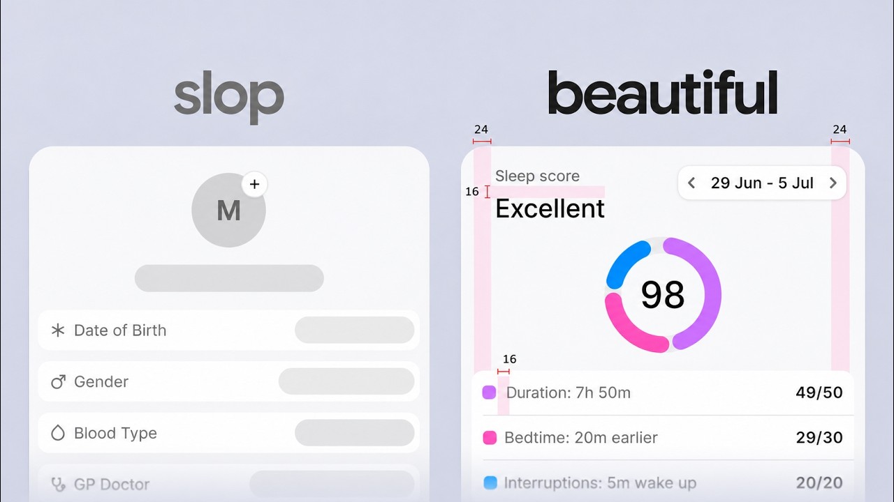
  • The video argues AI 'slop' persists but changes appearance as models improve, so one generic prompt won't yield distinctive design.
  • Fable 5.2's default output is solid but generic, showing telltale signs like serif headlines, italic accents, eyebrow labels, cream backgrounds and buttons.
  • Step one, taste: build a mood board of design references from Pinterest, Dribbble, Twitter, and component sites rather than trying to articulate preferences in words.
  • The presenter keeps a 'taste vault' web app built by Claude Code that organizes saved screenshots into collections for programmatic reference.
  • Step two, tools: use general design skills such as the taste skill and Impeccable, which target and remove AI-slop patterns across the design process.
  • Image and video generation is handled through the Higgsfield MCP, giving Claude Code access to many AI image and video generators.
  • Step three, direction: refine references toward a specific aesthetic by showing concrete screenshots, since many people cannot name the style they want in advance.
  • Claude generates multiple visual variants, including interactive elements like sliders and toggles, to narrow down a direction.
  • Step four, dial: have Claude build a tweaks bar that exposes adjustable controls (background texture, hero size, tilt, layout options) for rapid iteration.
  • The overall message is that treating the model as an engine you steer, rather than a slot machine, yields outputs that reflect your own taste.

Answers

Questions about this video

Why does the video say a single prompt isn't enough to avoid AI slop?

A single generic prompt produces regression-to-the-mean outputs with recognizable AI patterns. The video argues you need a repeatable workflow that injects your own taste through references, skills, direction, and iterative controls.

What is the 'taste vault' the presenter describes?

It is a web app built with Claude Code that stores screenshots of design references organized into collections. Claude can then access it programmatically when looking for inspiration, instead of relying on a folder on the desktop.

What is the purpose of the tweaks bar in the final step?

The tweaks bar gives toggles and sliders for adjustable design parameters such as background texture, hero size, and layout. It lets you iterate quickly across many variations and settle on an output you actually like.

Full Transcript — Download SRT & Markdown

00:00
Speaker A
Did Fable 5.2 finally kill AI slop? Well, not exactly. Unfortunately, AI slop is never going to go away. It's just going to look different as these models continue to get better and better. What you're looking at here is
00:14
Speaker A
the new face of AI slop. This was created by Fable 5.2, and it is not objectively bad. This is not the purple gradient nonsense we saw in 2024. This is pretty solid, but it is extremely generic and it screams Claude Code made
00:30
Speaker A
this. But the issue is one prompt isn't going to change this. You can tell Fable 5.2 whatever you want. You can say, "Hey, I want you to be creative. I want you to think outside of the box. I want
00:40
Speaker A
you to create an award style website and it will create interesting things like you see here. But are these driving conversion? And most importantly, are you actually able to inject your own taste? Are you in control of the
00:52
Speaker A
creative process or are you just using Fable 5.2 as a slot machine and saying, "Hey, be creative." And just hoping you get some generation that makes sense. We don't want a slot machine. Instead, we want Fable 5.2 to be the engine of a car
01:07
Speaker A
we are driving. And to do that, we need a sustainable, repeatable workflow that allows us to inject our taste. And that's exactly what I'm going to show you today. Now, the workflow I'm going to walk you through today has four
01:18
Speaker A
steps. That's taste, tools, direction, and dial. For taste, I'm going to show you where you can find references and inspiration that you can bring into Claude so you aren't starting from scratch. For tools, I'm going to show you which skills can actually improve
01:33
Speaker A
your outputs. For direction, I'm going to show you how to pick an aesthetic style. This can be really hard if you don't come from a design background.
01:40
Speaker A
Like, where do we even start in terms of prompting? We're going to cover that there. And lastly, when it comes to dial, I'm going to show you how to create stuff like a tweaks bar similar to what you see inside of claw design
01:51
Speaker A
that allows us to iterate very, very quickly so we can land on outputs we actually like. But in order to defeat AI slop, we first have to understand it.
01:59
Speaker A
Again, we're talking about generic regression to the mean outputs. I would consider this AI slop. This was a very plain prompt. It didn't use any skills.
02:09
Speaker A
And you see a lot of the telltale signs from AI. First of all, we have the serif headline. Guess what's going to be number two? It's going to be this italicized font at the end. Next, what do we have here? We have the eyebrows.
02:21
Speaker A
Everything is always labeled, whether it's at the top or the bottom. Next, we have the cream background. And then these buttons are pretty much everywhere. Props to Fable 5.2 for not making them super rounded like we usually see. Now, a successful front-end
02:33
Speaker A
design workflow goes beyond simply noticing these things and getting rid of them. Like if I change the font and I get rid of the italics and I get rid of, you know, the eyebrows, does that necessarily make it a better product?
02:45
Speaker A
Not necessarily. What makes a product good or what makes this good for a design is very subjective. So we constantly talk about taste. Taste.
02:53
Speaker A
Taste. You also hear AI has no taste. Well, that's why the first step of this workflow taste is so important. You need to cultivate your own taste. What do you think actually looks good? And then how do you articulate that? That's sort of
03:05
Speaker A
difficult. it. It's actually very very difficult to articulate why you like certain things. So instead of expecting you or anyone else to be able to figure out in words what you want Claude to do, why don't we just go out into the web,
03:18
Speaker A
go out on the internet and find websites and designs we like and just show it to Claude. Essentially give it a mood board that it can work off of. Well, that's exactly what you're going to do in step
03:28
Speaker A
one. And for this rest of the video, we are going to be demoing the creation of a webpage board. This app called 14.
03:34
Speaker A
This is essentially an app that helps people find campgrounds or places on public land where they can camp. Think like disperse camping sort of thing. So, when it comes to finding inspiration, luckily there are a ton of places we can
03:47
Speaker A
go. Some of my favorites include Pinterest, Dribble, Twitter, and even component pages like 21st.
03:55
Speaker A
The idea is you just need to go out there and you need to start finding things you like. Ideally, you already have some sort of repository or perhaps a saved folder on your computer that's just like screenshots of web designs you
04:07
Speaker A
really like. But if you haven't created that yet, you just need to start now.
04:10
Speaker A
And I suggest choosing one of these sites to sort of start your journey. So let's say for Pinterest, for example, we're creating essentially a SAS a software as a service application. So I don't have to go hyper specific when I
04:24
Speaker A
talk about, you know, hey, we're doing something related to camping. I could just do like SAS UI design or I can do SAS web design to sort of just get the ball moving and see if anything speaks to me. The same thing goes for dribble.
04:37
Speaker A
If I just put like landing page SAS, what do I get? I get a bunch of stuff pop up that may I may or may not like.
04:46
Speaker A
And the idea is once I find something I do like, I'm just going to take a screenshot of it and I'm going to dump it into claw code. And truthfully, I think the best place to find really good
04:55
Speaker A
design is going to be on Twitter. There's a ton of great web designers that are on this app. And if you can start following them, you're going to see things populate on your feed all the time that make you kind of just like
05:05
Speaker A
stop, go, "Wow!" and kind of just add it to your collection. Now, I referenced earlier the idea of taking all these screenshots over time and putting them in some sort of folder on your computer.
05:13
Speaker A
You can also turn this into a web app. I called mine a taste vault, and I have a number of references inside of here that I have clawed code. take a look at when I'm looking for inspiration for web
05:24
Speaker A
design. So, same sort of idea. I have a bunch of screenshots of different things I found on the web. I gave them all to Cloud of Code and I said, "Hey, just turn this into a vault of my quote
05:32
Speaker A
unquote taste." It breaks it down by collection. And the idea is instead of having to, you know, bring up this folder on my computer at any point in time, I can just have Claude programmatically take a look at this.
05:44
Speaker A
So, if you are someone who's doing a lot of front-end design, I highly suggest doing something like this. So, inside of my taste vault, I think this looks pretty sweet. I like this. I'll throw something like this as a reference as
05:55
Speaker A
well. And I think the general layout of the landing page of this reference also kind of speaks to me. Again, we don't have to hone in on a specific aesthetic style yet. We're just kind of throwing a bunch of stuff at the wall that we like.
06:08
Speaker A
And again, just kind of moving Claude in the right direction. Now, once you feel happy with the references you found that you want Claude to sort of build off of, next we move into step two, which is the
06:18
Speaker A
tools. what skills you need to bring on board before you can even begin prompting. Now, when it comes to front of design skills, MCPs and CLI, they really fall into one of two categories.
06:25
Speaker A
The first are the general design skills, and the two biggest ones in the game today are the taste skill and impeccable. These both kind of operate the same. The idea is they have identified what they consider to be AI
06:37
Speaker A
slop and the skill gets rid of AI slop. Some minor practical differences between the two, but that's how they work. And again, they affect every level of the design process. These aren't micro scales that are like, "Oh, hey, this
06:49
Speaker A
skill does, you know, scrolling animations or stuff with like asking, none of that." Now, should you be using these very large all-encompassing skills? I would say yes if you're new to front of design and cloud code. These act as a great crutch. They give you
07:06
Speaker A
really good guard rails and they're going to make sure whatever you create isn't quote unquote sloppy. However, as you become more mature, you need these less and less. Now, that second group of skills and MCPS are the ones that give
07:18
Speaker A
Claude code some ability. It just does not have it all, namely image and video generation. Now, for this, I tend to rely on the Higsfield MCP because it gives me access to all the AI image and video generators out there today. Being
07:33
Speaker A
able to add images to your web page definitely adds a certain premium effect to whatever it is you're building. So, I think this one is extremely useful. Now, specifically to use the Higsfield MCP, all you need to do is go to
07:45
Speaker A
Higsfield.ai, go up to the MCP, and then you're going to hit add Higsfield to Claude. We're going to want to connect it in the desktop app. You're going to copy the MCP link inside of the desktop app. We
07:56
Speaker A
are then going to go to the left, go to customize. You're going to go to connector, add custom connector. You're going to paste in the custom connector.
08:02
Speaker A
Call it whatever you want, and then you're going to hit continue. From there, you're going to have to already have a Higsfield account for this, but it's going to walk you through the authentication process. At that point, it's going to include the Higsfield
08:13
Speaker A
skills, which means Claude now has access to essentially any AI video or image generator it wants. And truth be told, beyond those skills, the Higsfield MCP, the taste skill in the impeccable, it really becomes a case-byase basis. I
08:26
Speaker A
suggest, and I think this is sort of something we see across the board as these models get better and better, you don't just go out and add 10,000 front of design skills to your stack. You aren't one skill away from sort of
08:38
Speaker A
getting like good outputs. It really comes down to this workflow process and these references and everything we're talking about today. Try not to overbloat it with skills. And truth be told, if you are ever like unsure if, hey, should I use impeccable? Should I
08:50
Speaker A
use tkill? Should I just rely on plain claw code? You can always prompt claude code to give you outputs using the skill, not using the skill. So, you can quite literally see what your website would look like with or with or without
09:02
Speaker A
all these add-ons. So, we've completed steps one and two, which is the taste and the tools. Now, we move into direction. Here is where we begin.
09:09
Speaker A
prompting it and begin settling into some sort of design or aesthetic direction. Now, I've gone ahead and updated some of my references. I went further into Pinterest and looked up hiking and camping SAS UIs and took some screenshots that you see here that are
09:26
Speaker A
sort of going to drive our references. Now, the prompt looks just like this. So, basically, I'm just saying I'm building a landing page for 14, our madeup app that finds free legal dispersed camping spots on public land.
09:40
Speaker A
So, I'm just explaining what my app is, what I'm trying to build. I say, take a look at the references I've attached for the type of aesthetic I like. Now, importantly, I'm saying keep those references in mind with what we're
09:51
Speaker A
building and come up with three landing pages for this app. Make them three very distinct takes. You can generate images with Higsfield if you deem appropriate.
10:01
Speaker A
So, I don't necessarily know what I want it to look like yet. I know I have some references. So, because I'm kind of a visual person, I'm having Claude create three landing pages for me, three very different styles, and we're going to go
10:13
Speaker A
from there. Maybe you already know an exact style you want to go for. If so, great. But I think for a lot of us, we kind of have to see it. Like so many things when it comes to AI and Cloud,
10:21
Speaker A
you don't need to know the answers to the test at first. Just ask Cloud what it thinks is best and have it come up with a bunch of different options for you. So that's what we're going to do
10:28
Speaker A
here and we're going to have Claude go to work and create some landing pages for us. So here are the three options that Fable 5.2 ended up giving us. So it lists them all side by side. We have
10:38
Speaker A
survey over here on the left. We have the diarama in the middle and then the almanac over here on the right. So I can see all of them side by side, but we can also expand each one. So we have the
10:50
Speaker A
survey one. So this is kind of cool. I can kind of actually adjust things on the hero itself, which is kind of neat.
10:57
Speaker A
and definitely different than the original output we got with Fable 5.2. Again, we're getting away from the generic. As we scroll down, what do we got? Another image it created that's actually interactive. Got this cool image and this interactive slider. So,
11:15
Speaker A
this looks pretty neat. Then we have the diarama. Um, first impressions are I probably like this one the most out of all the ones we've seen. kind of just because I think kind of has some character, you know, uh when it comes to
11:27
Speaker A
frame design, it's so subjective, you know. I could totally see someone that likes number one over number two. But I kind of like the design it went with.
11:34
Speaker A
Kind of reminds me of sort of those like remember those like almost claimation Airbnb uh commercials they had come out.
11:40
Speaker A
Was that last year or something? Um although there's some minor things like the image you can see kind of goes over the top of the early access bar. Don't know if I love the color doing green on green, but again, maybe I'm kind of like
11:52
Speaker A
feeling it. I don't know. I kind of just like the character of this one. Um, this is cool. Again, I kind of like the interactive stuff that are on here. Turn it on. Turn it off. This also adjusts.
12:04
Speaker A
So, pretty solid. I think this part might be cool if this was actually just part of the footer itself, if that makes sense. So, I feel like I like maybe the the sole of number two, even though I
12:14
Speaker A
think it could definitely use a little bit more work. Then we have the almanac setup. This is almost like too clean, I think, which I don't really love. Too clean for me. Not a huge fan. So, definitely between one and two. I could
12:29
Speaker A
see people who would like number one the most. But what I'm going to do is I'm going to say I like number two. Now, you have a few options at this point at this part of the workflow. Step three, we're
12:38
Speaker A
talking about directions. I could say, "Hey, Claude Code, I like number two. Now, give me three different versions of number two of the diarama." and then I want three versions of that. Right? You can keep having it giving you more and
12:48
Speaker A
more sort of macro iterations. Or you can say, hey, you know what? I like the diarama style. Let's go with number two.
12:56
Speaker A
And then let's move into step four, which is the dial step. And really, that's about more micro adjustments.
13:02
Speaker A
That's where we go inside of here and we start giving it more specific changes we want. And that's where we also bring in the tweak bar. Because the problem is what you're going to find is you get to
13:14
Speaker A
this step and you're like, "Okay, let me give it a prompt to fix this, you know, little thing on here, and let me give it another prompt to deal with the color.
13:20
Speaker A
Let me give it another prompt to do X, Y, and Z." And you're constantly relying on you yourself to be the one to come up with the prompts to do the fixes. Well, what if instead all these things I want
13:28
Speaker A
to change were just like a toggle switch or a slider, and I could very quickly see a bunch of different things at once.
13:33
Speaker A
That's what a tweak bar is going to give us, and that's what we see in things like Claw Design. But we can take that to the nth degree just by prompting it.
13:40
Speaker A
So that prompt will sound something like this. So what I want to do now is move forward with the diarama option. But I do want to see some more adjustments to it. So could we create some sort of like
13:50
Speaker A
tweak bar that gives me like sliders and toggles to where it could change different things on the web page itself?
13:56
Speaker A
Whether that's like fonts or even like motion, how things go in shadows. I want you to get very very deep with the amount of things that show up on this tweet part. I want to be able to edit a
14:06
Speaker A
lot of things via this bar so I can iterate over and over and over again. So even things you think I wouldn't necessarily change, go ahead and throw it on there. Surprise me. And then go ahead and bring that up once you're
14:16
Speaker A
done. And let's see what it comes back with for that. So here's the tweak bar over on the right. And it gave us 101 controls. So it went pretty nuts with this thing. Now right away it also made
14:26
Speaker A
a few changes. So you can see it fixed sort of the get early access thing that we saw there before. But let's take a look at some of the controls. It has a surprise me control. So, if we click
14:35
Speaker A
that, it'll just do a complete adjustment. So, I mean, you know, you want to talk about slot machine. Well, we kind of just put that straight into this. Um, which I guess is kind of interesting. Um, although we can always
14:47
Speaker A
just reset it. We can change sort of the palette. So, right now we're on sage. We could do desert, lakeside, wildflower, dusk, whatever we wanted to do. Again, the idea here with the tweaks bar is that I can rapidly iterate until I find
14:59
Speaker A
something I like. We can mess with the background texture. I can adjust the hero thing itself, the actual size. I can pull it up or down towards the headline. I can tilt this thing if we want to. Can even kind of change the
15:14
Speaker A
seasons or the hue really kind of make it a little more fall. Also apply that color to all of the clay art if we want to adjust the shadowing. Can even adjust the actual pin style, you know, whether
15:25
Speaker A
we want that to be a ring, a dot, or a teardrop. can adjust the motion. So, we can replay it when scrolled back. You can see it kind of bounces up as it comes in. All that can be edited here.
15:38
Speaker A
And like you see, we could spend another 20 minutes here going through pretty much every single change we ever wanted to. And this becomes the last step in having Fable 5.2 give you outputs that aren't just generic slob. So, that's
15:52
Speaker A
where I'm going to leave you in today's video. I hope what you got from this, if nothing else, is the workflow. the idea of injecting taste, using the right tools, choosing an art direction before finally tuning these little dials to get
16:04
Speaker A
an output that isn't generic and actually reflects what you want. And you can apply this to any sort of web design idea you have. So, as always, let me know what you thought. Make sure to check out Chase AI Plus if you want to
16:16
Speaker A
get your hands on my cloud code master class and I'll see you
Topics:AI design workflowClaude CodeAI slopweb designdesign tastemood boardHiggsfield MCPfront-end designUI iterationFable 5.2

Get More with the SozAI App

Transcribe recordings, audio files, and YouTube videos — with AI summaries and speaker detection. 30 minutes free.

Or transcribe another YouTube video here →