Skip to content

Give Me 10 Minutes & I'll Boost Your Website Conversions

Learn 4 key changes to boost SaaS website conversions by simplifying calls to action, focusing on outcomes, and optimizing copy clarity.

Key Takeaways

  • Simplify to one clear call to action to reduce visitor overwhelm and increase conversions.
  • Sell outcomes and benefits, not just product features, to connect with visitors emotionally.
  • Write clear, concise copy that anticipates and addresses visitor objections without overloading them.
  • Structure landing pages to quickly communicate value and next steps for fast-scanning visitors.
  • Use multiple calls to action only when necessary to meet visitors at different points in their buyer journey.

What the video covers

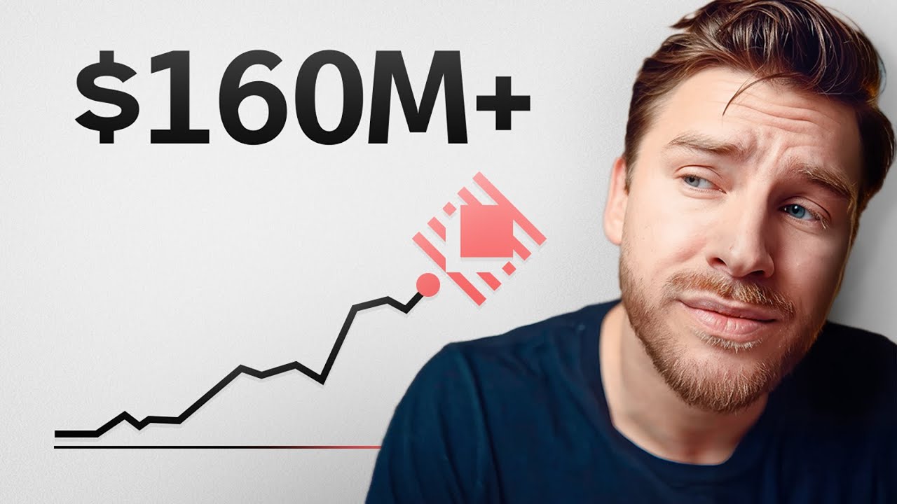
  • Average SaaS websites convert less than 4% of visitors, while top performers reach nearly 12%.
  • Pages with a single clear call to action convert better than those with multiple options due to the paradox of choice.
  • A Columbia University study showed fewer choices significantly increase purchase rates, illustrating choice overload.
  • Effective messaging focuses on the outcome and benefits for the user, not just product features or specs.
  • Steve Jobs exemplified outcome selling by framing the iPod as '1,000 songs in your pocket' rather than technical specs.
  • Visitors scan landing pages quickly, so copy must be clear, context-driven, and address objections without overwhelming.
  • The Goldilocks principle applies to copy length: not too little to leave questions, not too much to cause paralysis.
  • A well-structured landing page includes a clear headline, subheading, product visuals, trust signals, and a single call to action.
  • Sometimes multiple calls to action are necessary to cater to visitors at different stages of readiness.
  • Offering the right choices at the right time drives conversions, especially for complex SaaS products.

Answers

Questions about this video

Why is having a single call to action important for website conversions?

Having a single call to action reduces visitor overwhelm and decision paralysis, leading to higher conversion rates. Studies show pages with one clear call to action convert better than those with multiple options.

How should SaaS companies frame their product messaging to improve conversions?

SaaS companies should focus on selling the outcome and benefits their product delivers rather than just listing features or technical specs. This helps visitors understand how the product improves their lives or work.

What is the Goldilocks principle in relation to landing page copywriting?

The Goldilocks principle means copy should be just right—not too brief to leave questions unanswered, and not too long to overwhelm visitors. Clear, context-driven copy that anticipates objections works best.

Full Transcript — Download SRT & Markdown

00:00
Speaker A
Less than 4%. That's the share of visitors who become buyers on the average SaaS website. Meanwhile, the best ones reach almost 12%. Same visitors triple the return.
00:14
Speaker A
And after a decade of designing landing pages and products, I've learned where most sites miss out on conversions. So, in this video, I thought I would break down the four changes that can turn your site from basically average to a great
00:30
Speaker A
sales machine. Let's start with something that sounds simple, but that many websites ignore: settling for one clear call to action. Not two, not three, one. You see, Unbounce ran a massive study on more than 18,000 landing pages, and this is what they
00:51
Speaker A
found. Pages with a single call to action converted at 13.5%. Those with two, 11.9%, and those with three, just 10.5%. This makes it really clear that the more choices you offer, the fewer conversions you get. So what's going on
01:08
Speaker A
here? Well, it actually comes down to a psychological principle called the paradox of choice. And there's a real-world study to show how it works and why it's important for your website. But quickly before that, if you're trying to
01:23
Speaker A
grow your business, but don't have time to optimize all these things yourself, at SIPAP, we actually do free design strategy calls each month for a few select tech companies. So, if that sounds interesting, you can use the link
01:37
Speaker A
down below to see if there are any spots left. Anyways, back to the study. So, at Columbia University, researchers set up a test at a candy shop. One setup offered 24 flavors of candy, while the other one offered just six. And the
01:53
Speaker A
number of people for each setup was exactly the same. But here's what blew them away. Only 3% of people who saw the 24 options actually bought something.
02:04
Speaker A
Meanwhile, 30% of people shown just six flavors made a purchase. That's a 10x increase in conversions just by removing options. Showing us that choices don't empower the buyer. It actually can overwhelm them. And when someone feels overwhelmed, they hesitate and they
02:25
Speaker A
leave. The same goes for your landing page. In this case, every extra button, whether it's watch a demo, subscribe, learn more, or download white paper, it feels helpful. But to a distracted visitor, it's just noise. It creates analysis paralysis and ultimately in
02:43
Speaker A
action. So, the best converting pages act like a guide saying, "Here's what to do next." Just this one thing, one single action. Now, there are situations where one call to action doesn't make sense and where removing options can
03:00
Speaker A
actually hurt your conversions. We'll cover those tricky exceptions later in the video. So, stick around for that.
03:07
Speaker A
But before we go there, while we've now given the visitor one clear option to really make them convert, we need to help them understand why it matters to them. And the best way to exemplify this is with a great Steve Jobs story. Back
03:23
Speaker A
in 2001, the digital music scene looked very different. Portable MP3 players were all about specs, and they marketed themselves that way. Talking about storage, what formats they supported? It was all very technical and super abstract to most consumers. Like, what
03:42
Speaker A
does 128 MB of storage on my music device even mean to me and my life? But then Apple stepped onto the stage and while revealing the iPod, Jobs didn't brag about 1 GB of storage. Instead, he stood on stage, held up the sleek new
04:00
Speaker A
iPod, and said, "1,000 songs in your pocket." And that was a line that changed everything because it was a similar product with a totally different message. Jobs understood that to sell this to the consumer, he needed to focus
04:16
Speaker A
on the outcome, not the specs. He made people understand and feel what the product meant for their daily life. And that's what stuck. So when you write something like real-time notifications with Slack and Jira integrations, it has no power to it. But if you focus on the
04:35
Speaker A
outcome, like close tickets three times faster without switching tabs, then you're speaking a language that will help the visitor understand how this will actually improve their life.
04:47
Speaker A
Because you're not selling tools, you're selling time saving, faster wins, more revenue. Whatever your customer's ideal future looks like, that's what you're selling and that's the story you have to tell on your website. Now, if you feel like your current messaging might be
05:04
Speaker A
doing too much of the tool selling and not enough of the outcome selling, again, check out our free design strategy calls. The link is down below.
05:14
Speaker A
But all of this quickly breaks down if you don't understand how people actually absorb landing pages, which brings us to one of the most important points of this video and something we touched a little bit on earlier. No one is reading your
05:30
Speaker A
landing page. They're scanning for a reason to care or a reason to leave. It's as simple as that. And that's why your copy needs to load fast in the brain. But it's not necessarily about writing less, which is the common
05:44
Speaker A
misconception around great copy and well-converting landing pages. It's about writing what matters and nothing more. Enter the Goldilocks principle, a principle coined by James Clear, the best-selling author of Atomic Habits. He explains that humans naturally gravitate towards tasks that are at the right
06:06
Speaker A
degree of difficulty. So not too hard and not too easy. And applied to copywriting, that means if you have too little copy, you probably leave important objections unaddressed, which makes people hesitate and look for an alternative. On the flip side, if you
06:23
Speaker A
have too much copy, you drown buyers in analysis paralysis again. They become overwhelmed and they leave. So, you don't want to be brief and you don't want to be long-winded. You want to be clear with context-driven copy that
06:39
Speaker A
anticipates what your audience is thinking and covers for any objections or questions they might have for you.
06:46
Speaker A
Let's have a look at an actual website example to make this a bit more practical. First, we have a headline that names a pain point or an outcome.
06:54
Speaker A
Then we have a subheading or a body that adds a new angle or fresh value to the pain point or outcome. We have a product visual that shows helpful context or contrast. We have proof points that signal trust like social proof,
07:10
Speaker A
impressive numbers, previous clients, and lastly, a clear call to action. The quick litmus test to see if you're doing a good job here is to ask yourself three simple questions for every section of your website when someone scrolls fast.
07:27
Speaker A
Will they catch what it is, why it helps, and what to do next? If they can't, you most likely don't need more content. You need to deliver your content in a better way. Because again, clarity isn't about saying more or
07:43
Speaker A
saying less. It's about saying precisely what your buyer needs and cutting everything, and I mean everything else.
07:50
Speaker A
So, now you've got one clear call to action. You're finally selling the outcome, and your copy is structured for your ideal customer to quickly absorb it. But remember at the start when I mentioned that sometimes the one call to
08:06
Speaker A
action rule isn't really ideal. Well, the reason for this is that the world is messy. In the real world, visitors drop in from all kinds of sources, whether it's newsletters, social posts, or help docs, and they land at different levels
08:24
Speaker A
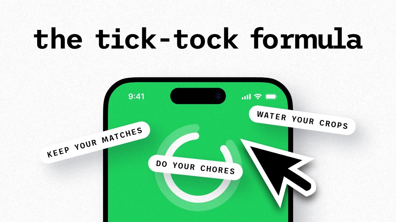
of readiness. Some are just browsing, others are ready to buy. And that's why some high-converting websites offer multiple next steps or actions depending on where the visitor is in their journey because not everyone is ready to try for
08:41
Speaker A
free. And in those cases, you'll often see something like one primary call to action for high intent users like try for free today and a secondary call to action for those who need more context like watch a demo or learn how it works.
08:57
Speaker A
This helps you meet people where they are in their buyer's journey, which can be especially important for more complex SaaS products where the value proposition might not be immediately clear to the visitor. But with that, sometimes users aren't ready at all. And in those cases,
09:15
Speaker A
we want to give them a way to ex...
09:31
Speaker A
you'll see in ecom. These options keep people engaged even when they're not ready to convert. It's funny because I recently went through an escape valve myself. Just the other week here, I signed up for an automated bookkeeping service here in Spain simply because of
09:47
Speaker A
their chat widget. For me, at my stage in the buyer's journey, in this case, the difference in friction between one-clicking a chat bubble versus digging for an email or lengthy FAQs was everything, especially as I was evaluating other options on the market.
10:05
Speaker A
So, sometimes you don't need fewer choices, you need the right ones for the right person at the right time. That's what drives action, as in my case. Now, if you found this helpful, you'll probably love this video here. And
10:21
Speaker A
before we round off, if you're trying to grow your business for the third time, feel free to sign up for one of our design strategy calls. The link ain't going to leave anywhere. It's going to stay down there. Click it. See you in
10:37
Speaker A
there. Until the next one, have a great
Topics:website conversionsSaaS marketingcall to actionlanding page optimizationcopywriting tipsparadox of choiceoutcome sellingconversion rateuser experiencedigital marketing

Get More with the SozAI App

Transcribe recordings, audio files, and YouTube videos — with AI summaries, speaker detection, and unlimited transcriptions.

Or transcribe another YouTube video here →