The Tiny Design Rule Behind Top 1% Apps — Transcript

Learn how top apps use the psychology of peak and end moments to create memorable user experiences and boost engagement.

Key Takeaways

  • Designing for peak and end moments significantly impacts user memory and engagement.
  • Intentional peaks create emotional highs that keep users hooked and boost key metrics like bookings or retention.
  • A strong, well-crafted ending reinforces completion and encourages positive user actions like ratings or return visits.
  • Mapping the entire customer journey helps identify where to place peak moments and improve the overall experience.
  • Reducing negative or stressful moments is crucial as they are equally memorable and can harm user perception.

Summary

  • Top apps like Airbnb, Ahead, and Uber master two critical moments in user experience: the peak (most intense moment) and the end (final moment).
  • Daniel Kahneman's research shows people remember experiences based on peak and end moments rather than the entire journey.
  • Disney theme parks design peak and end moments intentionally to create lasting positive memories, resulting in high return rates.
  • Airbnb uses micro animations and tailored tags to elevate the peak moment when users find their perfect listing, followed by a slick purchase animation.
  • Ahead, an Apple Design Award winner, creates a friendly, guided experience with a peak moment of a personalized brief and a gentle nudge to return.
  • Uber focuses on ending the journey well by encouraging polite driver ratings and tipping, reinforcing a sense of completion and satisfaction.
  • The video offers a step-by-step guide to map the customer journey, identify peak moments, and design intentional peaks and endings to increase user engagement.
  • Designers are encouraged to pick one magical peak moment in the user journey and enhance it with animations, badges, or surprise copy.
  • Negative moments should be identified and minimized as they are as memorable as positive ones.
  • The video promotes free design strategy calls at SIPAP for personalized help applying these principles.

Full Transcript — Download SRT & Markdown

00:00
Speaker A
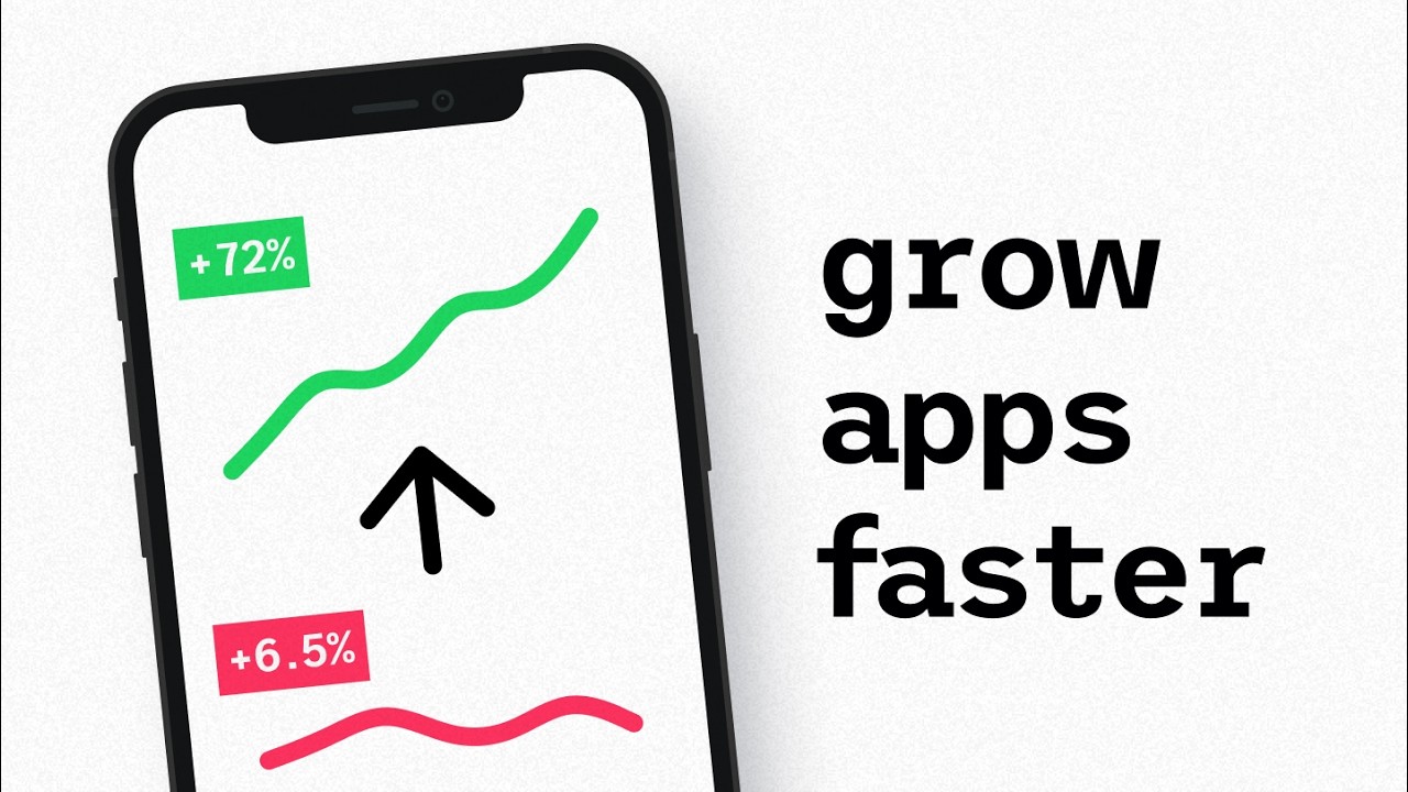
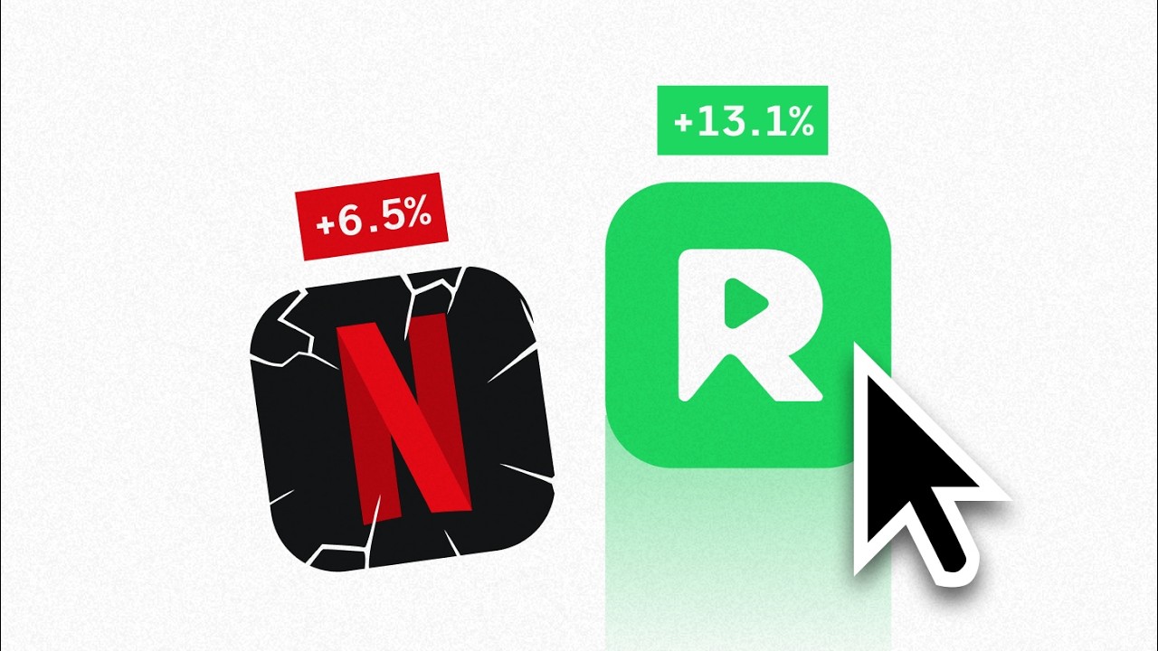
What does the world's most popular rental app, an Apple Design Award winner, and one of Silicon Valley's biggest success stories all have in common? It's not just good design. How they master two simple but critical moments: the peak and the end. In this
00:20
Speaker A
video, I'll show you how they do it. Drawing from a decade of experience designing for both scrappy startups and global tech giants, you'll learn how these apps intentionally design those moments to keep you hooked and the exact checklist you can use to do the same
00:39
Speaker A
[music] for your own product. But to make sense of this entire concept, you have to understand why these moments work in the first place. So, let's break down the psychology behind it. It all started with the Nobel Prize-winning
00:55
Speaker A
psychologist Daniel Kahneman discovering that our brain doesn't remember an experience as a whole. It compresses it.
01:05
Speaker A
What we actually recall is how we felt at the two specific points I mentioned in the beginning of the video: the peak, aka the most intense part of the experience, and the end, aka the last part of the experience. Everything else
01:21
Speaker A
is basically just noise. And nowhere is this better illustrated than at the Disney theme parks because, to be honest, like waiting in line for 90 minutes in the sun, hustling between attractions, and fighting for $10 fries, all of that
01:38
Speaker A
kind of sucks. I mean, it's very clear that not everything about the Disney experience is smooth. But Disney knew something most theme parks didn't. They could intentionally design what visitors remember. And they did so by leaning in hard on the high points, the peaks, and
01:57
Speaker A
making sure the final moment before you left the park, the end, felt carefully crafted. Whether that was a surprise interaction with a character, the last firework show of the night, or even the music playing as you exit the park,
02:13
Speaker A
everything is deliberately timed to a peak and then gently winds down to a great ending. And as a result, about 70%, again, 70% of Disney park visitors come back for a second visit. Not because the entire day was flawless, but
02:32
Speaker A
because the moments they remember were. So, if Disney can pull this off in a 6-hour, $200 experience, what could you do with your app in a couple of minutes?
02:44
Speaker A
Well, turns out a lot. But before we look at how Airbnb does this in their app, if you want to talk about this or anything else design related with a team that has many decades of design experience, then check out the free
02:58
Speaker A
design strategy calls we do at SIPAP. It's in the link down below. Now, let's zoom in on Airbnb. They're known for being one of the most design-focused companies on the planet. But what truly sets them apart is how they sweat the
03:13
Speaker A
small stuff. Every screen feels like it was crafted by hand. When you open the app, you're met with friendly openings and subtle animations. Even their icon set comes alive as you switch between tabs in the app. And all of this helps
03:29
Speaker A
make the experience truly top tier. But the strongest parts of the app come later because Airbnb knows that the first core moment for guests, the one they really want to elevate into a peak, is when they find that perfect listing.
03:46
Speaker A
Knowing this, they sprinkle in nice little micro animations and supporting tags showing the unique value to your specific pick, all to make you feel confident and excited in that peak moment. Then once you make the decision to reserve your booking, they end your
04:04
Speaker A
experience with a super slick purchase animation in their trademark 3D style. And while these things may seem a bit trivial at first glance, knowing how data-driven the team at Airbnb is, it's pretty safe to assume that this exact
04:19
Speaker A
peak experience has been tested extensively to help boost their booking rates. However, with that said, peak moments can come in more forms than just elevating actions like booking a listing. The Apple Design Award winner Ahead uses these moments to create a
04:37
Speaker A
really sticky and friendly user experience. Most wellness apps lean on moral pressure or habit dashboards. But Ahead took a different path. They designed a flow that guides you kindly from start to finish. Let's take when you first download the app. You're
04:55
Speaker A
welcomed with a smooth, quiet splash screen that really sets the vibe of the app immediately. Then you ease into a self-profiling journey, answering key questions at just the right cadence.
05:10
Speaker A
But while this is all really well-crafted and amazing, it's not the peak or the end. Because as the experience continues, you're not just shown a report. You get a carefully, deliberately designed peak experience, a brief that just gets constructed right
05:30
Speaker A
in front of you, making you as a user feel like this is made for me at just the right moment. Then as the grand finale before closing the app, you'll get a gentle nudge to come back tomorrow, subtly reinforcing that your
05:45
Speaker A
time meant something and that we care to see you coming back to the app. So, this is a great example of how to use the peak rule to create more stickiness with our users in a friendly way. But what if
05:59
Speaker A
we want to use the peak and power to have users directly contribute to reducing churn on our app? That's where Uber comes in with one of their most popular UI patterns. Because while Uber can't really brag about fancy skeuomorphic
06:16
Speaker A
icons or super cool animations, there's one thing they reliably do better than most. They end the journey extremely well. After a ride, you don't just exit the car and call it a day. You're given a tight little peak and flow, a
06:33
Speaker A
vibration of the phone, and a double reward opportunity: rate your driver and leave a tip. And it's not enforced. It's gentle and it's polite because Uber knows their riders already experienced the peak, which was about reaching their destination. So all they have to do is
06:52
Speaker A
wrap a sense of completion into the ending. A completion that might give the driver an additional tip and help grow their reputation, which in turn helps keep the drivers on Uber's platform.
07:06
Speaker A
This, of course, creates a really virtuous cycle where satisfied drivers provide better experiences, which encourages riders to use Uber more frequently, which in turn further increases demand and supply reliability for Uber. A win-win for the users and a great business
07:26
Speaker A
outcome for the company. But now the question is how do you apply this to your context? How do you take the same patterns with intentional peaks and good endings and leverage it to make users crazy about your product? Well, I'm
07:42
Speaker A
going to show you step by step how I would guide clients through it at SIPAP.
07:48
Speaker A
But first, if you want this actually applied to your context, or if you just want to chat about a new website, a rebrand, or a product design in general, again, take a look at our free strategy calls in the link down below. Now, the
08:04
Speaker A
step-by-step guide. As a first step, you want to map out your entire customer journey. You can use sticky notes on a wall or a digital board in a tool like FigJam. It doesn't really matter, but I prefer to have it online, so I just use
08:19
Speaker A
FigJam. Then you lay out every step your user takes in your core flow from sign-up to task completion to whatever the end looks like in your product.
08:31
Speaker A
After that, ask questions like, where is the user slowed down? Where might stress peak? Where's the quiet in between? Save the result of this exercise and treat it as a living tool you will iterate on as your product evolves. The next step is
08:48
Speaker A
to pick your magical moment or your one well-timed peak. Pick just one spot in the journey to spark it. For example, after a user completes a core task, right when they hit a milestone, or at a point when they're investing a lot of
09:04
Speaker A
effort. This is where you place the holy dang moment. It could be a badge, a sparkle, an animation, or just surprise copy that lifts the experience above what's expected. But remember, don't save the magic for the end. Peak first,
09:21
Speaker A
because a lot of apps just end. They fall off without closure or the feeling of you're done or you're doing great.
09:30
Speaker A
And that, ladies and gents, is what we call a mis
09:44
Speaker A
It might be a check mark or a summary card or even a message like you showed up today. That's huge. The bottom line is it doesn't have to be fancy, but it should be designed with intent. Then as
09:58
Speaker A
the fourth step, bring out the vacuum cleaner. Look at your weight screens, your error states, your long forms, and ask yourself, where might someone feel stuck or uncertain? Then make an effort to wrap those moments in true care.
10:14
Speaker A
Again, use microcopy that's uplifting or add tools that help before they even ask, or use delays as opportunities instead of dead space. Because negative moments are as memorable as positive ones. So, make sure you do your absolute best to locate them and reduce them.
10:36
Speaker A
Then lastly, just run variations of your peak moments. Try timing changes, emojis versus icons, animations versus static feedback. Watch where people drop off, and where they stay around a bit longer than expected or necessary. That's your signal to jump in and tweak the
10:57
Speaker A
experience. Now, if you want guidance on any of this, we're happy to help at SIPAP. And for the last time, feel free to check the link below for that free design strategy call I cannot shut up about. Also, if you like this video, I'm
11:14
Speaker A
pretty sure you'll love this video here that is about very related stuff. It's about emotional design and how apps like Dualingo and Revolute use it to crush their competition. Now, until the next one though, have a great
Topics:user experienceUX designpeak-end ruleapp designcustomer journeyAirbnbUberAhead appemotional designdesign strategy

Frequently Asked Questions

What is the peak-end rule and why is it important in app design?

The peak-end rule is a psychological principle discovered by Daniel Kahneman that states people remember experiences based on the most intense moment (peak) and the final moment (end), rather than the entire experience. Designing these moments intentionally helps apps create memorable and engaging user experiences.

How does Airbnb use peak moments to improve user engagement?

Airbnb enhances the peak moment when users find their perfect listing by adding micro animations and unique value tags to boost confidence and excitement. They also end the booking process with a slick 3D purchase animation, making the experience feel polished and rewarding.

What practical steps can I take to apply the peak-end rule to my app?

Start by mapping your entire customer journey to identify key moments. Then, pick one well-timed peak moment to enhance with animations, badges, or surprise copy. Also, design a satisfying end to the user journey to reinforce completion and encourage positive actions, while minimizing negative or stressful moments.

Get More with the Söz AI App

Transcribe recordings, audio files, and YouTube videos — with AI summaries, speaker detection, and unlimited transcriptions.

Or transcribe another YouTube video here →