How Addictive Apps Are Made — Transcript

Learn the three layers that make apps addictive: experience foundation, interface boosting, and emotional design integration.

Key Takeaways

  • A smooth, optimized core experience is essential before any visual design.
  • Visual interface design is a strategic tool that builds trust and guides users.
  • Emotional design integration is the key to making apps truly addictive.
  • Strategically placed emotional moments increase user engagement and retention.
  • Following a structured design process prevents costly mistakes and maximizes revenue.

Summary

  • The video breaks down the three specific layers that make apps addictive and effective.
  • It starts with the experience foundation, emphasizing smooth and fast core user experience.
  • The importance of clarifying and mapping the core user experience before design is highlighted.
  • Interface boosting is the second layer, focusing on visual design as a trust signal to users.
  • Visual hierarchy, color contrast, and strategic design choices drive user trust and conversion.
  • The third layer, emotional design integration, creates genuine human connection and emotional investment.
  • Duolingo is used as a prime example of successful emotional design in apps.
  • Emotional design moments should be strategically placed where they impact business outcomes.
  • The video encourages a structured design process to optimize user experience and engagement.
  • Free design strategy calls are offered for personalized advice on app design.

Full Transcript — Download SRT & Markdown

00:00
Speaker A
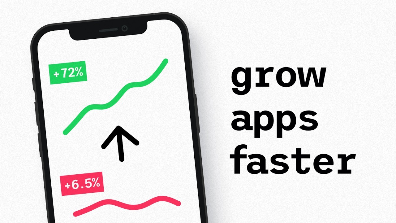
Everyone knows the apps you can't put down have something special about them, but nobody's breaking down the three specific layers that make them actually work. So, in this video, I'm going to reverse engineer how they do it. And
00:18
Speaker A
[music] Once you see it, it will change how you build products forever. [music] And just as some additional proof here, we've tested this framework with everything from App Store top layers to AI apps with hundreds of thousands of
00:34
Speaker A
monthly active users at SIPAP. So, we know this works. Now, let's start with a pattern I keep seeing. Many founders, whether they know it or not, actually follow the classic double diamond design approach when building a product. You
00:54
Speaker A
explore horizontally before going deep vertically. And that's the most proven way to reach startup success. But still, most products fail. Why is that? It's because they usually skip the specific nuances that actually matter for creating addictive products and
01:14
Speaker A
especially those related to the last layer we'll talk about today. The one that apps like Duolingo almost abuse to keep people hooked. But before we get there, if you're interested in chatting with me about design strategy for your
01:31
Speaker A
own app, check out our free design strategy calls in the link down below. Now, let's start at the base that makes the other layers of the three-layer framework relevant in the first place.
01:43
Speaker A
Something I call the experience foundation. To exemplify this, I want you to think about ordering pizza. You can have the most beautifully animated interface in the whole world, but if it takes half an hour to place a simple
02:00
Speaker A
one-person order, no award-worthy visuals can save you from pissing people off. In the end, people would much rather just have the ability to say, "Hey Google, order my favorite pizza for 6:00 p.m. tonight." And this example encapsulates what the entire experience
02:19
Speaker A
foundation is about. Your app should focus on helping people get their jobs done as smoothly and as quickly as possible. Again, most founders know this. But still, here's where 90% of them go wrong. Even the ones who have
02:38
Speaker A
successful products might be missing out on millions in potential revenue because of a non-optimized core experience. So how can we do this in the right way? How can we nail that experience foundation?
02:53
Speaker A
Well, first you need to clarify and map out your core user experience and make sure it's the right one. This happens before you touch any visual design whatsoever. And it applies to building an app from scratch, adding new
03:09
Speaker A
features, or even tweaking an existing experience. Always aim to do this. In our case, at Zips, we run strategy workshops as the first step in every single project. This helps us understand the core problems and create a comprehensive strategy document that
03:31
Speaker A
informs our entire path forward. And whenever we learn something new, whether that's through testing or just new insights from the client, we'll capture it in this document. And having this in written form forces us to not jump
03:48
Speaker A
into visuals yet, while also giving us AI-ready prompt material that can be used for anything from rapid prototyping to ideating new ways to solve core problems. After this, we'll touch design software for the first time. We'll create screen maps where we outline
04:07
Speaker A
every single part of the flow and its connected feature set. Then lastly, we get into real visual stuff. Here's where we create wireframes and prototypes that we can use to hone in on the most optimized user experience. Being strict
04:26
Speaker A
with this flow is key because it ensures that we're building the right foundation before anything else. And if you want to see it in action, I have a video on the channel where I go into detail on our
04:40
Speaker A
exact process. Or better yet, again, if you want to talk to me directly about this, check out the free strategy call in the link below. Now, the experience foundation helps us make sure we create true functional value. But in this age
04:58
Speaker A
of AI slop where everything looks the same, it's not really enough. If we want to build that next level of trust and conversion, we need to master the second layer, something I call interface boosting. Once your experience works
05:15
Speaker A
flawlessly, you need to turn your visual interface into your trust badge. And to showcase the importance of this, here's a crazy fact for you. People make trust decisions about your app within 50 milliseconds of seeing it. On top of
05:31
Speaker A
that, they'll continue to judge it throughout your entire app's existence. So having a clean, professional interface will signal reliability and competence. And whether you're actually reliable or competent, it will trick your users' subconscious into feeling like this is a safe place to invest
05:55
Speaker A
time, effort, and money. On the contrary, poor visual design will make people question your app. You see, warning signals will go off in their heads and you'll lose potential users and revenue. The common misconception with interface design is that it's about
06:12
Speaker A
shiny buttons or fancy gradients. So, naturally, we end up copying trendy designs without really understanding why certain visual choices work better than others for our specific case. And here's the bigger problem with that. We start treating interface design like
06:32
Speaker A
decoration instead of a strategic tool that enhances your entire experience foundation. Your color choices, your contrast levels, and your visual hierarchy aren't just aesthetic decisions. They're business drivers that either guide users toward your goals or completely distract them from what
06:58
Speaker A
really matters. So, here's what to do when you reach the interface boosting layer. Use strong, high-contrast colors strategically on elements that directly or indirectly drive revenue. Think about it like this. Your primary call to actions should almost pop off the screen
07:19
Speaker A
while secondary actions can safely kind of fade away into the background. Also, reduce contrast on less important content to create visual breathing room for what actually matters in your designs. And then design your visuals to tell a story that guides users naturally
07:40
Speaker A
through your interface. You can use directional elements, color coding, and visual weights to create a clear path toward conversion. Instead of cramming every feature into view, use strategic white space and visual hierarchy to spotlight your money-making actions. As a rule of thumb, every visual choice
08:04
Speaker A
should answer one single question. Does this help users see what they need to see when they need to see it? Now, by executing on the experience foundation and the interface boosting in a good way, your app should enter that top 10%
08:22
Speaker A
level of apps. But like I mentioned in the beginning of the video, it's the last layer that separates merely good apps from addictive ones. I call this layer emotional design integration. And this is the secret sauce that helps you
08:39
Speaker A
create that genuine human connection through a digital interface. Let's take this super classic example of Duolingo.
08:49
Speaker A
If you compare it to any basic learning app, you'll see that they teach the same kind of stuff, but somehow Duolingo just feels more alive and fun and addictive.
09:03
Speaker A
This is because the Duolingo app is a masterclass in emotional design. It celebrates your progress. It makes you feel guilty for missing days and it creates emotional investment. Nowadays, many successful apps and apps in general are trying to do what Duolingo is doing.
09:24
Speaker A
Here's the thing, though. You don't necessarily need to acquire a motion design studio to get the most essential parts of emotional design. While Duolingo has the multi-million dollar budget to create emotional moments basically everywhere in the app, you can
09:42
Speaker A
still get lots of emotional design value by simply focusing your efforts. For example, when we do it for clients at SIPs app, we pinpoint the moments where emotional integration most likely will lead to better business outcomes. So in
10:00
Speaker A
which parts of the flows does it really make sense to add this emotional design?
10:05
Speaker A
Then we just design strategic emotional moments.
10:30
Speaker A
other hand, you have to design that connection or it simply doesn't exist. And this is where most apps today fail horribly. It's becoming more and more apparent in the AI age where everyone and their grandma can create an app.
10:47
Speaker A
It's super easy nowadays. We're in a time where we treat users like robots who just want efficiency. There's no personality or emotional feedback in the apps or in most of the apps that are created today. And as a result, users
11:02
Speaker A
might complete tasks, but they'll never form emotional attachment to the product, which in turn increases the likelihood they'll eventually churn. So, how do you keep them from churning using emotional design? Let me show you a couple of recent examples of what we did
11:22
Speaker A
at Sibs. for free cash, an app that is currently at number two on the app store as I'm filming this. We introduced a tiered diamond system with levels designed to allow the user to keep collecting diamonds, basically for
11:39
Speaker A
years. This creates a reason for power users to keep returning and exploring what's at the next level. Also, if they're not careful, their whole progress can go lost in a very visually demoralizing way, which makes them not want to do that. Obviously, with another
11:58
Speaker A
app, in a very crowded AI note-taking space, we pick the most used part of the app to reinforce their brand while creating a memorable living experience the user will interact with daily. So, we picked an experience that is used
12:16
Speaker A
daily to reinforce the branding while also adding functional value. And then for a recent iOS app, among many things, we frontloaded emotional connection during the onboarding to gain that extra bit of trust with a very trust sensitive web 3 audience. And this is crucial here
12:35
Speaker A
with a trust sensitive web 3 audience that we think about emotional design as a lever to kind of gain their trust. In this case, we need to do everything we can to make them trust the app. And you
12:48
Speaker A
can do the same with your app. Just remember to follow the three layers. Start with the experience foundation and make your core user experience better than anything on the market. Then nail that 50 millisecond trust test through professional clean interface boosting.
13:08
Speaker A
And lastly, introduce emotional integration to create that next level of stickiness with your users. As I mentioned twice already, if you want help with any of this, just sign up for the strategy calls in the link down below. Also somewhere around here,
13:25
Speaker A
you'll find the videos about Dualingo and our detailed design agency process that I mentioned before. Until the next one, have a great
Topics:addictive appsapp designuser experienceinterface designemotional designproduct designstartup successDuolingodesign strategyuser engagement

Frequently Asked Questions

What are the three layers that make apps addictive according to the video?

The three layers are experience foundation (smooth core user experience), interface boosting (visual design as a trust signal), and emotional design integration (creating emotional connection).

Why is the experience foundation important before visual design?

Because a slow or complicated core experience frustrates users regardless of visuals, so the app must help users complete tasks quickly and smoothly before focusing on design.

How does emotional design make apps more addictive?

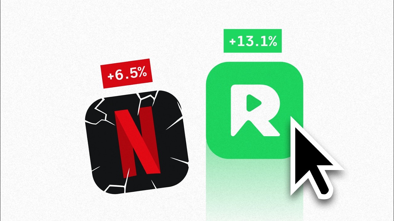
Emotional design creates genuine human connection by celebrating progress, inducing feelings like guilt for missing days, and fostering emotional investment, which encourages users to keep returning.

Get More with the Söz AI App

Transcribe recordings, audio files, and YouTube videos — with AI summaries, speaker detection, and unlimited transcriptions.

Or transcribe another YouTube video here →