What Founders Can Learn From Apple’s Design Domination — Transcript

Explore Apple's design secrets from physics-based gestures to subtle cues and math that create intuitive, trusted user experiences.

Key Takeaways

  • Use physics-based feedback to make digital interactions feel natural and intuitive.
  • Guide user behavior through subtle visual cues rather than explicit instructions.
  • Implement gradual transitions for major UX changes to reduce user friction.
  • Consistency and mathematical harmony in design build trust and user retention.
  • Every interaction detail, including sound and haptics, contributes to a polished experience.

Summary

  • Apple's design feels magical due to gesture physics, subconscious cues, micro feedback, and mathematical precision.
  • The rubber band effect in scrolling makes digital interactions feel physical and intuitive.
  • Apple uses subtle visual cues and gradual transitions to train user behavior without tutorials.
  • Micro interactions like vibrations and smooth animations create playfulness and reliability.
  • Mathematical curves called squircles enhance visual polish beyond simple rounded corners.
  • Audio and haptic feedback build subconscious trust and satisfaction with device interactions.
  • Consistency in design, guided by human interface guidelines, fosters user trust and retention.
  • Apple's three tap rule ensures key actions are accessible within minimal steps for ease of use.
  • The ecosystem design and layered UI effects maintain familiarity while preventing boredom.
  • Design patterns should be established and broken intentionally to build user confidence.

Full Transcript — Download SRT & Markdown

00:00
Speaker A
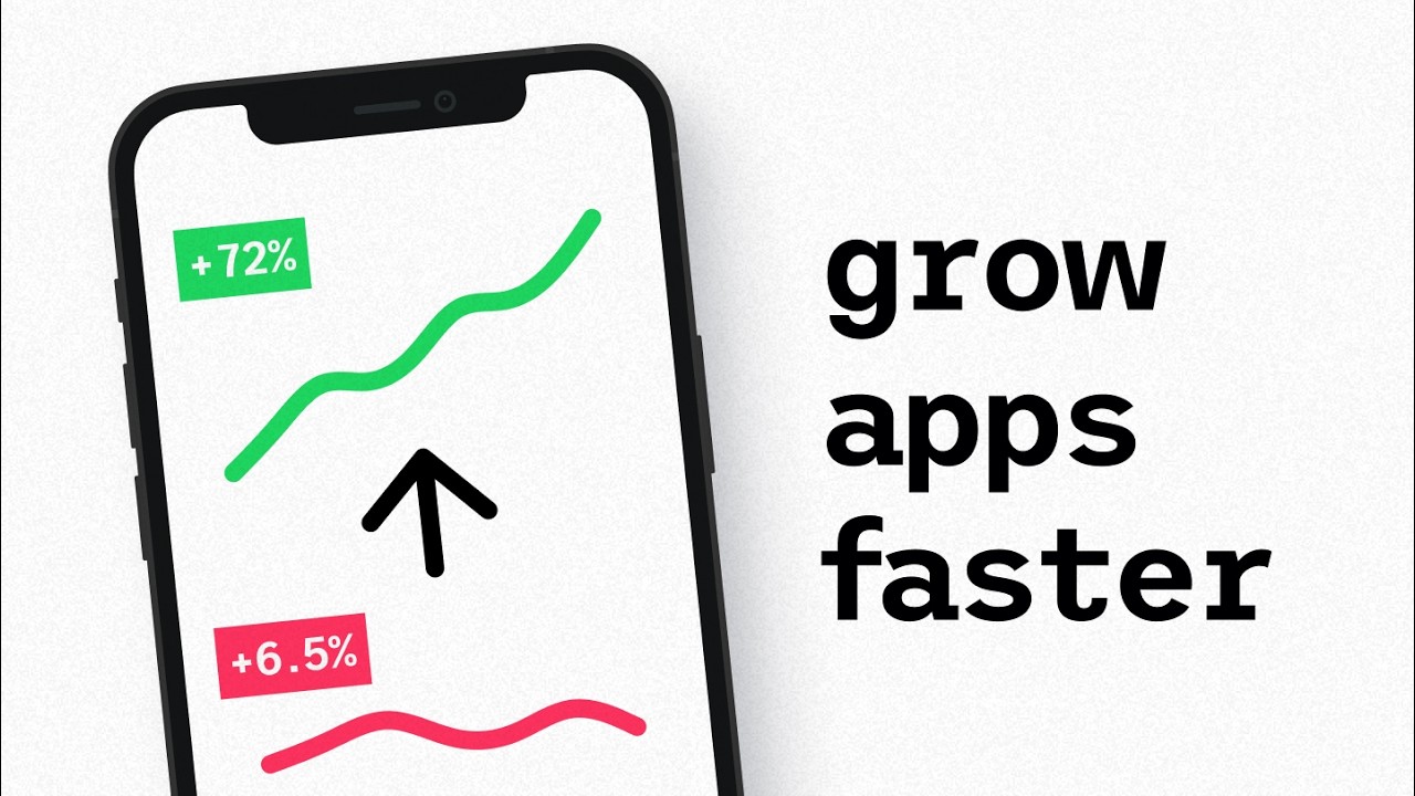
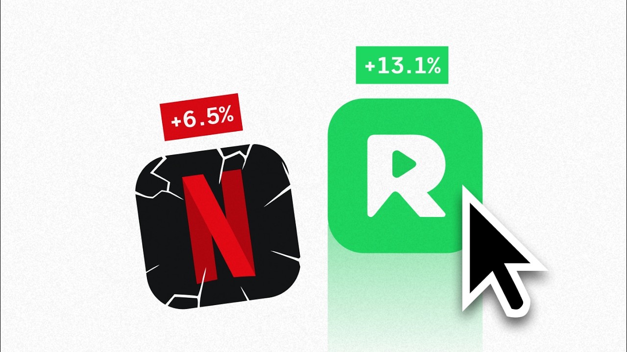
Apple's design isn't just beautiful. It feels like magic. But that feeling, it's not an accident. Behind it lies a recipe of gesture physics, subconscious cues, micro feedback, and even math. As someone who's spent the last decade designing for startups and tech giants,
00:23
Speaker A
I've seen how powerful these things are when put into practice. So, in this video, I'll reveal the four sneaky design principles behind Apple's amazing software experience and teach you how to use the same ideas in your own [music]
00:40
Speaker A
products. Let's start with something you probably never think about, but use hundreds of times a day. The rubber band effect when you scroll past the end of content on your iPhone. While most people think this is just an eye candy
00:54
Speaker A
thing, it's actually doing something much deeper. It's making the digital world feel physical. Because when you pull down and it bounces back, your brain doesn't think software. It thinks real object with weight and momentum.
01:11
Speaker A
I've talked in depth about emotional design and how that impacts user behavior in a different video and this is part of that same idea. Before we dig deeper into that though, [music] if you're looking to create that Appleoesque emotional feeling in your
01:29
Speaker A
app or on your website or in your branding, we open up free design strategy calls every month at SIPAP.
01:38
Speaker A
Just check the link down below to grab your spot. Now, Apple, they didn't just add gestures. They made them feel inevitable. Every swipe, every tap, every pinch follows the laws of physics.
01:53
Speaker A
Because when digital interactions mirror realworld physics, we don't have to learn them. We already know them. But here's where Apple gets really sneaky.
02:05
Speaker A
They obsess over tiny, almost invisible feedback cues. I'm talking subtle vibrations, elastic bounces, and precise, buttery smooth animations. For example, the bounce at the top and bottom of a scroll view isn't just flare. It reassures you the interface is responsive and alive.
02:28
Speaker A
These micro interactions create a sense of playfulness and reliability which elevates routine tasks into memorable moments. And this isn't new for Apple.
02:39
Speaker A
While drag and drop was pioneered at Cerox Park in 1973, Apple was instrumental in popularizing and redefining it for a mass audience with the Macintosh. You see, Apple understood that human interaction should mirror realworld physics. Like in this
02:59
Speaker A
case, grab, move, and release. They transformed a research concept into something millions could use intuitively. And they never stopped. In fact, one of their most powerful design choices ever is sitting right there on your phone, almost invisible. You know
03:18
Speaker A
that tiny line at the bottom of your iPhone screen? That's not decoration. It's a detail designed to teach you a specific behavior. Over 10 years, Apple gradually trained billions of users to swipe home without any tutorials. The evolution from a physical home button to
03:40
Speaker A
a basic gesture happened so slowly, most people didn't even notice they were being trained. And that's exactly what makes it so brilliant. A subtle visual cue paired with gradual change. No tutorial, no friction, just behavior shaped through design. So, what can we
04:00
Speaker A
learn from that? And how do we bring this level of polish into our own products? First off, use physics-based feedback. When users interact with your product, there is a real win in making things respond like realworld objects.
04:16
Speaker A
Whether that's through bounce, momentum, or through friction, our brains expect the digital world to behave like the physical one. And when it does, we notice and we appreciate it. Also, guide behavior through visual cues. Don't just tell users what to do. Show them through
04:37
Speaker A
subtle design hints. That little line at the bottom is a master class in nonverbal communication within a UI. And lastly, if you're making major changes to an app, transition gradually because major UX changes should happen in steps, not all at once. Apple didn't remove the
05:00
Speaker A
home button in iOS 1, they waited until users were ready. Now, while Apple has world-class gesture design, their incredible visual design is usually what we talk about the most, which begs the question, what is it that makes it so
05:17
Speaker A
dang good? The answer is quite surprising because in the end, it all comes down to one very non-designy thing, math. Most people think Apple just makes things look nice, but there's actual science behind why their interfaces feel so god polished. For
05:38
Speaker A
example, Apple doesn't just use rounded corners. They use something called squirles. These are mathematical curves that create a smoother, more continuous transition than standard rounded rectangles. It's even a dedicated setting nowadays within popular design tools like Figma. The difference is
05:58
Speaker A
really subtle, but your brain notices. Their corners feel soft, while others feel cheap. And in the end, it becomes one of many important differences between a 1,000 phone masterpiece and a $200 knockoff, even when you can't put your finger on why. But it doesn't stop
06:18
Speaker A
at the squirles. Visual design is just one layer. Apple also obsesses over how their products sound and feel. Subtle audio cues like the iconic camera shutter or the gentle tap on passcode entry assure users actions have registered building deep trust and a
06:39
Speaker A
tighter bond between the user and the device. And then we have Apple's haptic touch which is an even more interesting example of this bond between the user and the device. Carefully calibrated click on a virtual button mimics the exact satisfaction of
06:58
Speaker A
clicking a physical button. I remember personally being totally mind-blown the first time I learned that the trackpad on the MacBook wasn't actually physically moving down to register the click as I pressed it. And while our brains consciously doesn't process these
07:16
Speaker A
details, subconsciously it builds trust and satisfaction with every interaction. So take this with you. Consistency creates trust. Use mathematical relationships like the golden ratio, consistent spacing, and perfect roundings to make interfaces feel harmonious. Because when proportions look and feel right, users trust the
07:40
Speaker A
product more. And on top of that, remember every touch point matters, especially now that voice and UIs that go beyond just simple screens are becoming more prevalent. Treat every design detail of your product like it's the most important part of all,
08:01
Speaker A
regardless if it's voice, haptics, or a traditional screen interface. That's how you achieve Apple quality. Now, even with all of these learnings, we haven't even touched on what makes Apple truly stand out from the competition. Before we cover that though, if you want to dig
08:19
Speaker A
deeper into any of this to create a truly world-class product, website, or brand, again, check out the free strategy call link down below. Now, back to Apple once again. What makes them the best is not in what they add, but in
08:37
Speaker A
what they leave out. Apple was the first major tech company to formalize its human interface guidelines. Starting with the Apple 2 textbased guidelines and then expanding to more graphical versions in the later years. This influenced industrywide approaches to
08:56
Speaker A
usability, layout, and interaction consistency. Because while others focused on features, Apple focused on how humans actually think and work. And the results speak for themselves. iOS 17 adoption reached 77% within 6 months versus Android 14 at 13% after 1 year.
09:19
Speaker A
You see, when your design is consistent and learnable, users actually stick around. When it's fragmented and confusing, they don't. Which brings us to Apple's use of the three tap rule.
09:33
Speaker A
It's a rule suggesting that you should have key actions within a three-tap range. And while it's not a must obey kind of rule within UI design, if you've ever used an iPhone and just think about it for a moment, the number of steps you
09:50
Speaker A
have to take to get to the most important thing is usually in the realm of three. Camera, one swipe. Silence a call, press side button once. Pay at a store, double click and glance. Apple consistently optimizes for minimal
10:07
Speaker A
fri
10:29
Speaker A
non-essential elements and reveal complexity only when users need it. Actively reduce visible options. Every extra choice risks creating decision paralysis. So streamline your interface by hiding secondary actions and reducing visible choices. This directly supports a more seamless user experience. Also,
10:55
Speaker A
optimize for the common case or the most frequent actions by most users like Apple's three tap principle. Prioritize making common tasks fast and intuitive.
11:09
Speaker A
Now, with that said, removing and reducing can only get you part of the way when designing products, which becomes incredibly apparent when you zoom out and look at the level of attention Apple pay to ecosystem design.
11:25
Speaker A
Just take a look at their five main devices. Every one of these devices feel and function like they're part of a bigger ecosystem when matched together, but also work perfectly fine as a standalone piece when they're not. And
11:43
Speaker A
this is one of Apple's major locking factors because consistency reduces cognitive load. When users learn something once in Apple's ecosystem, it works everywhere, which creates confidence and fluency across a person's entire digital life. Apple's strict adherence to their own carefully crafted
12:06
Speaker A
UI guidelines creates predictability, while the nuanced layering like the blurs, the translucency, the parallax keeps the system from feeling boring.
12:18
Speaker A
And this is even reflected in their transitions and animations. Most people never consciously notice this, but when navigating, Apple rarely just switches screens on you. Instead, they use carefully animated transitions to carry the user around their device. This
12:40
Speaker A
spatial continuity reduces confusion and keeps their interfaces feeling holistic and immersive. As a user, your brain builds a mental map of where everything lives just like in a physical space. So remember this, invest in design systems because consistency across touch points
13:00
Speaker A
builds familiarity and trust. When every interaction feels related, users develop confidence in your entire product. Then train user expectations because when you establish patterns, users expect them everywhere. Therefore, break those patterns carefully and intentionally, not accidentally. And lastly, design for
13:25
Speaker A
muscle memory. Consistent placement of key actions reduces cognitive effort. Users should be able to navigate your product without thinking about where things are. Now, if you found this breakdown helpful at all and you're wondering how you might apply this to
13:44
Speaker A
your own product or your own business, for the last time, we open up a couple of free design strategy calls each month. Just check the link below. Also, if you like this video, you'll probably love this one somewhere around here
13:59
Speaker A
where I cover how Dolingo, Revolute, and Phantom use emotional design to beat their competition. With that, until the next one, have a great
Topics:Apple designgesture physicsuser experiencemicro interactionsemotional designUI consistencysquircleshaptic feedbackhuman interface guidelinesthree tap rule

Frequently Asked Questions

What is the rubber band effect in Apple's design?

The rubber band effect occurs when you scroll past the end of content and the screen bounces back. It makes digital interactions feel physical by mimicking real-world weight and momentum.

How does Apple train users to adopt new gestures without tutorials?

Apple uses subtle visual cues, like the tiny line at the bottom of the iPhone screen, and gradual transitions over years to train users to perform new gestures intuitively without explicit tutorials.

Why does Apple use mathematical curves called squircles in their design?

Squircles create smoother, more continuous transitions than standard rounded corners, making interfaces feel softer and more polished, which subconsciously enhances user trust and perception of quality.

Get More with the Söz AI App

Transcribe recordings, audio files, and YouTube videos — with AI summaries, speaker detection, and unlimited transcriptions.

Or transcribe another YouTube video here →