How Netflix Made Us All Binge (Design Breakdown) — Transcript

Discover how Netflix built a $400B empire by using three behavioral design weapons to create the most bingeworthy app.

Key Takeaways

  • Removing small user experience frictions can significantly increase engagement and retention.
  • Personalization through AI-driven micro-genres creates deeper user intimacy and longer sessions.
  • Designing viral, culturally resonant UX features can generate organic growth and free marketing.
  • Behavioral design principles are applicable beyond streaming, useful for SaaS, mobile apps, and crypto platforms.
  • Understanding and solving human psychology problems is key to building addictive digital products.

Summary

  • Netflix's success is not just due to content but three behavioral design weapons unrelated to Hollywood.
  • Initially, Netflix's streaming UI was basic, causing infinite choice paralysis among users.
  • Netflix solved a human psychology problem by removing microfriction, exemplified by the skip intro button.
  • The skip intro button saved users significant time and increased binge-watching sessions.
  • Netflix developed algorithmic intimacy by creating over 1,300 micro-genres and personalizing user experiences.
  • 80% of Netflix viewing comes from personalized recommendations driven by AI.
  • The third weapon, viral UX, involves designing features that become culturally relevant and encourage sharing.
  • Netflix’s UX design led to free marketing through cultural adoption of features like 'Netflix and chill'.
  • The video offers practical advice on applying these design principles to other products.
  • Tim Gabe leverages his design experience to explain how to create addictive, user-centered digital products.

Full Transcript — Download SRT & Markdown

00:00
Speaker A
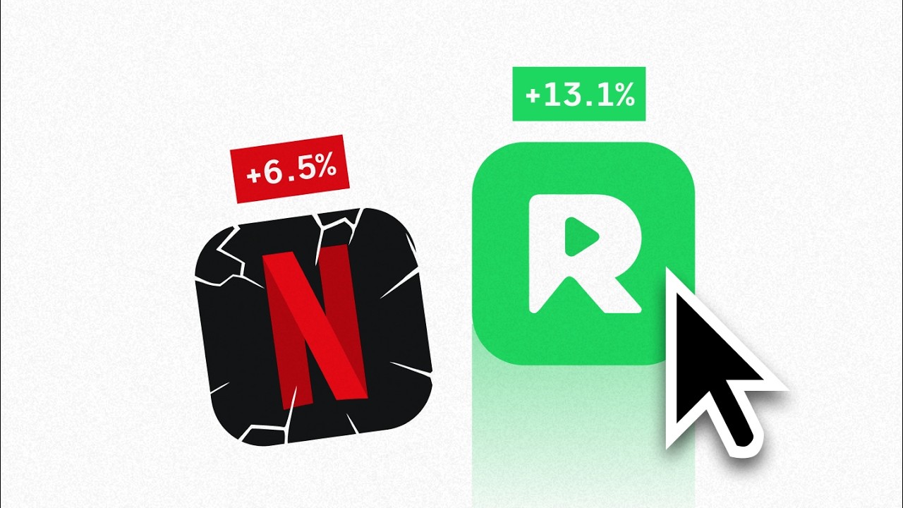
Everyone thinks Netflix won because of shows like Stranger Things and massive content budgets. But here's what will blow your mind. Netflix actually became a $400 billion empire by weaponizing three behavioral design weapons that have nothing to do with Hollywood. And
00:21
Speaker A
in this video, you'll discover how Netflix used these weapons to create the most bingeworthy app on the market. and exactly how you can steal them for your own product. Whether you're building SAS, mobile apps, or crypto platforms, doesn't really matter. By the way, I'm
00:41
Speaker A
in this video, you'll discover how Netflix used these weapons to create the most bingeworthy app on the market, and exactly how you can steal them for your own product. Whether you're building SaaS, mobile apps, or crypto platforms, it doesn't really matter. By the way, I'm
01:01
Speaker A
Basically, Blockbuster through your mailbox. When they launched streaming in 2007, their UI was super basic. Generic grids, soulless thumbnails, zero discoverability. But streaming created a nightmare problem for them. Infinite choice paralysis. With DVDs on their old website, you would spend days choosing.
01:24
Speaker A
Tim, and I've worked as a designer for over a decade building products for companies like Spotify and countless multi-million dollar startups. So, I obsess over these things daily. Now, Netflix started as a DVD-by-mail company in 1997.
01:36
Speaker A
So, here's what Netflix eventually figured out. They weren't solving a technology problem. They were solving a human psychology problem. And by figuring this out, they turned overwhelming choice into addictive delight using three specific design weapons. Weapons that actually work for
01:56
Speaker A
Basically, Blockbuster through your mailbox. When they launched streaming in 2007, their UI was super basic. Generic grids, soulless thumbnails, zero discoverability. But streaming created a nightmare problem for them: infinite choice paralysis. With DVDs on their old website, you would spend days choosing.
02:13
Speaker A
Now, the first weapon I call the microfiction eraser. And the perfect example of this from Netflix is the skip intro button that changed everything for them. You see, Netflix noticed something fascinating in their user data. 15% of viewers were manually fast forwarding
02:33
Speaker A
With streaming and thousands of options instantly available, users would instead spend like 30 minutes browsing and then get overwhelmed and give up.
02:48
Speaker A
They compound into massive user experience debt. Every small annoyance adds up until users start questioning whether your product is actually worth the hassle. Just think about your own product for a moment. How many tiny clicks, unnecessary steps, or confusing
03:07
Speaker A
So, here's what Netflix eventually figured out. They weren't solving a technology problem. They were solving a human psychology problem. And by figuring this out, they turned overwhelming choice into addictive delight using three specific design weapons. Weapons that actually work for
03:28
Speaker A
skip intro button. And in 2022, this tiny change was already generating 136 million button presses every single day, saving 195 years of time for users.
03:45
Speaker A
any product you're building. And before we dive into them, if you want help applying these exact principles to create truly bingeworthy apps or websites, well, we open up free design strategy calls monthly at SIPAP. You can grab your spot in the link down below.
04:06
Speaker A
this way. If each intro is 60 seconds and you watch 10 episodes in a night, skip intro has effectively freed up 10 extra minutes. Over time, that kind of micro friction removal can produce watch sessions that are significantly longer
04:23
Speaker A
Now, the first weapon I call the microfiction eraser. And the perfect example of this from Netflix is the skip intro button that changed everything for them. You see, Netflix noticed something fascinating in their user data. Fifteen percent of viewers were manually fast-forwarding
04:41
Speaker A
every single step where users might pause, get confused, or feel friction. This is about finding your equivalent of Netflix's skip intro button. Maybe it's as simple as autofilling forms with smart defaults. Maybe it's adding one-click actions for common tasks. Or
04:59
Speaker A
through show intros. This seemingly tiny friction point was breaking the binge-watching flow that Netflix desperately needed to build. And here's what goes wrong when you ignore microfriction like this.
05:18
Speaker A
results. But that's not enough to build a $400 billion company. Of course, Netflix had to solve an even bigger challenge, which brings us to design weapon number two, algorithmic intimacy.
05:32
Speaker A
They compound into massive user experience debt. Every small annoyance adds up until users start questioning whether your product is actually worth the hassle. Just think about your own product for a moment. How many tiny clicks, unnecessary steps, or confusing
05:51
Speaker A
that just showed different movies. This was an act of psychological manipulation at scale. But here's the challenge. Most companies fail with personalization.
06:03
Speaker A
moments are slowly but surely bleeding users away without you realizing it? Netflix realized they were bleeding, and well before AI was cool and hyped, they built an AI system to automatically detect intro sequences across every show globally. Then they just added a simple
06:23
Speaker A
surface level thinking that actually makes the choice problem worse. Netflix created over 1,300 micro genres like emotional crime documentaries or feel-good British comedies. Today, 80% of what people watch comes from these kinds of recommendations. They didn't just personalize content. They personalize
06:46
Speaker A
skip intro button. And in 2022, this tiny change was already generating 136 million button presses every single day, saving 195 years of time for users.
07:06
Speaker A
achieve with your app. Then create what I call emotional pathways through your product. For a step tracking app, for example, this could mean different onboarding flows for fitness beginners versus step counting enthusiasts. While for a texttospech app, it could be
07:25
Speaker A
Those are insane numbers to grasp, and it's even harder to grasp that it's achieved through one single button. More importantly though, Netflix found that users who skip intros binge-watch longer, which means a lot more money in the bank for Netflix. Think about it
07:48
Speaker A
can assure you that you're going to start seeing interesting results. Now, this algorithmic intimacy obviously drove crazy engagement for Netflix. But they had one more design weapon that most founders completely just ignore and one that turned their users into
08:06
Speaker A
this way. If each intro is 60 seconds and you watch 10 episodes in a night, skip intro has effectively freed up 10 extra minutes. Over time, that kind of micro friction removal can produce watch sessions that are significantly longer
08:18
Speaker A
The last weapon is called viral UX and it's about designing features so delightful that users can't help but talk about them. Netflix realized something powerful. When your UX becomes part of culture, you get free marketing that money can't buy. Features like are
08:37
Speaker A
without ever changing the shows themselves, which again is a pretty crazy outcome considering it's just one single button. But how do you apply this to your product? Well, start by mapping your users' journey from sign-up to their first success moment. Look for
08:51
Speaker A
But here's what most startups get wrong about viral UX. They think viral features happen by accident. And therefore, they don't invest in making their product experience sharable, memorable, or even culturally relevant.
09:08
Speaker A
every single step where users might pause, get confused, or feel friction. This is about finding your equivalent of Netflix's skip intro button. Maybe it's as simple as autofilling forms with smart defaults. Maybe it's adding one-click actions for common tasks. Or
09:20
Speaker A
Netflix didn't make this mistake. They designed moments that are so perfectly human that people screenshot them, quote them, and make them part of their daily vocabulary. Take their percentage match scores for example. That could have been simple star ratings, but by instead
09:40
Speaker A
maybe it's just about prepopulating dashboards with sample data so users aren't staring at empty states. Identify one to three of the biggest micro frictions in your products and then eliminate them. For Netflix, this micro friction fix created massive macro
09:59
Speaker A
interface to feel so naturally human that users adopted its language. Again, Netflix and chill didn't happen by accident. It emerged from UI that invited sharing and conversation. So, here's your practical playbook to do the same. Identify the one moment in your
10:17
Speaker A
results. But that's not enough to build a $400 billion company. Of course, Netflix had to solve an even bigger challenge, which brings us to design weapon number two, algorithmic intimacy.
10:40
Speaker A
laugh instead of just getting frustrated. Aim to create screenshot moments by having interactions that are so delightful that users just naturally want to share them. Now, let's recap Netflix's three design weapons. First, the microfion eraser, which is all about
10:59
Speaker A
Something Netflix used to make 230 million users feel like the app was built just for them. In 2015, Netflix launched their AI-powered personalization engine that transformed every user's homepage into a unique experience. This wasn't just a feature
11:18
Speaker A
If you bring any of these lessons into your own product, please let us know how it went in the comments. And if you found this breakdown helpful and you're wondering how this might apply to your products or your website or your
11:32
Speaker A
that just showed different movies. This was an act of psychological manipulation at scale. But here's the challenge. Most companies fail with personalization.
11:47
Speaker A
Dualingo, Revolute, and Phantom use emotional design to beat their competition. Competition. Competition. Competition.
Topics:Netflixbehavioral designbinge-watchinguser experienceskip intro buttonalgorithmic personalizationviral UXproduct designdigital engagementAI personalization

Frequently Asked Questions

What are the three behavioral design weapons Netflix used to succeed?

Netflix used microfriction removal (like the skip intro button), algorithmic intimacy through AI-driven personalization, and viral UX features that encourage cultural sharing.

How does the skip intro button improve user experience?

The skip intro button removes small annoyances by saving users time and maintaining binge-watching flow, leading to longer watch sessions and higher engagement.

Can these Netflix design principles be applied to other products?

Yes, the principles of removing microfriction, personalizing user experiences, and designing viral UX can be applied to SaaS, mobile apps, crypto platforms, and more to increase user engagement.

Get More with the Söz AI App

Transcribe recordings, audio files, and YouTube videos — with AI summaries, speaker detection, and unlimited transcriptions.

Or transcribe another YouTube video here →