Give Me 13 Minutes & I’ll Grow Your App — Transcript

Learn how to grow your app sustainably by designing for growth with a proven 4-step product funnel from top impression to win mapping.

Key Takeaways

  • App design itself can be a powerful growth driver beyond marketing and ads.
  • First impressions matter immensely and are largely visual—nail the 3-second test.
  • Onboarding should balance friction, not simply minimize it, to guide users effectively.
  • Timing user engagement requests around peak moments increases conversion and advocacy.
  • Emotional connection through design is key to long-term user retention and growth.

Summary

  • Most founders focus on viral marketing, growth hacks, or paid ads, but the app itself can drive growth if designed correctly.
  • The video presents a four-step product funnel for predictable and sustainable app growth, starting with quick wins at the top of the funnel.
  • The 3-second test emphasizes the importance of a strong first impression driven by visual design to avoid losing 20-30% of new users.
  • Common top-of-funnel mistakes include cluttered design, poor hierarchy, inconsistent spacing, cheap imagery, and unclear copy.
  • Fixing first impressions involves clean hierarchy, generous spacing, professional imagery, balanced typography, and outcome-focused copy.
  • Finding the friction sweet spot in onboarding is crucial—too much friction drives users away, too little fails to guide them effectively.
  • Examples include using IG story-style carousels and expanded tooltips to balance friction and reinforce value propositions.
  • Win mapping leverages the peak-end rule in psychology to engage users at moments of peak satisfaction for upgrades, ratings, and shares.
  • Many founders miss timing their asks, often presenting paywalls or tutorials when users are frustrated rather than at peak moments.
  • Emotional design and mapping user wins transform good apps into unforgettable experiences that build loyalty and advocacy.

Full Transcript — Download SRT & Markdown

00:00
Speaker A
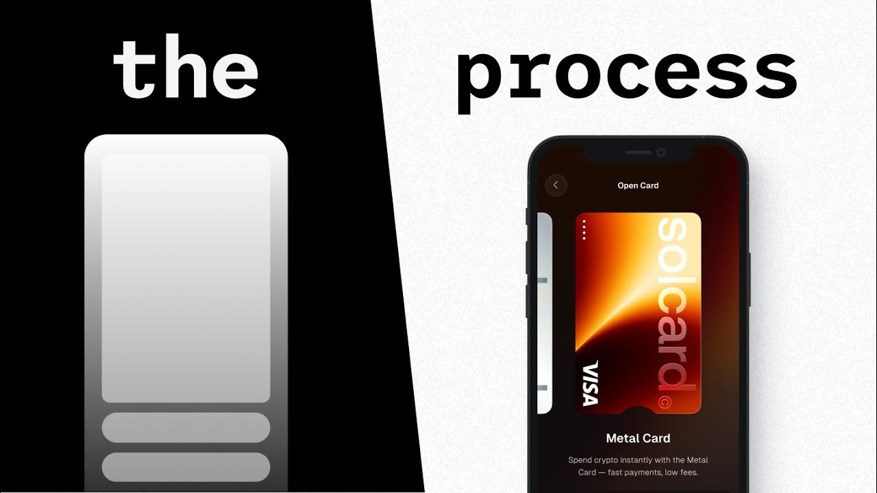
If your app isn't growing fast enough, you're probably thinking, "We need more viral marketing, more growth hacks, maybe more paid ads." But what most founders miss is that your app itself can actually do the growth work for you if you design it correctly. So,
00:20
Speaker A
in this video, I'm going to take a decade of experience designing for million-dollar startups and global tech giants to break down the four-step product funnel that you can use to achieve more predictable and sustainable growth with your app. We're going to
00:39
Speaker A
start from the top of the funnel with low-hanging quick wins and then move all the way down to the bottom of the funnel for the more expert-level tweaks that I'm confident you haven't thought about in this way before. Now, let's be real.
00:57
Speaker A
As founders, we're almost programmed to think that growth automatically equals spending more on ads, doing more marketing, getting more traffic. Those are the things, right? Essentially, we just want to pump more people through the door. But what often ends up
01:14
Speaker A
happening with this mindset is that we pour money into this bucket that has a hole in the bottom. So even if the overall ad spend has a positive ROI, we're missing so much potential revenue.
01:28
Speaker A
And the first and easiest way to regain that revenue is with something I call the 3-second test: your app's first impression. This is crazy powerful. And while most founders think they nail this, they usually don't. You see,
01:45
Speaker A
studies show that people form impressions in 50 milliseconds and they make trust decisions in less than 3 seconds. And the vast majority of that first impression is driven by visual design. The dangerous part is that getting this first impression wrong
02:05
Speaker A
could scare away 20 to 30% of new users immediately. Just like that, 20 to 30% of potential revenue gone. Before we go into the core problem and how to fix it, if you want to discuss how to boost your
02:21
Speaker A
own business metrics through design, check out our free strategy calls in the link down below. Now, here's what generally goes wrong with that first impression. If you really study bad top-of-funnel moments carefully, you'll start noticing a clear pattern. They're often
02:39
Speaker A
lacking basic design fundamentals. They're cluttered. They've got poor hierarchy, inconsistent spacing, imagery that looks kind of cheap, and random copy that doesn't effectively communicate the outcome. All this combined tells the story of why 99% of apps don't reach
02:58
Speaker A
real commercial success. Because science proves that even if users have no design background, not even a design eye, they feel these issues subconsciously and it makes them lose trust in your company.
03:12
Speaker A
But the crazy part is fixing this doesn't have to be rocket science. For example, when we redesigned a recent client website, we focused on five things: clean hierarchy, generous spacing, professional imagery that supports the headline, balanced typography, and outcome-focused copy
03:33
Speaker A
that is clear. For another recent project we worked on, we designed their app store screenshots as part of their app design. And we did the exact same thing. We focused on clean hierarchy, generous spacing, professional imagery, and balanced typography with outcome-
03:53
Speaker A
focused copy. If you nail those, you're almost guaranteed to make a great first impression because it's going to look professional and ultimately it's going to feel trustworthy for your users. Try to always ask yourself, is my top-of-funnel a trust builder or a trust
04:13
Speaker A
killer? Because if it's not a trust builder, you're losing out on a lot of users who'll just go to a competitor they can trust. But with that said, even when you manage to make your top of funnel trustworthy, you're up for the
04:28
Speaker A
next and even bigger challenge. It's something I call finding your friction sweet spots. This is actually a concept that can be applied across your entire app. But since generally the first interaction point for app users is going to be the onboarding, let's start with
04:47
Speaker A
that. You see, something I realized when talking to founders during the strategy calls. By the way, again, if you're interested in talking design strategy for your app, check the link below. is that most of the times your biggest win
05:02
Speaker A
will be to just shorten your onboarding down to the bare bones. Like just reduce the steps as much as possible. But while that's good advice, it won't always take you all the way because it's a bit of a
05:17
Speaker A
simplification. UX design is not about removing all the friction. It's about finding the right level of friction.
05:25
Speaker A
Generally, apps will do too much. Hence the general advice of just strip it down. But some apps will actually strip it down and then they end up confusing users because they're not creating that friction sweet spot. And it's tricky.
05:42
Speaker A
Too much friction and users give up. Too little friction. Well, then they're not effectively guided to the value which also makes them give up. Let me give you some examples to show it in practice.
05:54
Speaker A
With Spark app, we made the welcome screen into an IG story style carousel to reinforce the value proposition without bloating the onboarding. Then we made the actual card setup, aka the users download the app, show up within the first five screens, so it wouldn't
06:12
Speaker A
take them too long to reach it. With a crypto trading platform, instead of overwhelming the user with very detailed financial data breakdowns everywhere, we used expanded tool tips to hide secondary but still important data. And the natural instinct here could be to
06:31
Speaker A
just show all the data with the reasoning that we want to remove friction or have the IG story style carousel be individual screens in the onboarding sequence with the reasoning that we want the user to see each slide
06:47
Speaker A
so that they understand the value. But this wouldn't be the friction sweet spot in our cases. The lesson here is that product-led growth doesn't come from removing all friction. It comes from finding the sweet spot where you show
07:02
Speaker A
just enough to create value without overwhelming users. Whether you design an expanded tool tip or an IG story carousel all depends on the balance you need to strike with your app. And then once you've mastered that balance and
07:18
Speaker A
users are really engaging with your core features, you unlock one of the most underrated growth opportunities: a step I call win mapping. When the user is actively using your products, you have an opportunity to engage them enough to
07:36
Speaker A
turn them into paying customers or even better advocates. But timing is everything here, which is why win mapping relies heavily on the psychology principle called the peak-end rule. I have a whole video dedicated to this rule only that you can watch later. But
07:56
Speaker A
in a nutshell, the peak rule shows us that people judge entire experiences by one, the most intense moment, and two, the ending moment, not the average of all moments. This means that the timing of you asking users for stuff matters
08:14
Speaker A
much more than the ask itself. And the reason this is important for win mapping is because users are most receptive to asks right after meaningful wins in your app. And here's where I see many founders miss the mark completely.
08:32
Speaker A
They'll ask for upgrades, for ratings, and shares at random moments or at least not super strategic moments. I see this in strategy calls again and again. Paywalls, tutorials, forced flows. They're usually presented to users when they're more likely to be frustrated or
08:55
Speaker A
confused, not when they're experiencing peak satisfaction in the app. And that's a big mistake. For example, when designing the app for a big lending and borrowing platform during the early UX phases, we mapped where in the different flows users experience the biggest wins
09:17
Speaker A
or the highest peaks. We then took those moments and amplified them with emotion, which we'll go deeper into in a little bit. And as a result, we get a moment that feels special, a moment that amplifies the user's win, which in turn
09:36
Speaker A
makes them more likely to return the favor or even selfishly brag about their accomplishment. So, you need to sit down and map out
09:54
Speaker A
Because if you do it right, you can turn your app into a viral engine that brings new users onto itself. But to be totally fair, just mapping out the wins and being strategic about asks might not always be enough. You see, win mapping
10:12
Speaker A
is the most effective when combined with step number four, emotional design. This is the cherry on the top of your app.
10:23
Speaker A
This is what transforms good apps into unforgettable experiences. And if you watch my videos, you know that I rave about this a lot. But there's a reason for that. It's really freaking powerful.
10:37
Speaker A
Research shows that designs which deliberately evoke positive feelings through motion, feedback, and human touches are remembered, recommended, and revisited far more than purely functional ones. Essentially, this emotional layer is what can really help create that powerful word of mouth
10:59
Speaker A
growth for your app. But most apps don't get to experience that because they stop at functional. Even if they manage to solve the problem, they create no emotional connection. So users complete tasks but feel no attachment to the
11:16
Speaker A
experience. And without that emotional attachment, they have no real reason to not just switch to a competitor on a Black Friday sale. So what do we do?
11:28
Speaker A
Well, we need to give them such a high quality reinforcing experience in the right moments that our app becomes irreplaceable for them. With one of our current AI clients, we built emotional design into the core of the experience.
11:43
Speaker A
We designed these voice connected audio waves to make standard AI transcription tech feel more alive and responsive. I know it's a seemingly small touch, but it's a touch that make their app feel and look different and better than the
12:02
Speaker A
competition. It's details like this that makes them stand out, that makes them really connect with users, and that has their users raving about them. Now, let's summarize. If you want a great shot at achieving productled growth, remember these four steps. One, the
12:19
Speaker A
3-second test. Design for immediate trust. Two, the friction sweet spot. Find the right balance of information disclosure across your whole app. Three, win mapping. Map the peak moments and make them count. And four, emotional design. Create long-term stickiness and
12:39
Speaker A
loyalty through emotion. Now, for the last time, for this video at least, if you found this valuable and you want us to audit your app's funnel or talk about conversion optimization or just design strategy overall, the call link is still
12:55
Speaker A
in the description below. And if you're interested in diving deep into emotional design, check out this video. Now, until the next one, have a great life.
Topics:app growthproduct funneluser onboardingUX designfirst impressionfriction sweet spotwin mappingpeak-end ruleemotional designproduct-led growth

Frequently Asked Questions

What is the 3-second test and why is it important?

The 3-second test refers to the critical first impression users form within 3 seconds of opening an app, largely influenced by visual design. Getting this impression wrong can scare away 20-30% of new users immediately.

How should friction be handled in app onboarding?

Friction should be balanced to create a 'friction sweet spot'—too much friction causes users to quit, while too little fails to guide them to the app’s value. The goal is to show just enough information to engage without overwhelming.

What is win mapping and how does it help app growth?

Win mapping identifies moments when users experience their biggest wins or peak satisfaction in the app. Engaging users at these moments increases the likelihood of upgrades, ratings, shares, and advocacy, leveraging the peak-end rule in psychology.

Get More with the Söz AI App

Transcribe recordings, audio files, and YouTube videos — with AI summaries, speaker detection, and unlimited transcriptions.

Or transcribe another YouTube video here →