Learn how to create high-quality Roblox thumbnails using AI by analyzing top-performing examples and applying key design principles.
Ask about this video. Answers come from its transcript only — with the timestamp, so you can check them.
Generated from the transcript and can be wrong — check the timestamp.
Key Takeaways
- Effective thumbnails clearly communicate the game’s fantasy and unique mechanics.
- Readable faces with visible emotions increase engagement.
- Testing thumbnails on different devices, especially mobile, is crucial.
- Using AI and design tools can streamline thumbnail creation.
- Simple backgrounds and strong color contrast improve thumbnail clarity.
What the video covers
- The video analyzes top-performing Roblox thumbnails from popular games to identify successful design principles.
- Key elements include clear, readable faces, visible emotions, and teasing unique game mechanics.
- Thumbnails should communicate the game's core fantasy and provide context to the game title.
- The creator highlights the importance of testing thumbnails across devices, especially mobile, using a free tool called qptr.io.
- Different thumbnail concepts are explored, such as before and after, first-person perspective, two-character scenes, and one character with clear action.
- The video emphasizes simplicity in background and clear color contrast to improve readability.
- The creator shares personal tips on how to generate thumbnails using AI and design platforms like Canva.
- Examples from games like Grow Garden 2, Farmer Die, Hide from the Villain, and Car Flipper are used to illustrate points.
- The video also discusses how thumbnails impact player expectations and click-through rates.
- Bonus tips include focusing on the emotions the player can expect to feel when playing the game.
Chapters
- 00:00Introduction and Overview of Thumbnail Analysis
- 01:05Analyzing Grow Garden 2 Thumbnail and Unique Mechanics
- 02:18Farmer Die and Hide from the Villain Thumbnail Breakdown
- 03:24Missile Empire and Paint and Seek Thumbnail Insights
- 04:43Car Flipper and Clean the Library Thumbnail Examples
- 05:41Importance of Mobile-Friendly Thumbnails and qptr.io Tool
- 06:37Common Thumbnail Concepts to Try
- 07:50Advanced Tips and Personal Thumbnail Creation Process
Full Transcript — Download SRT & Markdown
Speaker A
How I make high-quality Roblox thumbnails with AI. In this video, basically what I'm going to do is I'm going to show you guys some top-performing thumbnails of some of the top-performing games. Basically, break down the principles behind why I think their
Speaker A
thumbnails did well and how you can apply those same principles to your own thumbnails. And then at the end of the video, I'm going to show you how I personally use AI to apply these principles and generate high-quality
Speaker A
thumbnails. So without further ado, let's dive straight into it. Step one, we want to study, research, and of course, notice patterns. So, let's take a look at some top-performing thumbnails. We have Grow Garden 2 right here, right? What do we see here? This
Speaker A
might be straightforward, but oftentimes we need to be reminded more than we need to be taught. So, we have two characters in the scene. Okay.
Speaker A
The scene communicates the fantasy. What's the fantasy? I'm growing a garden, huge fruit. Okay. Emotions are clearly visible. This is something I see a lot of devs also overlook. We can see this bacon right here. He looks like
Speaker A
he's got like a little menacing evil smile. He's stealing the grapes, right? This dude is sleeping. And more importantly, this is also often overlooked is we have the unique mechanic teased.
Speaker A
Now, you got to think about the marketing stage that Grow a Garden is in. If this were Grow a Garden one, the title would not say steal at night. Like if we look at Grow a Garden one, right?
Speaker A
Grows offline. Now, since this is their second game, they needed to communicate that, hey, this is what makes this game different. So, they're teasing the unique mechanic by saying Steal at Night. This is also something I found with Farmer Die. Let
Speaker A
me show you guys really quick what Farmer Die's top-performing thumbnail was. RP to this game. But our top-performing thumbnail for Farmer Die was also something that teased a unique mechanic. You can see cure the survivors. Okay, so that's something to
Speaker A
think about is you can actually tease the unique mechanic or what makes your game unique directly with the text. And that's what Grow Garden's doing here.
Speaker A
That's what was our top-performing thumbnail for Farmer Die. No longer is it, but back in the day when it first came out, it was. All right, let's move on to the next one. Here we have Hide from the Villain.
Speaker A
Emotions clearly visible, right? This character looks evil. It looks kind of tweaked out, right? Very readable, easy to see. We have the implied challenge.
Speaker A
This is more so with the title. You guys can see how the title actually in this case the thumbnail is giving context to the title. So the title Hide from the Villain immediately it's readable. I understand this is the implied challenge
Speaker A
to hide from the villain. And then we have the big scary villain right here which kind of solidifies what the game is about and I'm going to get into that towards the end of the video on what I
Speaker A
think the most important thing is when it comes to packaging thumbnails and titling. So thumbnail gives context to the title. You guys seeing a pattern already? We see clear, easy, readable faces. We can see the emotions. Let's keep cracking. Okay. Black Market
Speaker A
Missile Empire. This scene communicates the fantasy. I read this title, Missile Empire. And I see missiles coming from this plot, which every player knows what a plot is, right? Thanks to Grow a Garden, Steal a Brain Rod. Every player has this
Speaker A
sense of a player base. So, I can see missiles coming from the player base. I can see different countries here. I immediately know this game is probably about launching missiles and blowing other people up. So, the scene is
Speaker A
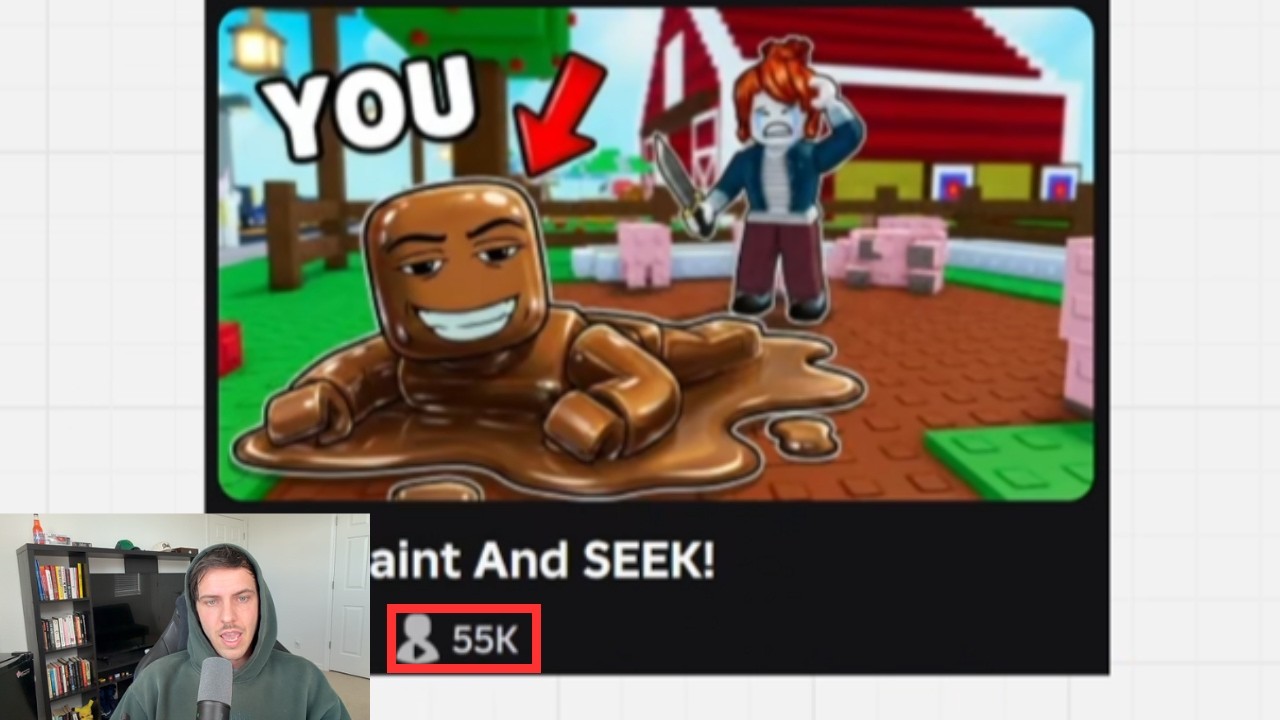
communicating the fantasy. What's the fantasy? It's a power fantasy of blowing other people up. Okay, let's take a look at Paint and Seek. We have two characters in this scene. Scene communicates the fantasy, which is look at I kind of outplayed you, right?
Speaker A
That's the fantasy of like sneaking around, outplaying the person, being smarter than the person. You can see this clear, readable face. The acorn hair in the background's crying. She's upset. Emotions clearly visible. Now, if this seems straightforward to you,
Speaker A
again, sometimes we need to be reminded more than we need to be taught. I'm going to show you a little bit more advanced techniques how to get even better thumbnails towards the end. So, here we have a recent game, Car Flipper.
Speaker A
Scene communicates the fantasy, right? Immediately I know what this game is about. Car Flipper, right? Buy and sell cars.
Speaker A
Simple, readable. I know what to expect. When I click that thumbnail, I know what the gameplay is going to be about.
Speaker A
Coral loop tease, right? Teasing what the gameplay is about. Buy, sell. Very readable, very understandable. Last one here. We have Clean the Library. This game fascinates me, dude. I actually have no idea why this game is blowing
Speaker A
up. If you do, leave a comment below. This one is very fascinating to me. I played this game yesterday. I have no idea why it's blowing up. We have the proven red guy from Rivals, right? You guys have seen this red guy. Rivals uses
Speaker A
him. Instantly understandable. Simple. So, this is one character and he's doing an action, right? Very easy to understand. Now, what I want to show you guys is a tool that my friend Michael made that's actually free right now. And this is hugely, hugely
Speaker A
important because when you're making your thumbnails, the most common mistake I see is devs make a thumbnail that looks good on desktop but is very hard to see on mobile. They'll make text that is basically impossible to read on
Speaker A
mobile. So, what you can do with qptr.io is you can sort by device. You can even see console, which is sick. Shout out to Michael for making this. This is free, by the way. And what you can do here is
Speaker A
you can type in your game name right here. So I have Hack and Business. And I can see what my thumbnail is actually going to look like in the Roblox homepage on a simulated mobile device. So this is what
Speaker A
you want to do. You want to upload your thumbnail and just see how it's going to look on mobile, on desktop, and on console. You can even go by search.
Speaker A
What's it going to look like on charts? You can even do icon. So highly recommend. This is not a paid sponsorship. This is a free tool. I just think it's dope and I wanted to shout it out 'cause I personally use it all the
Speaker A
time. Now, let's get into the types of thumbnails that you can try. These are the most common ones. These are the ones that I try. When I try thumbnails, I always want to try entirely new concept.
Speaker A
Okay, what's a concept? I'm going to go over this right now. So, a concept could be like before and after, right? You guys have seen this everywhere. Noob and pro, right? This implies this is a tycoon. We have noob. We have pro right
Speaker A
here. Before and after. Very simple. You guys have probably seen those thumbnails everywhere. First person. This doesn't only work for PvP games. First person can also work really well for any be a blank game where the player is becoming
Speaker A
or assuming the role of someone or something in the core fantasy. So like be a nurse, be a firefighter, be an engineer. Those could be interesting to test with first-person thumbnails.
Speaker A
Here we have for One Tap, we have a two-character scene. Okay, again, easily readable face, very simple background, clear color contrast. You can see how this yellow just pops from the background. And then another concept you could try is one character plus very
Speaker A
clear action. We can see Robert here. They have the guy stealing. He's got the money bag right here. You can see the gem in the background. So, one character plus action. I would try all of these.
Speaker A
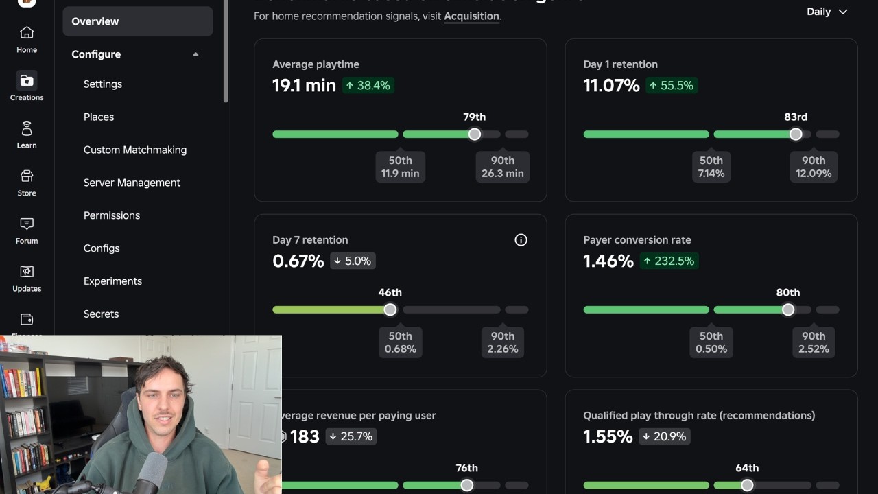
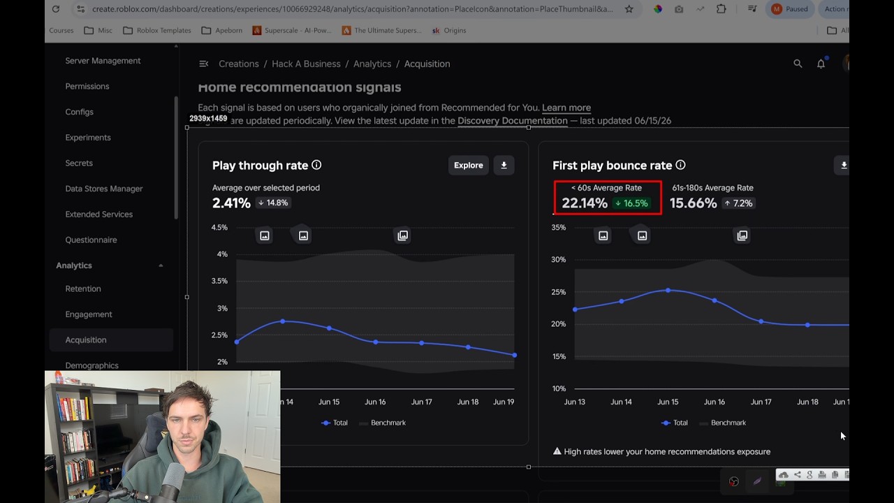
If I were you guys, think about how you can apply these to your game. So, for Hacker Business, for example, it's important to keep in mind that your playthrough rate or your QPTR because it still does say QPTR here is going to go
Speaker A
down as you get more impressions. So, like Hacker Business, for example, we st
Speaker A
impressions, your QBTR will always go down. Almost always. So, you want to keep your creative fresh. Usually, if I start to see it go down, I'm going to test a new thumbnail. I usually test, I would say, at least two or three
Speaker A
thumbnails a week. All right. I think a lot of devs don't test thumbnails enough. Now, as promised, the most important thing while this data is loading is you want the thumbnail to communicate what the player can expect to feel when playing.
Speaker A
what the character can expect to feel when playing. So, if we look at this thumbnail, what can the charact what can the player expect to feel? Well, they can expect to feel a sense of power.
Speaker A
This is a power progression game, right? I start off as a noob and then towards the end as a veteran player, I have a big scary base with lava surrounding it.
Speaker A
So, I can expect to feel a sense of power. That's the fantasy. Okay. Power/tycoon. What can the player expect to feel by looking at this thumbnail?
Speaker A
Well, they can expect to feel high intense action, PvP, dominating the other player with better aim, better skill. Okay, this game intensity, right? Anticipation. There's a countdown timer. Am I going to be able to get this thing in time? Right here,
Speaker A
this is also more of a fantasy of being able to dominate or outplay someone in a PvP environment. You can see this guy has kind of like a little bit of a troll face and this unsuspecting noob right
Speaker A
here is getting sniped. So very very important is that the thumbnail communicates what the player can expect to feel when playing. Now few other bonus tips is simple background.
Speaker A
Okay, one or two characters, sometimes three, but usually no more. It depends on what the thumbnail is. Okay, this is not always true. It really depends on what the game is. Like sometimes you'll see like if it's a zombie swarm game for
Speaker A
example, like let's see, survive zombie arena. If you look at this game, actually no, there is three characters in this thumbnail.
Speaker A
But you see how these bright colors, instantly readable emotion, action is portrayed. You can see what the player will expect to feel after clicking this and playing the game. Shooting zombies, headshot, boom, cool laser gun, right?
Speaker A
Simple background, one or two characters, high color contrast. Okay. Facial expressions easily readable. If your boy can spell facial, okay, this one's really important as well. If you do have a facial expression, you want it to be easily
Speaker A
readable. All right, now let's see if this is loaded. Okay, let me show you guys something. So, for example, this is by far our best thumbnail. 60 million impressions. Okay, how did I come up with this concept? Well, for me, it's
Speaker A
kind of hard to create a specific mental model for this because it's it's more of a creative process. But like usually what I'll do is I'll look at, okay, so my game's about hacking. So, I'll go and create an exchange. I'll filter by all
Speaker A
games and I want to go visits and I'll just type in like the keyword for the verb, right? So, hack. But you don't want to look at this because these are the icons. So, you want to look at,
Speaker A
okay, which game has the most visits? Grow a hacker business, right? 62 million visits. So, then what I'll do is go here, grow a hacker business, and I'm just looking for common themes. Okay, we can see the anonymous mask. We have some
Speaker A
like green hacker stuff. There's our game again. Anonymous mask, some green hacker stuff. So, I'm taking note of how this fantasy is portrayed and what's in the background. What objects are they using? And our game is about hacking a
Speaker A
business. So, like for me, I really thought about what's the actual fantasy that's being explained in the title, hacking a business. Okay. What's the most easily recognizable business in the world? It's the McDonald's business, right? The golden arches. So, that's why
Speaker A
I chose McDonald's. You can see this guy's tweaking out. Easy to see emotion. This guy looks like he's outsmarting him, right? He's hacking that business.
Speaker A
I think this is actually a little bit busy. So, I'm actually testing another thumbnail where it's easier to read the emotion and the text is larger. This might flop. Who knows? It really just comes down to testing. Am I an expert in
Speaker A
thumbnail design? Absolutely not. Are there devs that are way better at thumbnail design than me? 100%. But the thing I want to make clear and as promised is we're going to go over how to actually make these with AI. So I'll
Speaker A
give you guys an example of how I ended up with this thumbnail for hack business that I just launched literally today and how I came up with the concept. So again I started with just the concept of before and after. So I was like okay I
Speaker A
want to start with the before and after. Okay. So, I went into Canva, and if you guys don't know what Canva is, basically just like an online image edit platform.
Speaker A
So, I go in here, okay? And I just have screenshots of my assets, and I'm just getting a loose idea of like this is what I want this to look like. All right. Then I'll use an AI generating
Speaker A
tool. There's tons of them that you can use. And I gave it this concept. And this was the first version. Obviously, that looks like ass, right? So I told it, hey, let's change the colors like clear blue sky, green grass. We have the
Speaker A
color contrast. You can see the files. The purple really pops on top of the green. Then we have level one, level 99.
Speaker A
Okay, because I got that concept from where was it? This game level one and level 999. Okay, that's where I got that text concept from. And then I thought to myself, okay, I looked at this thumbnail on mobile using qptr.io
Speaker A
and I'll show you guys what it looked like. N man, I don't want icon. Hold up.
Speaker A
Hold up, twin. So, this is what it first looked like. And I was looking at this and I was like, dude, you can't even see the logo of the businesses. Like, you can't even see the McDonald's arch. So, I had it
Speaker A
zoom in. I said, make that logo huge, easily readable, and now it's much easier to see on mobile. the Apple logo still might be a little bit smaller.
Speaker A
Okay so that is how I designed this specific thumbnail to give you guys an example.
Speaker A
And what I'll do is I use row thumbs usually for thumbnail design, but there's tons of free tools you can use. You don't have to use row thumbs. So, I literally gave it this Canva image, and I was very
Speaker A
specific. I want to make a split thumbnail like this. This is just a shitty baka. Basically the scene on the left I want McDonald's to be on top of the hill. In the background McDonald's logo clearly visible. Then in the
Speaker A
foreground are the servers and antennas. The purple files are flowing from the McDonald's into the servers. Same for the scene on the right. It gave me this.
Speaker A
Okay. So I downloaded this. I started a new chat. I said make this look like an actual Roblox thumbnail. On the left it should say level one. On the right it should say level 999. It gave me this. I still
Speaker A
thought that was ass. So I said let me start a new chat. Let me just give it the file icon. No reference image and I said I want to make a split screen thumbnail. In both scenes there will be
Speaker A
business on a hill in the background. Make it big though. The scene on the left will be McDonald's on the hill. On the hill there are purple file C reference image flowing from the McDonald's down to the bottom of the
Speaker A
hill where there are only a few servers and antennas placed. The scene on the right is exactly the same as the scene on the left except is the Apple store.
Speaker A
The computer business, not the fruit. Okay. Had to specify because I don't want him to give me a freaking fruit apple. Right. And then there are a ton more advanced service antennas at the bottom of the hill. Okay, so it gave me
Speaker A
this. Again, this was too busy for me. I didn't like all the brown going on here.
Speaker A
It's just too visually noisy for mobile. So, I asked it to make the height of the hill shorter in both scenes. Make the buildings larger. The text level one, level 999 should be should not be covering the buildings. Okay? Because I
Speaker A
wanted clear color contrast. I wanted them to be able to easily read this text on a clear blue sky. And it gave me this. And then I said, "Yo, dude, like still stop making the text cover the freaking business." And it just would
Speaker A
not. So I said, "Okay, bet. Let me take this right here and start a new chat." Actually, no. It looks like I just completely started the same prompt from up here. I took this same prompt and I think I edited it a little bit. So you
Speaker A
guys can go back in this video and rewatch, but I'm not going to yap and and read this all. But basically the main change I said is make the businesses really big with logos very big. Okay. And then it gave me this. And
Speaker A
then I was still not happy because the clouds in the background. Let me show you guys what that looks like with qptr.io.
Speaker A
The clouds in the background. See how it becomes a little bit more visually noisy. So I was like, "Hey, just remove the clouds. Clear color contrast." Okay.
Speaker A
So boom. Kept working. I wanted to add the bacon as a character. I'm sure you guys already know that having a bacon or a noob usually performs best. acorn hair as well. And I just kept iterating and I
Speaker A
tried removing the bacon just to see what it would look like. Try readding him. Now he's facing the wrong direction. Now he's facing the wrong direction. So I said, "Okay, let's do one more chat and just give him this
Speaker A
reference image and have him remove the clouds." So you can see how much time I spend just making one thumbnail. And I have tons of thumbnails in my downloads that I haven't even tested because I usually spend sometimes
Speaker A
10 to 15 minutes on just one thumbnail. And that's how it works. Start with a concept iterate iterate iterate start a new chat if it's still getting it wrong. And of course, always look at what it's going to look like on all
Speaker A
devices using qptr.io. Not sponsored, just a dope tool. So hopefully you guys got value from this and just re-watch this video if you need to. But these are some concepts you can try. Do some research using creator exchange.io and
Speaker A
then use qptr.io to see what your thumbnails are going to look like on mobile. All right. Peace and
Topics:Roblox thumbnailsthumbnail designgame marketingAI thumbnailsRoblox game promotionthumbnail tipsthumbnail conceptsgame thumbnailsthumbnail readabilitythumbnail testing