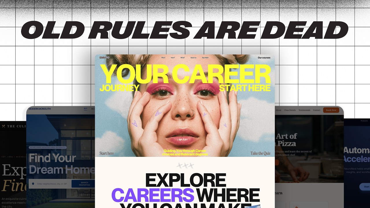
Learn 6 easy design tips to dramatically improve any website's look and conversion without needing advanced design skills.
Key Takeaways
- Typography is a powerful and easy way to improve website design by using thoughtful font combinations.
- Start font selection with headlines to establish the site’s personality and brand identity.
- A single standout design element ('star of the show') can anchor user attention and enhance emotional engagement.
- Design elements should be meaningful and connected to the website’s core message or story.
- Free resources like Google Fonts and Unsplash make professional design accessible without high costs.
What the video covers
- The video presents six simple web design techniques to create visually appealing and high-converting websites.
- Starts with improving typography by exploring three levels: single fonts, superfamilies, and font combinations.
- Emphasizes choosing an anchor font starting with headlines to set the website’s personality and brand tone.
- Demonstrates pairing fonts using resources like Fonts in Use to find complementary font combinations.
- Shows practical application by selecting Instrument Serif as a headline font and Geist Sans for subheadings to create contrast.
- Highlights the importance of having a 'star of the show' element that captures attention and emotionally connects with visitors.
- Advises against choosing decorative elements just because they look cool; instead, they should relate to the website’s story or purpose.
- Uses the example of a SaaS product site where the star element visually references charts and dashboards to reinforce the product’s value.
- Demonstrates sourcing abstract, relevant images from Unsplash to enhance the design without overpowering text content.
- Overall, the tips focus on making websites memorable and engaging while keeping design accessible to beginners.
Full Transcript — Download SRT & Markdown
Speaker A
There are six very simple design techniques that you can use to make websites that not only convert, but cause someone to stop and go.
Speaker A
Hey, that's actually awesome.
Speaker A
The best part is that you can do them right away on any website that you're building without needing a ton of experience or a full degree in web design.
Speaker A
So let's start with the fastest win, fixing typography.
Speaker A
You'll often hear people say, only use one font on a website.
Speaker A
Honestly, I've said that too.
Speaker A
It's not that it's bad advice, but that's just level one of typography for websites.
Speaker A
There are two whole other levels.
Speaker A
Level two is using something called superfamilies.
Speaker A
These are just massive fonts where you'll have one specific family that's got Sans Serif, Serif, and even mono sometimes, and they're all built to gel seamlessly together.
Speaker A
Now, level one and level two are great options, you're going to see a lot of awesome websites using these very techniques.
Speaker A
But level three gives it that extra little push.
Speaker A
And it's all about using different font families from different foundries that mesh together like they were meant for each other.
Speaker A
We're talking about font combos.
Speaker A
And what actually makes combining fonts a lot easier is starting with something called your anchor font.
Speaker A
Now, most people will tell you that you want to anchor all of your font choices around your body font.
Speaker A
I actually do the opposite, I start with the headline first.
Speaker A
And then find everything else to support that guy.
Speaker A
So why do I start with the headlines first?
Speaker A
Well, on a website, the headline is the main text that you see.
Speaker A
And I feel like your anchor should kind of set the whole personality for the page.
Speaker A
Is it more modern, is it more technical?
Speaker A
Maybe it's warm and approachable.
Speaker A
But no matter what, the anchor should always match the brand of the business.
Speaker A
Once you've got that dialed in, it's it's time to find fonts that just automatically support that anchor.
Speaker A
So every font that you add after that should feel like it at least came from the same world.
Speaker A
But hopefully it also adds some contrast to keep things kind of visually interesting.
Speaker A
But here's where you want to be careful, don't pick fonts that are just way too similar.
Speaker A
They're they're so close, but at the same time very different.
Speaker A
So this feels unintentional.
Speaker A
What you're really going after is something that has enough contrast that it can create some visual interest without making things confusing for the user.
Speaker A
A great resource that makes this way easier is a website called Fonts in Use.
Speaker A
You can go there and search for any of your anchor fonts and see what other designers have used to pair with that specific font.
Speaker A
So let's do this ourselves right now.
Speaker A
Let's take this website, which is not bad, but it's not super interesting.
Speaker A
And just kind of spice it up.
Speaker A
So for our anchor font, I'm going to go with one called Instrument Serif.
Speaker A
Now, this is a free Google font.
Speaker A
But it's also pretty cool and because it's super condensed, we can actually make it a lot bigger.
Speaker A
Which is something that I love about headlines.
Speaker A
They really command attention when they've got more size.
Speaker A
So let's take our anchor, let's take Instrument Serif, go over to Fonts in Use.
Speaker A
And just type that in and see what we get.
Speaker A
And already, we've got a handful of of really great options.
Speaker A
Over here, these are all completely free, Mona Sans, Anton, great solid fonts that we're not going to have to pay for.
Speaker A
Some of these you would have to pay for, but I want to stick with one that we're not going to have to spend a ton of money on.
Speaker A
So that it can be accessible to everyone.
Speaker A
So I'm really liking this Geist Sans and look how different it is in comparison to the width of each character.
Speaker A
Instrument Sans is much more condensed and Geist is much more spread out.
Speaker A
So this is going to provide that contrast that we're looking for.
Speaker A
So let's take this Geist font, go over to our Figma file and just change our subheading to kind of see how it works.
Speaker A
Sometimes you just got to test out a lot of different variations.
Speaker A
But this is looking pretty good, there's there's a lot of good contrast between our header and our subheading.
Speaker A
But it doesn't feel like they're coming from totally opposite ends of the spectrum.
Speaker A
So I think we're going to dial this in with Geist.
Speaker A
And just with that little change, this is already starting to be a lot more visually appealing.
Speaker A
It still doesn't have anything that quite makes you stop scrolling.
Speaker A
That's the next tip.
Speaker A
You've probably heard a lot of people say that boring or plain sites are way better for business.
Speaker A
And you always want to keep it simple and as a web designer, you're not trying to impress other designers or win awards.
Speaker A
And that's not bad advice.
Speaker A
But a website isn't just a checkout machine.
Speaker A
It's often the first and only meeting that people are going to have with you or your client's brand.
Speaker A
And if it doesn't make somebody feel something, you're not going to be remembered.
Speaker A
And when you start looking at websites for inspiration, you're going to find that every website that really captures your attention.
Speaker A
There's something that you notice almost right away.
Speaker A
Maybe it's a certain type of font.
Speaker A
Maybe it's an image or an object.
Speaker A
This is what I like to call the star of the show.
Speaker A
It's it's one thing that makes people feel something.
Speaker A
And it kind of anchors their attention long enough for them to actually take the action that we want them to.
Speaker A
Like look at this website here, the first thing that you notice are these gradient elements with some text on top of them.
Speaker A
And really cool gradients, they've been done really well.
Speaker A
The movement is neat and then you can go back and forth and interact with it.
Speaker A
This is something that is definitely the star of the show, it commands your attention and makes me actually care about what the rest of the page is saying.
Speaker A
But here's where a lot of designers get lost.
Speaker A
Picking a star just because it looks cool is where this goes way south.
Speaker A
I am a big fan of Brandon Sanderson.
Speaker A
Any Sander fans out there?
Speaker A
Nerds unite.
Speaker A
If you don't know who he is, he's a pretty prolific fantasy author.
Speaker A
And I I remember him talking about how a lot of the books that he writes start with what he calls a seed.
Speaker A
Tress of the Emerald Sea is a perfect example of this.
Speaker A
His what if on this was, what if the Princess Bride got flipped and the princess went out to save the prince?
Speaker A
So from that one question, he built this entire world.
Speaker A
Your star works the same way, it's your seed.
Speaker A
You pick one thing that's connected to the overall story of the website.
Speaker A
And you let everything grow around that.
Speaker A
So for this site that we've been working on, this is a SAS product.
Speaker A
And reading a little bit about it, this handles operations for service-based businesses.
Speaker A
The whole point of a product like this is is taking a mess of complex data and making it feel really simple.
Speaker A
Through things like dashboards and and charts.
Speaker A
So what if the star actually called back to that, like what if it visually referenced the the charts and the dashboards?
Speaker A
That the users are going to associate with it.
Speaker A
Now we're not just trying to put up a chart on here.
Speaker A
We want it to feel a little bit more abstract.
Speaker A
So so let's go to Unsplash and see if we can find something that fits.
Speaker A
I'm just going to type in orange gradient to kind of fit with our button.
Speaker A
And then vertical lines to match the chart idea that we're looking for.
Speaker A
So right off the bat, this image right here is pretty cool, it's it looks like a graph.
Speaker A
Kind of abstractly, but it's also really visually stunning.
Speaker A
So let's take our image, drop it onto our website.
Speaker A
And we'll just kind of center it up and bring it underneath all of our elements.
Speaker A
And because we don't want all this color to compete with our text, let's go ahead and flip this horizontally.
Speaker A
And then we'll just add a little shape underneath it and mask it out to where it's it's still subtle.
Speaker A
But making an impact.
Speaker A
Let's adjust this just a little bit.
Speaker A
And then I think we should be good to go.
Speaker A
And already.
Speaker A
Look at where we've come from.
Speaker A
We've just done two things.
Speaker A
And this is looking much better.
Speaker A
But there's another technique that we can use to kind of tie everything together.
Speaker A
Adding little design choices or even little design elements that kind of consistently show up in different ways across your website makes the whole thing feel much more cohesive.
Speaker A
And it can actually strengthen the user experience as well.
Speaker A
This is where something called visual rhyming comes in.
Speaker A
Visual rhyming is where you repeat little details across the site so that everything feels like it's kind of from the same universe.
Speaker A
Like look at this website here.
Speaker A
They took these curved shapes from their logo, put them in these overlays on their buttons and even in this arrow next to this link.
Speaker A
This is a lot of cool visual rhyming.
Speaker A
But it doesn't just have to be shapes, it could be colors like a a bunch of different gradients.
Speaker A
That kind of all show up in different ways, maybe even different textures.
Speaker A
It doesn't necessarily mean that you're just repeating visual elements, it's more like you're taking components of a really strong visual element.
Speaker A
Like the star of the show and using them throughout the whole site on other different elements.
Speaker A
Check out this website right here.
Speaker A
They clearly have made the star of the show this key element right here.
Speaker A
Which is really cool because it's all about unlocking your rental business.
Speaker A
But as you scroll down, you kind of see different elements from that key show up in different ways.
Speaker A
Like look at all of these text cards that are showing up around this.
Speaker A
Even the background of this element.
Speaker A
This they have done just such a great job on this visual rhyming.
Speaker A
This is the kind of website that makes you simultaneously inspired and want to quit all at the same time.
Speaker A
So it's really good.
Speaker A
Good job to whoever did this.
Speaker A
On our site, I think we can do something with these triangles in the logo.
Speaker A
First, let's take these plus icons and trade them out with a good old drop down icon.
Speaker A
Which is already feeling a lot more cohesive.
Speaker A
Then let's add them almost like an arrow in our main call to action.
Speaker A
And then something that I think is going to make an even bigger impact is changing out these rectangles with our triangles.
Speaker A
Using the triangles to mask over our image and then the triangle for the call out box.
Speaker A
And because we've got this chart motif, I don't think we need the chart in this little card right here anymore.
Speaker A
Cool.
Speaker A
We've got a whole lot of rhyming going on now.
Speaker A
But even with all of that, a lot of websites are standing out because you kind of feel like you're walking into them.
Speaker A
Rather than just scrolling up and down.
Speaker A
So in order for users not to check out on our website because everything just kind of seems business as usual.
Speaker A
You need to make the site feel a bit more tangible.
Speaker A
Like like it kind of exists in the real world.
Speaker A
And a really simple way to do that is using what I like to call depth.
Speaker A
Depth is something that kind of bridges the gap between the tangible and the online.
Speaker A
So think things like textures on the main background or maybe 3D elements that feel like you can almost touch them on the site.
Speaker A
Instead of just scrolling through it.
Speaker A
But here's the key in all of this.
Speaker A
All of these textures, all of this depth needs to be subtle.
Speaker A
We don't want to compete with the star of the show.
Speaker A
So think of it like real world details that are just kind of there, you notice them.
Speaker A
But they are not asking for your attention.
Speaker A
So let's go ahead and do that with the example that we've been working on.
Speaker A
First, let's add some texture to the star of the show.
Speaker A
We'll just add a little bit of noise to it.
Speaker A
There's this really cool plugin called Noise and Texture that allows you to do that straight within Figma.
Speaker A
Rather than having to open up Photoshop.
Speaker A
There's just a few settings you got to select and then bam, you're good to go.
Speaker A
Then I think there's an opportunity to kind of rhyme with the glass feel of the star of the show.
Speaker A
And then add a little bit more depth to it by taking these cards and some of the elements on our navigation.
Speaker A
And just adding some glass effect.
Speaker A
And now it's definitely starting to feel like just more than code and pixels on a floating page.
Speaker A
Our next tip is actually even more subtle, if you can believe it, but it can make a pretty big difference.
Speaker A
Early on in my web design journey, I got really into reading other businesses design systems.
Speaker A
Kind of nerdy, I know, but helpful.
Speaker A
And when I was reading Google's material design, I noticed something.
Speaker A
They don't just use 100% opacity on all of their text.
Speaker A
They've literally spell out 87% opacity for text that's high emphasis or the important stuff.
Speaker A
And then 60% for the medium emphasis.
Speaker A
There's a little bit of debate about why they do this, but regardless of where you land.
Speaker A
Using opacity is a massive win for hierarchy.
Speaker A
Your eye immediately knows what to read first, what you can skim through and then maybe what to ignore unless you really need it.
Speaker A
And you can steal that exact idea on your own website.
Speaker A
Now, let's keep this headline at 100% opacity.
Speaker A
This is actually what we want people to pay attention to the most when they first visit our website.
Speaker A
But we can take this subheading and drop that puppy all the way down to 70%.
Speaker A
And here's a little bit of the before and after.
Speaker A
The one on top, 100% opacity on all the text.
Speaker A
The one on the bottom has a few levels.
Speaker A
Like I mentioned before, it's pretty subtle, but man, it really makes this page feel intentional.
Speaker A
This final tip is one that most web designers aren't going to do, but it's going to make a huge difference in the outcome of the websites that you're working on.
Speaker A
I got this idea from a concept that I learned when I was doing music for a living.
Speaker A
And I was producing people's albums and I learned that the best producers will hear an artist's song.
Speaker A
And then have them speed it up a lot and then slow it way down a lot.
Speaker A
Maybe sing the octave up or sing the octave down.
Speaker A
Maybe change the keys.
Speaker A
Doing that forces the musicians out of their original thought so that they can finally find something that is the absolute best version of the song.
Speaker A
But you can't do that if you're just taking the first version and then trying to adjust it until it's better and better.
Speaker A
You got to just do something completely different.
Speaker A
The same is true with web design.
Speaker A
Take your first thought and then try something totally different.
Speaker A
Maybe make a light mode.
Speaker A
Maybe change the layout.
Speaker A
Try a different star of the show.
Speaker A
This one example that I showed you throughout the video had 12 different versions of the same star.
Speaker A
The first version would have probably been fine.
Speaker A
But if I hadn't kept going, it wouldn't have been nearly as good.
Speaker A
So play around, have fun with your ideas until that angel gets carved out of the rock.
Speaker A
Like Michelangelo used to say.
Speaker A
These tips can instantly level up almost any website that you're working on.
Speaker A
But there are still just that.
Speaker A
Tips, if you want to become the kind of designer who can walk into absolutely any project and know exactly what to do.
Speaker A
You have to move past tips and build the underlying skills.
Speaker A
That's why I made this video.
Speaker A
The only five web design skills that actually matter.
Speaker A
Check that out next and go design something great.
Speaker A
Don't forget, if you don't quit, you win.
Topics:web designtypographyfont pairingwebsite design tipsSaaS website designFonts in Usedesign contrastuser engagementvisual hierarchyfree design resources