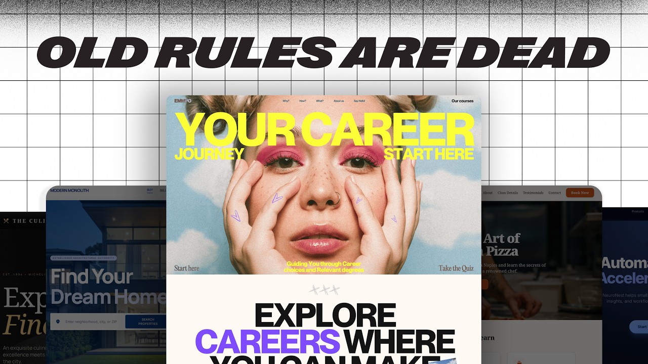
Learn a simple 5-step framework to build effective websites using Showit, moodboards, and design systems from a self-made web designer.
Ask about this video. Answers come from its transcript only — with the timestamp, so you can check them.
Generated from the transcript and can be wrong — check the timestamp.
Key Takeaways
- Start website building by defining the primary goal to guide all design and platform decisions.
- Showit offers a user-friendly drag-and-drop interface with WordPress integration, ideal for flexible, scalable websites.
- Creating a moodboard before design saves time and aligns visual elements with the website’s purpose.
- Using a design system ensures consistency in fonts, colors, and UI elements across the site.
- The hero section is crucial for first impressions and must clearly communicate value and next steps.
What the video covers
- The video addresses common beginner struggles when starting website design, emphasizing the importance of defining the website's goal first.
- The creator shares a 5-step framework used for over a decade to build client websites, demonstrated by redesigning their own site.
- Choosing the right platform depends on the website's goal; the video compares Webflow, Framer, and Showit, highlighting Showit's drag-and-drop ease and WordPress integration.
- Before designing, the video stresses the importance of creating a moodboard to define typography, colors, layouts, and pages.
- Relume, an AI-powered tool, is recommended for generating moodboards, sitemaps, wireframes, and brand styles quickly.
- The video explains setting up a design system in Showit, including fonts, colors, and button styles to maintain consistency.
- The homepage design process involves creating sections like navigation, footer, and the hero section, which is critical for user engagement.
- The hero section should include a motivating header, clarifying sub-header, a clear call to action, and an appealing visual element.
- The video encourages gradual complexity in design rather than jumping straight into detailed homepage design.
- Overall, the approach balances ease of use with professional quality, making it accessible for self-taught designers.
Full Transcript — Download SRT & Markdown
Speaker A
So you sit down to build a website.
Speaker A
And five minutes later, you're stuck.
Speaker A
Should you start with a template, what about SEO, and then we haven't even gotten to the design of it.
Speaker A
You might even have a really clear idea of what the website should look like, but actually making that happen is where things start to get shaky.
Speaker A
So in this video, I'm going to give you a simple five-step framework that I've used for over a decade to build client sites.
Speaker A
And I'm going to show you how to do it by redesigning my own site because it's way overdue.
Speaker A
Are you ready?
Speaker A
Let's go.
Speaker A
The first question that most people ask when they build a website is how?
Speaker A
How should I build it, should I use a website builder or maybe code it from scratch, what about a template, should I use one of those?
Speaker A
You might even have searched for best website builder for fill in the blank.
Speaker A
But here's the truth, that's actually the wrong question.
Speaker A
The real question is, what's the goal of my website?
Speaker A
Because the goal determines everything.
Speaker A
What you should build, how you should build it, and what the website actually needs.
Speaker A
When I work with clients, I actually start with a questionnaire.
Speaker A
To get super clear on their site's primary goals.
Speaker A
You can actually grab this exact questionnaire for free.
Speaker A
The link's in the description.
Speaker A
So, for this website, I actually filled out the questionnaire for myself since it's my website.
Speaker A
And here's what I realized, the main goal of the self-made web designer website is really simple.
Speaker A
I want people to sign up.
Speaker A
Either for a free resource, maybe a newsletter.
Speaker A
But it all starts with an email address.
Speaker A
So that's the goal that I'm building around.
Speaker A
Thankfully, for this kind of site, I don't need to code anything from scratch.
Speaker A
I'm perfectly fine to use a website builder.
Speaker A
And because I'm trying to impress other web designers, I can't build from a template.
Speaker A
I have to build it from scratch.
Speaker A
So, the game plan right now is building something from scratch with a website builder.
Speaker A
Now, I know that there are a ton of options out there for website builders.
Speaker A
So let's break down a few of the most popular.
Speaker A
First, Webflow.
Speaker A
Webflow is really powerful and it's packed with a lot of features.
Speaker A
You can create some seriously cool stuff with it.
Speaker A
But it comes with a really steep learning curve.
Speaker A
And if you want to do anything outside of its native features, you're probably going to need to code a little bit.
Speaker A
Framer is a little bit easier to learn and it comes with beautiful sites right out of the box.
Speaker A
But it's missing some flexibility, like if you wanted to sell digital products or build a custom checkout page, I'd have to embed something like Shopify or Gumroad.
Speaker A
And that means giving up a lot of control over the design.
Speaker A
But there's a third option, a platform that you might not have heard of.
Speaker A
That actually gives me the best of both worlds.
Speaker A
And it's called Showit.
Speaker A
It works kind of like Canva.
Speaker A
Easy to use, fully drag and drop.
Speaker A
But here's the kicker, it integrates with WordPress.
Speaker A
Which means if there's a plugin for it, you can do it on Showit.
Speaker A
And that also means that as my business grows or expands or changes, I don't have to do a lot of development or potentially hire someone to help me.
Speaker A
So this is the perfect solution for the goal of my website.
Speaker A
Now that the platform's picked, it's time to hop into Showit and start designing, right?
Speaker A
Not so fast.
Speaker A
When I first started building websites, I made this mistake all the time.
Speaker A
I jumped straight into designing the homepage, only to hear from clients that it looked nothing like what they had in mind.
Speaker A
The same is true if you're building your own website.
Speaker A
That's why now, I start slow, I start simple, and I build up complexity gradually.
Speaker A
So the thing that I start with after I've picked my platform is called a moodboard.
Speaker A
Your moodboard is going to help you determine things like maybe your typography or the font styles that you're going to use.
Speaker A
The colors that your website will have.
Speaker A
Maybe the layouts of different section or different layout ideas and even the pages that the site will have.
Speaker A
But here's the thing, once you have all these things down, you basically have everything you need to build a killer website.
Speaker A
There are all kinds of different ways to approach building a moodboard.
Speaker A
Some designers build a really detailed Figma file and others just kind of pin stuff to a private Pinterest board.
Speaker A
Both work.
Speaker A
But I've found that building a moodboard from scratch might take a while.
Speaker A
And a Pinterest board might not be detailed enough.
Speaker A
So there's a lot of gaps that are going to be missing.
Speaker A
But something that makes all of this incredibly easy is a tool called Relume.
Speaker A
It actually uses AI to do everything that we just talked about automatically.
Speaker A
So, it's going to give you all the pages that you need, it's going to help you find fonts and colors.
Speaker A
And help you with layout ideas.
Speaker A
You actually just give it a few details about your business or project and it instantly generates a full sitemap with page-level wireframing suggestions.
Speaker A
And then even brand styles like font combos and and color palettes.
Speaker A
And the best part is you can actually tweak everything until it fits exactly what you have a vision for.
Speaker A
It's like having a creative partner that just gives you a massive head start.
Speaker A
There's a free plan available and if you want to try the premium features.
Speaker A
They've got a seven-day free trial.
Speaker A
I'll drop the link in the description if you want to check it out.
Speaker A
So we got our moodboard all set for the new self-made web designer site.
Speaker A
Now it's time to move on to the next step, which is designing the homepage.
Speaker A
So, first things first, let's set up our design system inside Showit.
Speaker A
A design system is just a set of rules for things like your fonts, your colors, and even things like buttons.
Speaker A
And how they're displayed and look.
Speaker A
I've got some of this dialed in from the graphics from the self-made web designer YouTube channel.
Speaker A
And I want the site to feel similar to the channel so people don't feel like they're in the wrong place.
Speaker A
So for the display fonts or the fonts that I'm going to use for like my titles and headers.
Speaker A
I'm using a font called PP Right Grotesque.
Speaker A
That comes from the Pangram Pangram Studio.
Speaker A
Which is a great font resource.
Speaker A
Then for the paragraph fonts, I'm actually using the Aeonik family.
Speaker A
And the colors are really simple.
Speaker A
We're talking about gray, black, white, and this yellow.
Speaker A
And I'll probably use a few different shades of that gray.
Speaker A
So it gives me some options later on.
Speaker A
The good news is that Showit actually lets you define all of your global styles in the design settings.
Speaker A
So we're going to add all of our colors and then come through, add our fonts.
Speaker A
Make them exactly how we want them to be.
Speaker A
My title fonts are going to be about 150 pixels big.
Speaker A
And that's because I really like big fonts.
Speaker A
I feel like there could be a song written called I like big fonts and I cannot lie, but I'm going to spare you from that.
Speaker A
So then I'll come through and add all my paragraph fonts as well as my subheading and my heading fonts.
Speaker A
Now that the design settings are all finished, I'm going to start building out all of the sections that I need for my homepage.
Speaker A
And within Showit, we do that by adding blank canvases.
Speaker A
And then we can come in and change the name of each of these canvases.
Speaker A
So that we can know exactly what it is that we're working with.
Speaker A
Now, every homepage needs a few sections, it needs a navigation and a footer.
Speaker A
But there's also this fun little section that we need to add called the hero.
Speaker A
The hero is arguably the most important section of your website.
Speaker A
This is the first section that people see when your site fully loads.
Speaker A
And you've got about three seconds to convince someone that your website was actually worth the click that they just gave you.
Speaker A
Every hero needs at least three things.
Speaker A
It needs a motivating header, a clarifying sub-header, and then a crystal clear next step that the user should take.
Speaker A
And then for good measure, you should probably throw in something beautiful like a image or some type of design element.
Speaker A
As you start to look at other websites with a critical eye, you'll notice that most of them follow this exact pattern.
Speaker A
So on this site, here's the header, here's the sub-header, and here's that next step.
Speaker A
And then they've got some images thrown in as well.
Speaker A
So let's come back into Showit.
Speaker A
Let's make our navigation just a little bit smaller.
Speaker A
And then we're going to make our hero section a little bit bigger.
Speaker A
That kind of follows the patterns that we saw on the other websites.
Speaker A
And I always like to start with the headline on my hero section.
Speaker A
Because that's the quickest indicator that your visitors are actually in the right space.
Speaker A
So within Showit, we're going to add our title because that's the header of the hero section.
Speaker A
And then we're going to start thinking about what does our specific audience want the most?
Speaker A
And for me, my audience wants to learn web design quickly.
Speaker A
So that's exactly what I'm going to add as my headline here.
Speaker A
How to learn web design fast.
Speaker A
It's clear, it's motivating.
Speaker A
And it's something that people are actually going to search for on Google.
Speaker A
You also want to make sure that you're designing the mobile version of your homepage as you're designing the desktop.
Speaker A
So many folks think about how their site looks on mobile devices as kind of an afterthought.
Speaker A
But it actually needs to be a priority because a lot of your website visitors are going to find you on mobile first.
Speaker A
Thankfully, Showit gives you the option to see the desktop and the mobile version of your site at the same time.
Speaker A
Next, I'm going to move to the sub-heading.
Speaker A
And this is where I get really clear on the value that I'm hoping to offer people who visit my site.
Speaker A
So we want to be thinking about things like the what, the why, and the how.
Speaker A
Of how I'm going to deliver what I offered them in this headline.
Speaker A
How to learn web design fast.
Speaker A
So, I'll probably add something like web design courses, tutorials, and podcasts that'll help you ditch the frustrating job, build a side hustle, grow your income, and be your own boss.
Speaker A
Seems great.
Speaker A
I'll come through and fix some of these typos here.
Speaker A
But we're off to a fantastic start.
Speaker A
After the sub-heading's done, you need a crystal clear next step.
Speaker A
And that's where something called a CTA or call to action comes in.
Speaker A
It's actually just a button that tells your visitors exactly what to do next.
Speaker A
You never want them to wonder, like, okay, what now, right?
Speaker A
You've got to show them that next step.
Speaker A
So, for me, I want people to sign up for my newsletter.
Speaker A
So that's exactly what I'm going to add here.
Speaker A
Instead of learn more, we want it to be really clear.
Speaker A
Sign up for my newsletter.
Speaker A
Super clear, super easy to understand.
Speaker A
Gives them exactly the next thing that they should be doing.
Speaker A
And hey, I know we're talking a lot about copy right now.
Speaker A
And if you're struggling knowing what you should write or maybe your client didn't give you copy.
Speaker A
Relume can actually write out the copy for you.
Speaker A
Just go back to your wireframe, select the section that you're working on.
Speaker A
And then click generate copy.
Speaker A
You can even add a short description that works as a prompt.
Speaker A
This entire time, I'm actually playing around with layouts to see what feels the best and flows more naturally for the user.
Speaker A
So maybe I'll try text on the left with an image on the right or vice versa.
Speaker A
But for my website, I actually just want to keep everything straight up and down the middle.
Speaker A
So let me adjust that here.
Speaker A
Thankfully, Showit makes it really easy for you just to kind of center align everything without having to guess at where the exact center actually is.
Speaker A
So let me do that with this button as well.
Speaker A
Size and position.
Speaker A
And that's already kind of the case over on the mobile version.
Speaker A
And that makes it that much easier.
Speaker A
Because we're already aligned with what we're doing on the desktop.
Speaker A
Let me give it a little bit of space down here.
Speaker A
Pull this down.
Speaker A
Now, I don't just want to have a stock image here in the hero section.
Speaker A
I want to have an image of myself.
Speaker A
Because hopefully, the goal is people from YouTube come to visit my website.
Speaker A
And how are they going to know they're in the right place without there being a picture of me?
Speaker A
So let me double click on this.
Speaker A
We'll change out to this headshot.
Speaker A
And then I'm actually going to round these corners just a little bit to add some soft edges.
Speaker A
Now, one final element that I want to add to the hero section is something that I've seen a lot of on some really cool websites.
Speaker A
Let me show you what I'm talking about.
Speaker A
So you can see here on this site, there's these grids that when you kind of hover over them, they interact with you just a tad bit.
Speaker A
And same for this website as well.
Speaker A
Now, is this necessary?
Speaker A
Probably not.
Speaker A
But it adds a little bit of visual appeal.
Speaker A
Now, let me go back over here to Showit.
Speaker A
And then we're going to open our media library.
Speaker A
And I've already kind of put a grid here.
Speaker A
I'm actually just going to make this really big.
Speaker A
Because I want it to cover a lot of space.
Speaker A
So let's move everything to the center.
Speaker A
And then we'll put our Y coordinates up here.
Speaker A
And then let's go ahead and turn down the opacity on this so it's not quite as sharp.
Speaker A
And then we'll do the same thing over on the mobile version of things.
Speaker A
So about 1538.
Speaker A
That's looking pretty good.
Speaker A
And then we'll bring the Y coordinate up to zero.
Speaker A
So it's at the very top.
Speaker A
So I am really pleased with how this is starting to look.
Speaker A
Now that the hero section feels right, it's time to add the other sections of our homepage.
Speaker A
So we're going to add some more blank canvases.
Speaker A
And maybe this section we talk about the value.
Speaker A
And then maybe we add another one and this section we're going to add a little bit of social proof.
Speaker A
So people that have said nice things about me.
Speaker A
Thank you to those people if that's one of you.
Speaker A
Once you got that first version of the homepage built.
Speaker A
It's time to bring in a fresh pair of eyes.
Speaker A
Because here's the thing.
Speaker A
You probably been staring at this for a while.
Speaker A
You know where everything is, you know what it all means and how it works.
Speaker A
That's actually called the curse of knowledge.
Speaker A
And it makes you miss out on things that are glaringly obvious to everyone else.
Speaker A
So, that's why the revision step is absolutely crucial.
Speaker A
Who do you ask for feedback?
Speaker A
Well, if you're working with a client, they probably want to have a say in how things are shaping up.
Speaker A
But if it's for your personal site, don't just send it to your mom or your closest designer friend.
Speaker A
Instead, look for a few people, ideally ones who don't know all that much about your business.
Speaker A
And give them specific things to look for.
Speaker A
Here are the questions that I always tend to ask.
Speaker A
Does the headline make sense immediately, right?
Speaker A
That's super important.
Speaker A
Is it clear what the site is about?
Speaker A
Do you know what to do next?
Speaker A
Does it look good on mobile?
Speaker A
All of these questions are going to guide you in the right path.
Speaker A
Since I'm a little too close to this project, I actually had a friend go through the self-made homepage.
Speaker A
And give me his honest thoughts.
Speaker A
Once your homepage passes the test.
Speaker A
You're ready to build out the rest of the site.
Speaker A
And this is the final step in this framework.
Speaker A
But I always recommend starting with just the essentials and then adding more later.
Speaker A
So the must-have pages are your about page and your contact page.
Speaker A
Some nice to have pages are things like services or products, maybe resources or portfolio depending on your actual goal.
Speaker A
Maybe a blog as well.
Speaker A
Thankfully, the hard part is already done.
Speaker A
The homepage set the tone, the style, and the structure.
Speaker A
All the remaining pages are just kind of remixing what's already been built.
Speaker A
Here's the key though.
Speaker A
Don't overthink it.
Speaker A
You can always come back and improve pages later on.
Speaker A
I followed these exact steps, the same ones that I just walked you through to go from this to this.
Speaker A
And the best part is, I didn't code it by hand, it didn't take me a ton of hours.
Speaker A
If you want to see how each section and page turned out, head to selfmadewebdesigner.com to see the final product.
Speaker A
And hey, if this video has helped you, make sure to hit that like button, drop a comment, and subscribe because I've got a ton more coming your way.
Speaker A
Go out there, build an amazing website and don't forget, if you don't quit, you win.
Topics:website buildingweb designShowitmoodboarddesign systemwebsite builderself-made web designerRelumehomepage designhero section


![[Beginner] Learn Korean Without Books | Comprehensible … — Transcript](https://i.ytimg.com/vi/03dvxTFiuEw/maxresdefault.jpg)