Speaker A
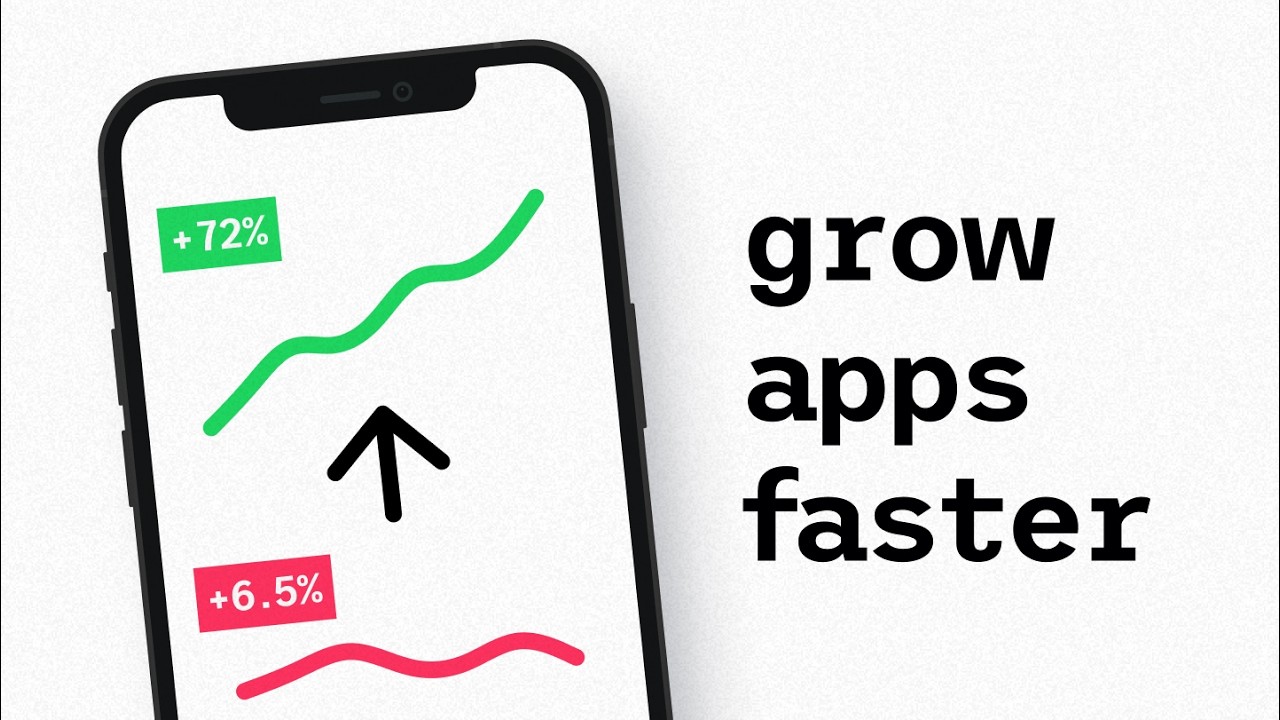
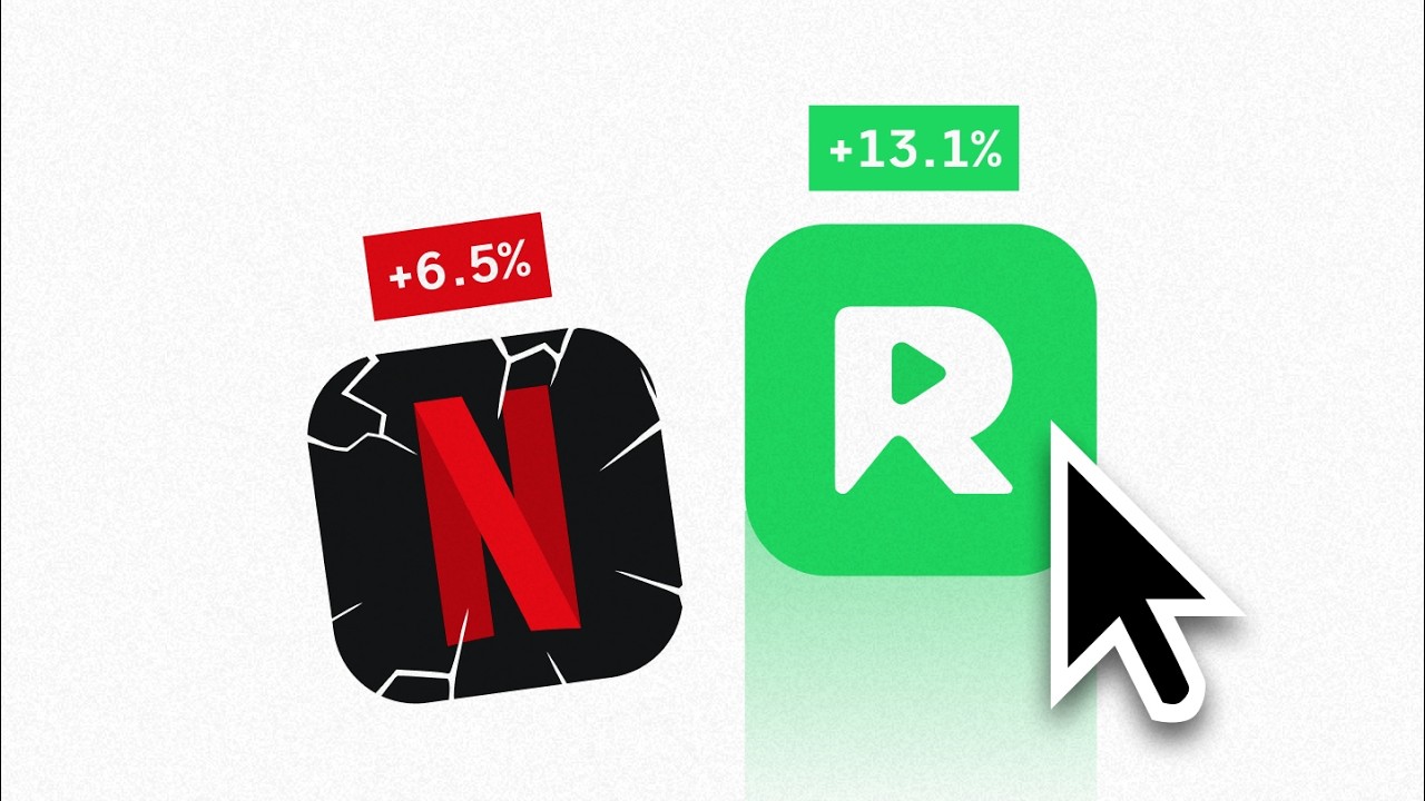
In 2026, AI is generating apps faster than humans can name them. iOS releases jumped 80% year-over-year in Q1, and today we're at almost 90% on iOS. And yet, three-decade-old apps have stood the test of time. One charged money to compete with Apple's free weather app. One got more than 2 million real trees planted by making a virtual tree die while you're checking Instagram. And one of them won an Apple Design Award 12 years ago and still has today a 4.8-star rating from over 100,000 reviews. They all won the same way, by building experiences instead of screens. And in this video, I'm going to show you the three meta patterns these survivors use to stay unfairly competitive. By the way, I'm Tim. I've spent over a decade designing software for startups and tech giants around the world. And my literal job is about obsessing over this stuff. Now, most products have at least one screen where the user reads numbers and has to make sense of it. And most apps stop at just showing the data. One of the survivors in today's video is a data-driven app that made the data secondary. And in a year where AI-powered founders spit out new apps in an afternoon, that difference is the entire moat. Introducing meta pattern one, something I call the human pattern. You see, here's the trap most founders fall into. You try to make your product feel like it has personality. So, you ship a friendly empty state, a confetti animation on first save, a cute mascot on the loading screen. That, my friends, is basically just decoration. And none of it actually changes what the user feels when they open the core surface because the core surface is usually still a chart or a row of numbers or a long list or a table. Same data delivered in the same boring traditional way every other app in the category delivers it. The personality got bolted onto the edges instead of at the core. Now, to try to understand the difference between this and really making something feel human, let's jump back a decade. A solo developer in 2013 decided to build a weather app. The problem was iPhones already came with one, free, pre-installed, and he was going to charge money for his version of it. That developer was Brian Mueller. He ran Carrot Weather as a thriving indie business by himself for over a decade. And here's the part that matters. The data inside of Carrot was practically the same data Apple Weather was using. Same forecasts, same sources, same numbers. The difference was that Carrot didn't ship the numbers. They were still there, but the headline was the funny little character reacting to the actual forecast with custom poses, scenery, and dialogue. On a heatwave, the character might sweat and call the user a meatbag. When it was cold, you could get bundled up in front of a frozen backdrop, threatened to dress warmer or die. The character's comedic reaction to the weather was the forecast. You opened the app, saw the character react, and you knew what the weather felt like before you read a single number. This is part of why Apple gave them the 2021 Design Award for Interaction. And here's the core takeaway that will work for any app that shows data. Sometimes your data is not the product. Sometimes, the very way you deliver the data is the product. The genuine human-like personality that gives the user a great feeling in a second is what competitors can't copy in a weekend. And Carrot showed that it's something that compounds with your brand voice over years, making you even more competitive the more you build upon it. But, with that said, human touch won't necessarily save you when your user is in the middle of doing something hard. Focus apps, fitness trackers, habit apps. The moment the user is mid-action, what's actually useful isn't a witty reaction. It is stakes, which brings us to meta pattern two, something I call the behavior pattern. Forest is a focus app. Imagine you wanted to stop checking your phone for 25 minutes. You open Forest, start a session, a tiny virtual tree begins growing on the screen, and if you left the app to scroll Instagram, the tree died. That was the entire session screen, a tree, a timer, a tag for what you were focusing on. And the tree was really the only thing moving on the screen, just breathing slowly as the minutes ticked by. As with most focus apps, the timer was there, of course, but in this case, it was secondary. Again, imagine you're mid-session, reaching for Instagram, and catch the tree on the screen. The pull stops being I should focus and becomes I don't want to be the one who killed this. That's the psychological difference that turned into crazy amounts of platform coins earned by users, which resulted in over 2 million real-life trees being planted. You see, Forest didn't ask the user to focus harder. It gave them something tangible to lose if they didn't. The dying tree did the discipline work for them. For focus, when you need a behavior to last, maybe don't track it. Maybe instead make the absence of it cost something the user notices. The form is up to you. A stake that's visible, a streak that breaks, a status that drops, a story that pauses, or a relationship that fades. Whatever it is, the bottom line is that not doing the behavior is deeply felt by the user. By the way, if you want to help grow your business with these kinds of psychological mechanisms, at Sipsup we run free design strategy calls every month. The link's down below if you're interested. Now, meta pattern three, the hardest one to nail, but arguably the one that delivers the biggest future moat. To exemplify it, we're going to focus on an app that won an Apple Design Award 12 years ago. This app has a 4.8-star rating from over 116,000 reviews and is still shipping updates monthly. I'm talking about Day One, a journaling app built by Paul Mayne and Bloom Built, a small indie team that took home the 2014 Apple Design Award in the Mac app category right alongside the insanely hyped Monument Valley on iOS. Now, here's the thing about journaling apps. The data layer, the actual text the user types, is fully commoditized. Apple Notes does it, Apple Journal does it, both free, both pre-installed on your device. Day One charged a subscription against two free pre-installed defaults from Apple and thrived. How the F did they do that? They didn't reimagine where journaling lived. They reimagined what surrounded it. Same entry texts as Apple Notes, but around it Day One auto-captured the weather, your location pinned to the map, the photo embedded right into the entry, a day-by-day timeline of your years, a polished search across everything you'd ever written. Every sensory layer treated like it mattered. It's like the difference between a basic IKEA notebook and a Moleskine. Both hold the same text, but the Moleskine has the pocket in the back, the elastic band, the ribbon bookmark, the paper weight that feels considered. Day One did the exact same thing to digital journaling. Same text, totally different sensory experience around it. You see, craft is the work users won't see, but will feel. The animation timing, the font weight, the metadata that appears in the right place at the right time. All of it lands as "This app is on a different level." And that's the moat. Competitors can copy your features. They can't copy years of compounding decisions the average team will never make. To recap: One, the human pattern. Your data isn't always the product. Sometimes the user's emotional read of the data is the product. Two, the behavior pattern. Don't put the metric on screen, put the stake on screen, or in other words, what the user would lose by walking away. Three, the craft pattern. When the data layer is commoditized, the moat is what you enrich around it. Three apps, three patterns, one meta. The apps that survive the AI age build experiences, not screens. Now, if you found this helpful, for the last time, we open up a couple of free design strategy calls each month at Sipsup.