Why Leaderboards Kill App Retention (How To Fix It) — Transcript

Learn why traditional leaderboards hurt app retention and how to use the invisible scoreboard to boost user engagement and retention.

Key Takeaways

  • Leaderboards without psychological design do not improve retention.
  • Making competition feel winnable by localizing cohorts increases user engagement.
  • Recognition and social acknowledgment are critical to sustaining long-term retention.
  • The invisible scoreboard concept leverages social comparison to create a compelling retention tool.
  • Simple design changes at key moments can significantly boost app retention.

Summary

  • Most app founders rely on features like notifications and streaks, but long-term retention comes from creating a feeling of competition.
  • The invisible scoreboard is a concept where users feel they are in a race, either climbing or falling behind others.
  • Leaderboards alone are just glorified lists; the psychological engine of social comparison is what drives retention.
  • Surface comparisons at the moment of task completion to make users aware of their relative progress.
  • Localize the competition cohort to make winning feel achievable, such as neighborhood or friend groups instead of global leaderboards.
  • Strava uses localized leaderboards to keep over 100 million athletes engaged by making competition feel winnable.
  • Peloton retains users by combining leaderboards with live instructor shout-outs, creating emotional recognition and social connection.
  • Recognition moments that feel social and emotional boost user motivation more than mechanical acknowledgments.
  • Three key strategies to build an invisible scoreboard: comparison at completion, localized cohorts, and human acknowledgment of progress.
  • The video encourages founders to rethink leaderboard design and offers free design strategy calls through Zips App.

Full Transcript — Download SRT & Markdown

00:00
Speaker A
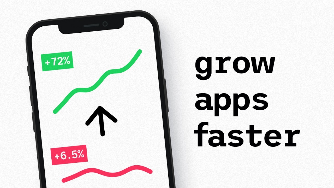
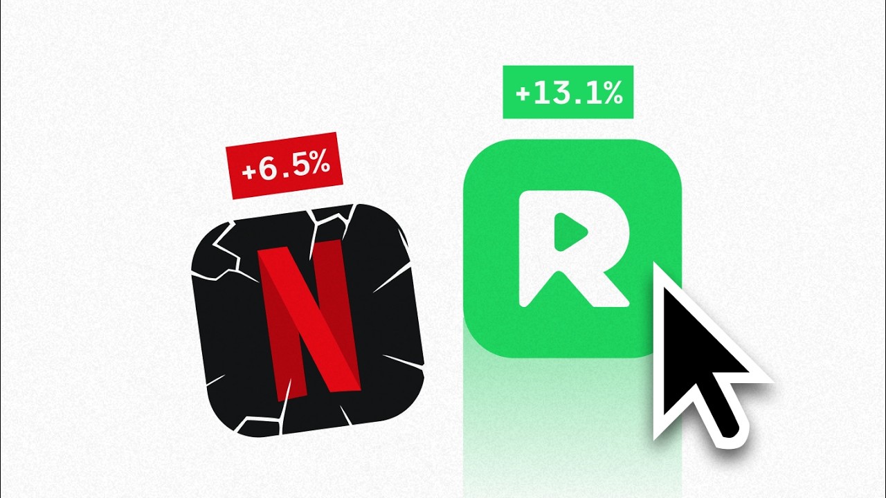
Most app founders choose the wrong thing: features, notifications, streaks. That's what the classic retention advice pushes. But the apps that keep people for years wire in a feeling. They make users really feel like they're in a race, and they're either climbing or falling behind. It's a phenomenon I call the invisible scoreboard. And in this video, I'm going to break down how it actually works and the three ways to use it to boost your own app's retention. By the way, I'm Tim. I've designed digital products for the last decade, both in big tech and for lots of multi-million dollar startups. And trust me when I say this: a leaderboard that keeps people for years is so much more than just a leaderboard. A leaderboard is the surface. Social comparison is the psychological engine underneath. Most founders ship the leaderboard like a nice-to-have without really thinking it through. That kills the entire thing before it even starts. You see, without the psychology baked in, you don't have a retention tool. You have a glorified list, and lists don't tend to move retention. So what you need is an invisible scoreboard. It's when your product makes another user's progress feel like you're in a race with it. The first move is pretty simple. Try surfacing the comparison at the moment of completion, whatever completion means in your app: the end of a workout, a transaction, a listen. Just a signal in their face that they're falling behind. But also keep in mind that the signal will land differently depending on who's on the other side of the comparison. There's a big psychological difference between chasing a world record holder and chasing your neighbor. Let's look at two apps that use this insight to their advantage, starting with the first one, Strava. Over 100 million athletes. The core loop is segments. Public leaderboards on specific stretches of road or trail. Finish a ride, and your segment rankings are right there. But here's the thing: Strava doesn't just give you the ability to keep on a hyper-competitive global leaderboard. If you want, you can be ranked against your neighborhood, against your friends, against that dozen riders who happened to ride the same exact hill in your city. And that's the move. A global leaderboard can feel unwinnable, so most people stop trying. A neighborhood leaderboard, on the other hand, feels very winnable, so people keep showing up. If your app has any kind of competition layer, remember that the cohort size is a great lever. The rule of thumb is to shrink it until winning feels possible. That's how we make competition more interesting to more people. Localizing the cohort gets users into the race. But staying in the race for years takes something else. Feeling seen while you're competing. Before we dig into that, design choices like this are just one of many things we help founders think about during our monthly free design strategy calls at Zips App. Links down below if you want to grab a spot. Now, let's look at Peloton. They kept people paying $44 a month for years. The reason isn't the bike. You see, their instructors became celebrities. In class, riders watched the live leaderboard. Their instructors called out names live in front of thousands of people grinding through the same ride. This is key, and the takeaway isn't you need instructors. It's what instructors create: an emotional hit of recognition. The leaderboard creates the race. The callout is the boost that makes people push. Most apps can't do live shout-outs, but you can still design your own recognition moment. Something that acknowledges the user's effort in a way that feels social and emotional instead of mechanical. For Peloton, that's a part of what helps them keep users year after year. So, three ways to build an invisible scoreboard. One, put the comparison at completion. Two, localize the cohort so winning feels possible. And three, acknowledge people's progress and effort, ideally in a very human way. Now, if you found this breakdown useful, again, retention strategies like this one are just one of many things we do when we have our strategy calls each month at Zips App. So, if you're interested, check the link down below. And also, check out this video here somewhere where I break down the design rule the top 1% of apps used to hook users from session one. Now, until the next one, have a great life.
00:18
Speaker A
either climbing or falling behind. It's a phenomena I call the invisible scoreboard. And in this video, I'm going to break down how it actually [music] works and the three ways to use it to boost your own app's retention. By the
00:34
Speaker A
way, I'm Tim. I've designed digital products for the last decade, both in big tech and for lots of multi-million dollar startups. And trust me when I say this, a leaderboard that keeps people for years is so much more than just a
00:50
Speaker A
leaderboard. A leaderboard is the surface. Social comparison is the psychological engine underneath. Most founders ship the leaderboard like a nice-to-have without really thinking it through. That kills the entire thing before it even starts. You see, without the psychology baked in, you don't have
01:11
Speaker A
a retention tool. You have a glorified list and lists don't tend to move retention. So what you need is an invisible scoreboard. It's when your product makes another user's progress feel like you're in a race with it. The
01:26
Speaker A
first move is pretty simple. Try surfacing the comparison at the moment of completion, whatever completion means in your app, the end of a workout, a transaction, a listen. Just a signal in their face that they're falling behind.
01:42
Speaker A
But also keep in mind that the signal will land differently depending on who's on the other side of the comparison.
01:50
Speaker A
There's a big psychological difference between chasing a world record holder and chasing your neighbor. Let's look at two apps that use this insight to their advantage, starting with the first one, Strava. Over 100 million athletes. The core loop is segments. Public
02:11
Speaker A
leaderboards on specific stretches of road or trail. Finish a ride, and your segment rankings are right there. But here's the thing, Strava doesn't just give you the ability to keep on a hyper-competitive global leaderboard. If you want, you can
02:28
Speaker A
be ranked against your neighborhood, against your friends, against that dozen riders who happened to ride the same exact hill in your city. And that's the move. A global leaderboard can feel unwinnable, so most people stop trying.
02:44
Speaker A
A neighborhood leaderboard, on the other hand, feels very winnable, so people keep showing up. If your app has any kind of competition layer, remember that the cohort size is a great lever. The rule of thumb is to shrink it until
03:02
Speaker A
winning feels possible. That's how we make competition more interesting to more people. Localizing the cohort gets users into the race. But staying in the race for years takes something else.
03:15
Speaker A
Feeling seen while you're competing. Before we dig into that, design choices like this are just one of many things we help founders think about during our monthly free design strategy calls at Zips App. Links down below if you want
03:30
Speaker A
to grab a spot. Now, let's look at Peloton. They kept people paying $44 a month for years. The reason isn't the bike. You see, their instructors became celebrities. In class, riders watched the live leaderboard. Their instructors called out names live in front of
03:49
Speaker A
thousands of people grinding through the same ride. This is key and the takeaway isn't you need instructors. It's what instructors create, an emotional hit of recognition. The leaderboard creates the race. The callout is the boost that makes people push. Most apps can't do
04:10
Speaker A
live shout-outs, but you can still design your own recognition moment. Something that acknowledges the user's effort in a way that feels social and emotional instead of mechanical. For Peloton, that's a part of what helps them keep users year after year. So,
04:28
Speaker A
three ways to build an invisible scoreboard. One, put the comparison at completion. Two, localize the cohort so winning feels possible. And three, acknowledge people's progress and effort, ideally in a very human way.
04:45
Speaker A
Now, if you found this breakdown useful, again, retention strategies like this one is just one of many things we do when we have our strategy calls each month at Zips App. So, if you're interested, check the link down below.
05:00
Speaker A
And also, check out this video here somewhere where I break down the design rule the top 1% of apps used to hook users from session one. Now, until the next one, have a great life.
Topics:app retentionleaderboardssocial comparisonuser engagementinvisible scoreboardapp designproduct strategyuser motivationcompetition designTim Gabe

Frequently Asked Questions

Why do traditional leaderboards often fail to improve app retention?

Traditional leaderboards are often treated as simple lists without incorporating the psychological aspect of social comparison, which makes them ineffective as retention tools.

What is the 'invisible scoreboard' concept?

The invisible scoreboard is a design approach where users feel they are in a race with others, with progress comparisons surfaced at key moments to drive motivation and retention.

How can apps make competition feel more winnable for users?

Apps can localize the competition cohort, such as ranking users against neighbors or friends instead of a global leaderboard, making winning feel possible and encouraging continued engagement.

Get More with the Söz AI App

Transcribe recordings, audio files, and YouTube videos — with AI summaries, speaker detection, and unlimited transcriptions.

Or transcribe another YouTube video here →