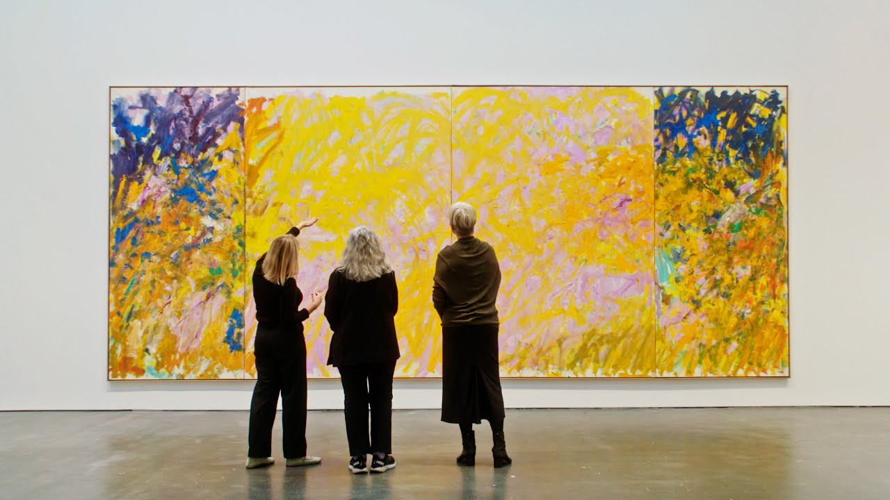
Learn to analyze art using color theory with three simple steps covering color schemes, temperature, and naturalism.
Key Takeaways
- Understanding color schemes helps identify harmony and contrast in art.
- Color temperature influences spatial perception and emotional response.
- Naturalistic vs. unnaturalistic colors reveal whether the artist aims for realism or expression.
- Combining multiple color schemes can increase visual interest and dynamism.
- Applying these steps enhances appreciation and interpretation of artworks.
Summary
- Colors in artwork evoke emotions, direct attention, and create balance.
- Five major color schemes explained: analogous, complementary, split complementary, neutral, and monochromatic.
- Analogous schemes use colors close on the color wheel, creating harmony; can be tight or loose.
- Complementary schemes use opposite colors for contrast and visual tension; split complementary reduces tension.
- Neutral schemes use desaturated colors for calmness, while monochromatic schemes use variations of a single hue.
- Color temperature differentiates warm colors that advance and cool colors that recede, creating depth.
- Naturalistic colors mimic reality for clarity; unnaturalistic colors express subjective emotions or symbolism.
- Examples from Singaporean and American artworks illustrate the application of these concepts.
- Analyzing color schemes, temperature, and naturalism helps decode the artist’s message and emotional tone.
- Further topics like symbolism and cultural associations are reserved for future videos.


