50 Web Design Tips & Tricks to Level Up Instantly — Transcript

Discover 50 rapid web design tips covering mindset, design, UX, and technical skills to instantly improve your web design abilities.

Key Takeaways

  • Start designing immediately without waiting for perfect readiness.
  • Build and maintain a personal library of design inspiration and fonts.
  • Master the four pillars of web design: layout, color, typography, and images.
  • Use visual hierarchy and white space to improve readability and engagement.
  • Apply color theory and consistent call-to-action colors to enhance user experience.

Summary

  • Web design knowledge is categorized into mindset, design, user experience, and technical skills.
  • Mindset is crucial: start building immediately, learn by doing, and cultivate curiosity by analyzing other websites.
  • Create a personal swipe file and font library to collect inspiration and resources regularly.
  • Practice daily design, starting by copying and gradually developing your unique style.
  • Key design elements include layout, color, typography, and images, with emphasis on using grids, white space, and visual hierarchy.
  • Typography tips include understanding font families, pairing fonts carefully, and applying the golden ratio for scaling font sizes.
  • Color theory basics such as analogous, complementary, and triadic colors help build harmonious palettes; use the 60-30-10 rule for color distribution.
  • Images should align with the website’s color palette and use directional cues (like people looking towards content) to guide users.
  • Consistent call-to-action colors improve user interaction and clarity.
  • The video encourages continuous practice and thoughtful design choices to create professional and engaging websites.

Full Transcript — Download SRT & Markdown

00:00
Speaker A
I've got 50 web design tips, tricks and hacks coming at you in the next 15 minutes, no filler, just rapid fire ideas to instantly level up your skills no matter what stage you're at.
00:11
Speaker A
Are you ready?
00:11
Speaker A
Let's go.
00:14
Speaker A
You can basically break everything up that you need to know about web design into four categories: Mindset, Design, User Experience, and Technical skills. Let's kick it off with mindset because if you get this part wrong, none of the other stuff will matter.
00:28
Speaker A
First, the best way to learn web design is by doing! Stop waiting to feel ready, nobody does, you don't need another course, just start building.
00:39
Speaker A
One of the fastest ways to grow your skills is by getting really curious about other people's websites, so go looking for them, make it a part of your routine to find, study and analyze great design.
00:51
Speaker A
And when you find something great, you got to save it, don't trust your brain to remember it later, what I do is take screenshots of maybe an interesting section or a full-on website and then I make an Apple note and I link back to the site and also include the fonts that they use, so it's like I'm building my own personal swipe file that I can revisit anytime I need it.
01:54
Speaker A
While you're at it, you should also start building a personal font library, I also just create some Apple notes, I put them in folders and I sort them by style, so I've got a folder for serif, sans serif, script, display and and so on, and then I also make notes on which ones are free and ones that I would have to pay for.
02:12
Speaker A
But here's the key, you can't wait until you have a project to start collecting this inspiration, you got to make it a part of your daily routine, the more you do it, the sharper your eye becomes.
02:22
Speaker A
But if all you ever do is look for inspiration, your skills still aren't going to grow.
02:27
Speaker A
You have to practice, and here's how I'd encourage you to do it at different stages of where you might be, at first, it's okay just to copy ideas, right, you find somebody that you like, you find a website that you like and then you try to do that same thing, eventually, you're going to start putting your own spin or your own style on things, and after you've done that for a while, you'll notice that you've got your own unique way of doing things and that can become your own signature.
03:35
Speaker A
But don't wait for inspiration to strike, do a little bit of designing every single day, even just 10 or 15 minutes is going to help you to really stand out over time, but be sure to schedule it in, don't wait for those free moments because they never come.
03:49
Speaker A
Let's talk about putting it all together with design, and this is going to be our biggest section for tips, so buckle in, the four building blocks of every great website are layout, color, typography, and images, if you get these four things right, then everything else just kind of clicks into place.
04:05
Speaker A
For layout, most websites use a 12-column grid system and that helps to keep things organized.
04:16
Speaker A
Easy to read and even responsive on all sorts of screen sizes.
04:22
Speaker A
But even though there are 12 different columns to kind of put things on, you hardly ever see it go much bigger than one, two or three columns on a given section, and eventually, you're going to start to notice a few layout patterns that just kind of show up everywhere.
05:07
Speaker A
So, for instance, here's a real popular one, you'll have image on the left and then text on the right, and if you really want to make things spicy, then you'll put the image on the right and the text on the left.
05:25
Speaker A
Don't be afraid to use these patterns, but also look for small ways to tweak them so that your site doesn't end up feeling overdone.
05:31
Speaker A
And don't skimp on white space, in fact, you probably need to use more white space than you think you do, okay?
05:40
Speaker A
You got to let your designs breathe and mix up the style of your sections, add some different backgrounds, maybe layout variations, this keeps people visually engaged with your website and kind of helps them to keep scrolling.
05:59
Speaker A
Which in turn makes it more likely that they're going to say yes to whatever you're offering them, also use visual hierarchy to guide the eye, make it easy to scan so people can find important information without a lot of effort.
06:38
Speaker A
I like to think of visual hierarchy in terms of three levels of importance, you've got your biggest or the most important and and you want to make sure that this level is really easy to recognize and scan, and then you got your medium level or that second tier underneath and this should still be fairly easy to spot, but but don't let it compete with what is most important, and then finally, you've got the the smallest of the details, and this is for folks that want to get into the weeds, there's always folks that will want to know every single detail about what you're trying to communicate, but you don't really need to make this something that is standing out, keep it less conspicuous.
07:25
Speaker A
For typography, it's important to get familiar with some major font families.
07:37
Speaker A
And a few of the big ones are things like serif or sans serif, script or even displays, each one sets a really different tone, so you got to use them on purpose.
08:21
Speaker A
And what I like to do is think of what's the role of this text for the overall user journey, so I try to use display fonts for for big text that is trying to grab attention, and then for the stuff that I'm really hoping that they read and kind of dive into, I make it legible, and so that's for the smaller text, so my rule of thumb is anything longer than like seven or 10 words should probably prioritize legibility.
08:49
Speaker A
Also, you've got to get good at pairing fonts that work together, and something I like to do is lay out ideas onto a big Figma frame side by side just to see how things feel.
09:07
Speaker A
If I can tell that a font is clashing with another font, then I just keep looking, I keep trying different alternatives.
09:20
Speaker A
You might hear some people talk about something called the golden ratio, which is that you want to scale up font sizes by 1.618, so you take whatever your base font is, multiply that by 1.618 to get the next size up, so for example, if our base font size was 16 pixels, then the next step up from that would be 26 pixels, and hey, like, listen, this can help, but here's the rule that I go by, if it looks good, it is good, okay, don't let formulas keep you from just trying new things.
10:23
Speaker A
For color, you're going to want to learn the basics of color theory.
10:27
Speaker A
There's something called analogous colors that are colors directly next to each other on the color wheel, and then there's complementary colors, which are colors that are across from each other on the color wheel, and then finally, there's something called triadic colors, which are equally spaced apart from one another.
10:49
Speaker A
Use these to build color palettes that that actually work together harmoniously.
10:54
Speaker A
But don't feel like you've got to have a lot of colors on a website.
10:59
Speaker A
Oftentimes, less is more.
11:02
Speaker A
A good rule of thumb when it comes to colors is called the 60-30-10 rule, so the idea is that you use about 60% of your space with your dominant colors, things like black and white, and then 30% goes to brand colors, maybe to add a little bit of variation, and then that final 10% is just an accent, and for that 10%, I actually like to reserve that for my call to action, I pick one color and I stick to only that for my button, that way, if a user sees that color, they'll almost intrinsically know that it's meant for action.
12:12
Speaker A
For images, you want to make sure that the color of the images match the overall color palette of the website, now, this isn't a hard and fast rule, but when I'm building a website, I try to make sure that the color of the images are at least in the ballpark of the color palette of everything else around it because you don't want them to stick out, right, a neon pink hoodie on a sleek black and white site will make your site look maybe just a little less than professional.
12:38
Speaker A
I always like to use images where the people are looking towards key content, so you can see that in this image here, you've got folks that are looking straight at this header, our brains almost intrinsically follow the eyes of people that we're looking at, so you use that to your advantage by having people's eyes focus on where we want the user to look.
13:42
Speaker A
When I'm picking images, I always try to start with brand photos from my client, but if they don't have a lot or maybe they don't have any, that's when I go to stock photos.
13:53
Speaker A
Now, it's it's kind of tough to find good stock photos, it takes a bit of getting used to, but here's a few things that I've found really separate good stock photo from bad, one is good lighting and the next is just a natural expression, and this is what makes the biggest difference between a photo that looks staged and one that looks like it was taken as a candid image.
14:15
Speaker A
There are plenty great places to find good royalty-free stock photos, but one that I really like is is called Pexels, and rather than just like hunting and pecking for the right image that I'm kind of looking for, what I do is I go and I find artists that I like and then I follow them, and that way, when I'm ready to go find images for a project, I've got a few folks that I know take really quality photos.
15:19
Speaker A
Another thing is that you want to save your images as WebP files when possible.
15:28
Speaker A
They load faster without killing the quality, and a rule of thumb that I like to use is I try to keep my images to about 300 kilobytes in size because big images are the number one thing that slow sites down the most.
15:39
Speaker A
Also, be intentional with your cropping, use the rule of thirds to focus on the subject.
15:50
Speaker A
And that might be a face or maybe a product or a key detail, you can see how I've kind of given you an example of that in this photo, we've got this subject who is aligned to the far right third and the far left third, so this is just kind of the natural place that the human eye looks for whenever we're looking at images, so you're helping your user out if you put your subject in those spots.
16:49
Speaker A
Speaking of cropping, don't leave cropping to your web builder alone, once you know the exact size that your image needs to be, you want to resize and export it using something like Photoshop or Canva, that way your image loads faster and it checks an SEO box that Google's going to look for.
17:06
Speaker A
Let's move on to user experience.
17:08
Speaker A
Number 32, always, always, always design for the user first, not your portfolio and not for the latest trend.
17:18
Speaker A
And remember, most people only skim websites, they're not reading it from top to bottom, so you got to use that visual hierarchy that we talked about to help users understand even if they just give a section a quick glance.
17:31
Speaker A
Only about 20% of people make it past the top fold of the website, that's that very first section that people see when the site loads, so think about that when you're building that section, you want it to be crystal clear and super motivating.
18:25
Speaker A
Once you're done designing a page, something I like to do is actually scroll backward from the bottom to the top, this is going to give you a fresh perspective and you'll be able to spot issues that maybe you missed after staring at it for hours and hours.
18:39
Speaker A
Make sure to test your websites on real devices, not just previews or emulators, what looks great on maybe Chrome DevTools might be a hot mess on an actual iPhone, this might have gotten me in trouble quite a few times, so make sure that you check.
18:56
Speaker A
And be sure to stick with one web builder until you truly outgrow it, jumping between tools only slows you down and keeps you from mastering your skill.
19:05
Speaker A
Also, websites have competing priorities, you've got to consider things like brand or maybe SEO, performance, accessibility or even conversion.
19:19
Speaker A
And they all can't take priority at the same time, so what do you do, you budget, right, you think about what matters most for each project or even every single section.
20:07
Speaker A
Make sure that your button text is clear and action-oriented and it tells people exactly what's going to happen when they click, you want to do things like see pricing or download the guide, instead of things like let's do this or heck yes, right, if people don't know what's going to happen when they click, they're actually much less likely to do so, and this also helps with accessibility.
20:30
Speaker A
Let's wrap this up with the technical best practices.
20:34
Speaker A
There are basically three main categories of technical skills that you need to work on, development, SEO, and accessibility.
20:42
Speaker A
For development, you need to learn a little bit of coding knowledge, but you don't necessarily have to be a full-fledged developer, get familiar with tools like HTML, CSS, and JavaScript.
20:55
Speaker A
Then use resources like Chat GPT or Claude to fill in the gaps, be careful with third-party tools and plugins, they often add extra code that you probably don't need and that slows your site down.
21:40
Speaker A
Only use what's absolutely necessary, get familiar with tools like Chrome DevTools or even Google Lighthouse.
21:52
Speaker A
I use Chrome DevTools whenever I'm adding CSS to a website and Google Lighthouse to figure out what's slowing down a website, you don't have to be a developer to use these things, just poke around and and start to learn, it can be really, really helpful.
22:11
Speaker A
For SEO, use proper HTML tags to structure your site, each page should have just one H1 tag, and this is going to give a summary of the entire page, then you use H2 tags to divide the page up into sections, P tags are for those big chunks of text, and then also LI's for list, and don't forget your nav and footer tags as well, Google reads structure before it reads all of the words on a page.
23:22
Speaker A
When you're changing any URLs, make sure that you set up 301 redirects so you don't lose traffic or SEO value, and fix broken links as soon as as you spot them.
23:35
Speaker A
Make sure to write descriptive alt text for every single images, use keywords whenever it makes sense, but don't keyword stuff just to boost SEO, this isn't just an SEO tool, it's also important for accessibility.
23:49
Speaker A
Speaking of accessibility, make sure that your color contrast is strong enough for people with vision challenges to read comfortably, test your keyboard navigation as well, users should be able to tab through links and buttons without having to use a mouse.
24:05
Speaker A
And then finally, don't rely on color alone to communicate meaning, if you're using color to show things like success or error statuses, you also want to use icons or labels or even patterns because not everyone sees color the same way, so adding a second queue makes your site more inclusive.
25:05
Speaker A
Woo, and that is it, you have now got 50 tips to build faster, smarter, better websites, I know that was rapid fire, so thank you for hanging with me, hopefully this really helps you to level up your skills and go on to build websites that you're super proud of.
25:23
Speaker A
Hey, if you enjoyed this video, make sure that you like and subscribe, and don't forget, if you don't quit, you win.
Topics:web designdesign tipsuser experiencetypographycolor theorylayout designweb design mindsetdesign inspirationcall to actionweb design practice

Frequently Asked Questions

What is the best way to start learning web design according to the video?

The best way to learn web design is by doing. The video emphasizes starting to build immediately rather than waiting to feel ready or taking more courses.

How should I organize and use fonts for web design?

Create a personal font library sorted by style such as serif, sans serif, script, and display. Pair fonts carefully and use display fonts for attention-grabbing text, while prioritizing legibility for longer text.

What are the key elements to focus on in web design layout?

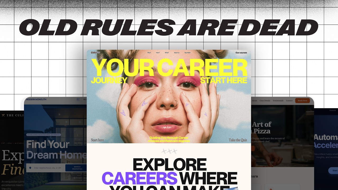
Focus on using a 12-column grid system, applying white space generously, mixing section styles, and using visual hierarchy to guide the user's eye through important content.

Get More with the Söz AI App

Transcribe recordings, audio files, and YouTube videos — with AI summaries, speaker detection, and unlimited transcriptions.

Or transcribe another YouTube video here →