How to think like a GENIUS UI/UX designer — Transcript

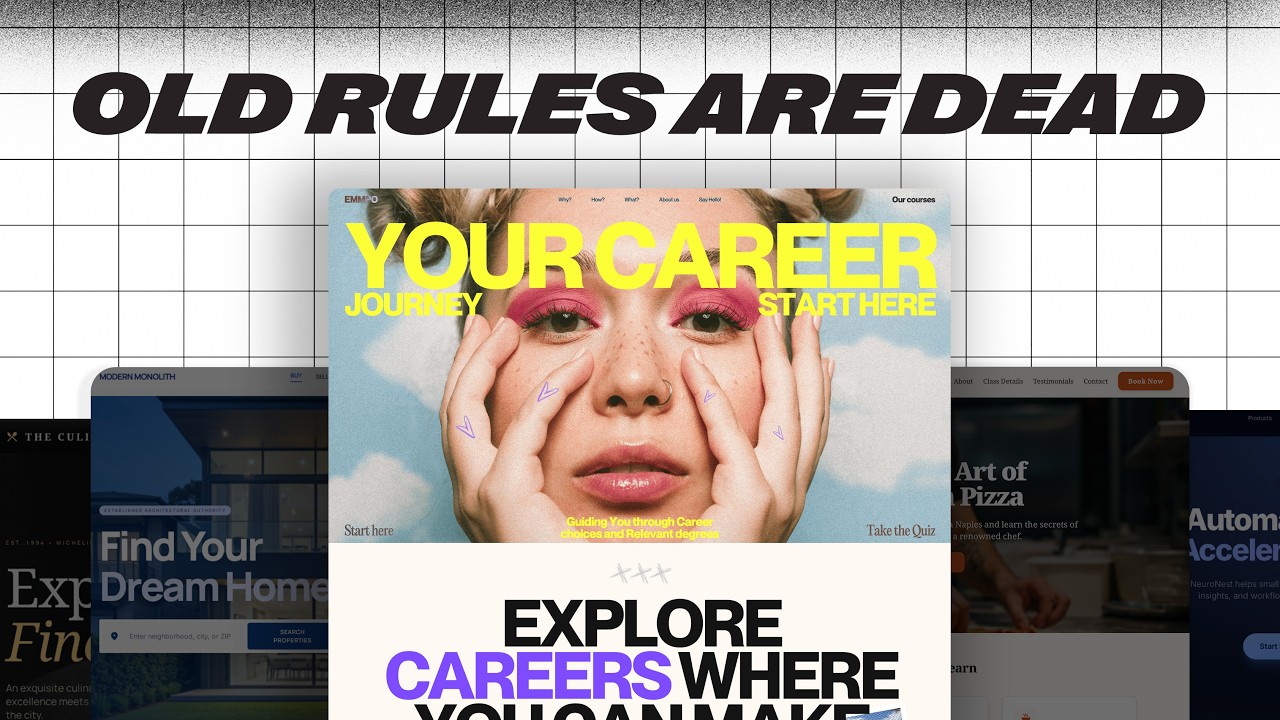
Learn how genius UI/UX designers focus on user intent, content structure, and design systems to create functional, user-centered designs.

Key Takeaways

  • Focus on user intent over aesthetics to create functional designs.
  • Respect established layout conventions to meet user expectations.
  • Use animations and progressive disclosure to enhance usability without overwhelming users.
  • Develop design systems that align with team needs and allow flexibility.
  • Content structure and clarity are essential for effective UI/UX design.

Summary

  • Genius designers prioritize making designs work brilliantly for users rather than just looking good.
  • Design should be approached as storytelling focused on guiding user actions, not just visual flair.
  • User intent is the foundation of UI/UX design, influencing features like search bars and filtering options.
  • Design layouts should respect user expectations, typically flowing top to bottom and left to right.
  • Micro interactions and unique features differentiate good designs from genius ones.
  • Content structure is critical: deciding what content to display and how to present it effectively.
  • Animations should enhance clarity or functionality, using progressive disclosure to improve user control.
  • Load more buttons are preferred over infinite scroll to maintain user control and access to page footers.
  • Design systems provide replicability and speed, reflecting team values and enabling scalable design.
  • Mastering a design system means knowing when to intentionally bend its rules without breaking it.

Full Transcript — Download SRT & Markdown

00:00
Speaker A
Most designers want to work for big tech or start an agency.
00:00
Speaker A
But most designers won't.
00:00
Speaker A
Most designers focus on making things look good.
00:00
Speaker A
But genius designers don't, they focus on making things work brilliantly for the user.
00:00
Speaker A
Think of web design not as art, but as story.
00:00
Speaker A
And not every story needs 3D graphics or buttery smooth scrolling.
00:00
Speaker A
If your goal is to impress other designers, maybe.
00:00
Speaker A
But if your goal is to guide someone to an action, all that flair might just be in the way.
00:00
Speaker A
Start with user intent.
00:00
Speaker A
Let's say you need to design a user flow that enables customers to rent vacation properties.
00:00
Speaker A
Not unlike Airbnb.
00:00
Speaker A
A UI designer might start thinking about the icons or the layout of each card.
00:00
Speaker A
And entirely lose the plot of why we are designing, the intent of the user is to search for accommodations.
00:00
Speaker A
So, a search bar is a natural starting point.
00:00
Speaker A
We can then augment with useful features like destination, amount of travelers, and dates.
00:00
Speaker A
You might think the next step is to put a header above this and slap an image on the background.
00:00
Speaker A
But think about the user, does this design do anything extra that this design didn't?
00:00
Speaker A
Not at all.
00:00
Speaker A
But there can be more than one intent for a website.
00:01
Speaker A
Maybe the user knows they want to go on a vacation, but doesn't know where, they are there to browse.
00:01
Speaker A
We can serve that intent too by displaying our listings.
00:01
Speaker A
But the user wants something more specific.
00:01
Speaker A
So, we can add in filtering UI elements, notice how the fonts, colors, and icons affect the aesthetics, but do very little to change the functionality.
00:01
Speaker A
Only as the user intent expands, do we expand the functionality of our designs.
00:01
Speaker A
But we jumped the gun a little by building full UIs before talking about leveraging existing layouts.
00:01
Speaker A
Why not put the search bar down here or arrange the cards like this?
00:01
Speaker A
Truth be told, nothing is stopping us from making a UI like this if it serves the user better.
00:01
Speaker A
But after 30 plus years of websites, users have come to expect certain layouts.
00:01
Speaker A
This doesn't preclude us from trying new layouts, but means that typically information should flow top to bottom and left to right, navigation is at the top of the page, and call to actions are typically eye-catching and easy to find.
00:01
Speaker A
Designs that follow these guides are generally much easier to integrate new sections seamlessly.
00:02
Speaker A
And make responsive, respecting these expectations, but making the design uniquely yours.
00:02
Speaker A
Like adding a cool micro interaction or a set of unique features is what separates the good from the genius.
00:02
Speaker A
And if you're trying to think like a genius designer, it helps to see how the best are already thinking.
00:02
Speaker A
Mobbin is a curated library of real world UI and UX from full user flows down to individual components.
00:02
Speaker A
All pulled from top apps and websites.
00:02
Speaker A
Instead of downloading dozens of apps just to reverse engineer their design patterns, Mobbin lets you search and explore them all in one place.
00:02
Speaker A
Personally, I'm always diving into the UI elements section.
00:02
Speaker A
There's a link in the description if you do want to check it out.
00:02
Speaker A
Thank you Mobbin for sponsoring this video.
00:02
Speaker A
But without content structure, design has very little value.
00:02
Speaker A
There are two steps to designing around content.
00:02
Speaker A
The first is to decide which content to display, understanding how the user will interact with the design will determine what type of information is presented.
00:02
Speaker A
For example, on our travel page, we can include a short description for every listing, but if the user wants a detailed look, they'll just click on the listing, they need the specifics to scan, like the location, rating, and price before anything else.
00:03
Speaker A
The second step is structuring the content that we do display.
00:03
Speaker A
Currently, our design has perfect content, meaning that the titles and locations are all short.
00:03
Speaker A
But what if we had a destination with a really long name or save icons on really bright listing images?
00:03
Speaker A
We would probably want to truncate long names and add a circle to the icons to guarantee contrast.
00:03
Speaker A
Otherwise, you end up with unintended consequences which are not fun to deal with.
00:03
Speaker A
Animations should add clarity or functionality to a design.
00:03
Speaker A
Just take a look at my old portfolio website.
00:03
Speaker A
It's awful.
00:03
Speaker A
All of these animations didn't do anything.
00:03
Speaker A
Navigation is a great example of this.
00:03
Speaker A
As we add more links, we simply run out of room, so we consolidate them into a menu that can animate in, serving a purpose.
00:03
Speaker A
Or if our web app starts to take on browsing priority, instead of sticking this block to the top of the screen, we can reduce the size of the search bar and have it animate in when clicked.
00:04
Speaker A
These are all great examples of progressive disclosure, showing the user what they need to see and revealing more as it's requested.
00:04
Speaker A
That's why a load more button is preferable over infinite scroll, it gives the user more control and crucially, it lets them actually reach the footer, something infinite scroll often makes impossible.
00:04
Speaker A
Context matters, but as a general rule.
00:04
Speaker A
Buttons should almost always have a small animation, while scroll jacking effects should be used very sparingly, if ever.
00:04
Speaker A
Finally, design systems add a layer of replicability and speed that's tough to match.
00:04
Speaker A
But the system has to reflect the values of the team.
00:04
Speaker A
A lean startup might need something lightweight and flexible, quick to update and easy to scrap.
00:04
Speaker A
Whereas something like Google's material design is massive and deeply defined because the use cases span dozens of products and billions of users.
00:04
Speaker A
More importantly, the development of a design system is often more critical than the design itself.
00:04
Speaker A
The process of defining rules, spacing, typography scales, interaction patterns, gives you an architecture for expansion.
00:05
Speaker A
But a design system isn't about making everything look the same, it's about giving your team a shared language.
00:05
Speaker A
And like any language, mastering means knowing when to bend the rules, you don't break the system by accident, you break it with intention.
00:05
Speaker A
Overall, I hope this gave some perspective on how to think like a better designer.
00:05
Speaker A
If you're interested in checking out Mobbin, it'll be the first link in the description below.
00:05
Speaker A
And thanks for watching.
Topics:UI designUX designuser intentdesign systemscontent structureprogressive disclosuremicro interactionsweb designuser experienceMobbin

Frequently Asked Questions

What is the main focus of a genius UI/UX designer according to the video?

A genius UI/UX designer focuses on making designs work brilliantly for the user by prioritizing user intent and functionality over just aesthetics.

Why is respecting layout conventions important in UI/UX design?

Respecting layout conventions is important because users have established expectations, such as information flowing top to bottom and navigation at the top, which makes designs easier to use and integrate.

How do animations contribute to better UI/UX design?

Animations should add clarity or functionality, such as consolidating navigation links or revealing elements on demand, helping users control their experience without unnecessary distractions.

Get More with the Söz AI App

Transcribe recordings, audio files, and YouTube videos — with AI summaries, speaker detection, and unlimited transcriptions.

Or transcribe another YouTube video here →