The Only 5 Web Design Skills That Actually Matter (2026) — Transcript

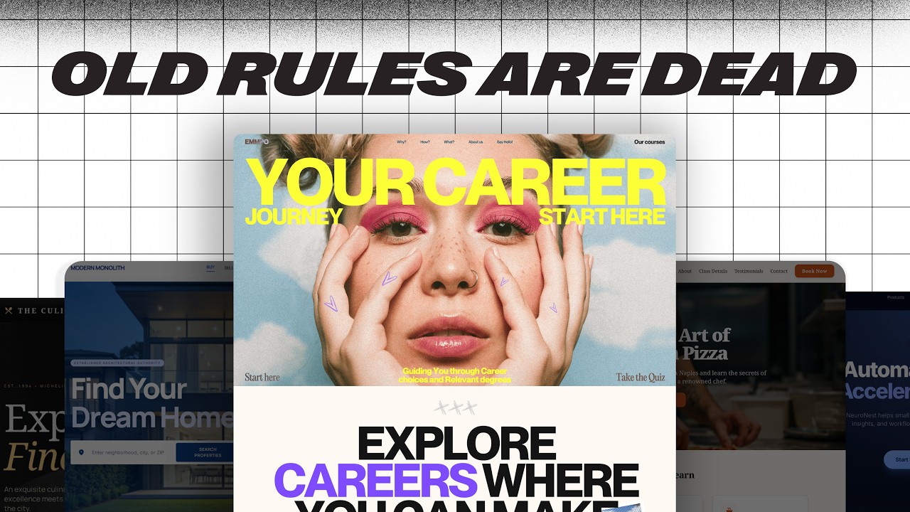
Learn the 5 essential web design skills to level up fast, including typography, layout, color, and more from a pro with 10 years of experience.

Key Takeaways

  • Only five core web design skills are essential to becoming a pro.
  • Typography mastery involves font selection and a systematic approach to sizing and spacing.
  • Structured layouts using grids and spacing systems create rhythm and clarity.
  • Visual hierarchy is critical for guiding user attention on websites.
  • Intentional, limited color use improves design balance and user experience.

Summary

  • Master typography by choosing unique fonts and using a type scale system for consistent sizing, spacing, and line height.
  • Use grid systems (12 columns desktop, 8 tablet, 4 mobile) for structured layouts and apply an 8-point spacing system for rhythm.
  • Create visual hierarchy with proximity, size, contrast, and alignment to guide users' eyes effectively.
  • Limit color palettes to 2-3 colors with distinct roles, applying the 60-30-10 rule for visual balance.
  • Avoid common beginner mistakes by relying on proven systems rather than guessing layout and design choices.
  • Use resources like fontshare.com and uncut.wtf for high-quality, less common fonts.
  • Leverage tools like typescale.net and Figma to simplify typography and layout setup.
  • Understand that professional design feels intentional, cohesive, and easy to navigate.
  • Focus on readability and usability by adjusting letter spacing and line height appropriately.
  • Color usage should be intentional, not excessive, to enhance design clarity and impact.

Full Transcript — Download SRT & Markdown

00:00
Speaker A
In this video, I'm going to show you the only five web design skills that actually matter.
00:05
Speaker A
You can usually tell right away if a site was built by a pro or by somebody who's still kind of figuring it out.
00:10
Speaker A
And it's easy to think that that takes a ton of different skills.
00:14
Speaker A
After 10 years of reading books, taking courses, and plain old building a ton of websites.
00:20
Speaker A
I can actually tell you there are really just five things you need to know.
00:23
Speaker A
By the end of this video, you're going to know exactly what to focus on to level up fast and finally feel confident as a web designer.
00:30
Speaker A
Are you ready?
00:31
Speaker A
Let's go.
00:34
Speaker A
First up are your typography skills.
00:36
Speaker A
Outside of white space, text takes up the most real estate on your website.
00:41
Speaker A
But 99% of web designers can't tell the difference between bad type choices and good type choices, they might be able to feel when something's off, but it just kind of stops there.
00:51
Speaker A
But here's the good news, you actually only need to answer two questions.
00:55
Speaker A
To master typography for websites, and when you can do that confidently on every project.
01:00
Speaker A
You'll be in the top 1% of web designers.
01:04
Speaker A
So question number one is, how do I pick the right fonts for my project?
01:09
Speaker A
Most web designers use the same free fonts over and over again.
01:14
Speaker A
And when you use those same fonts as everyone else, your design starts to blend in, not stand out.
01:19
Speaker A
So you got to find fonts from places that aren't overused.
01:23
Speaker A
Two of my favorite resources are fontshare.com and uncut.wtf.
01:30
Speaker A
Font share is clean, high quality and completely free to use.
01:35
Speaker A
While uncut is a bit more experimental.
01:38
Speaker A
But they're both packed with personality and tons of free fonts to use.
01:43
Speaker A
Oh, and I've got a running list of free and affordable fonts that I've found out in the wild.
01:48
Speaker A
Every one of them are chef's kiss.
01:50
Speaker A
So you're going to find the link to that list in the description of this video.
01:54
Speaker A
Oh, and by the way, make sure to like and subscribe so you don't miss another episode.
02:00
Speaker A
And if you want the slides that I used to teach these five skills, there's a link for those in the description.
02:06
Speaker A
Question number two is, how do you set up your fonts?
02:10
Speaker A
In such a way that it actually improves your design and makes your site easier to use.
02:13
Speaker A
If you've ever looked at a site that was designed by a true web pro, you're going to notice something, right?
02:20
Speaker A
All the text feels cohesive, yet predictable, without feeling super robotic.
02:25
Speaker A
Like you're kind of reading a Wikipedia page.
02:27
Speaker A
That's because pro designers use something called a type scale system.
02:33
Speaker A
And it's just a simple set of rules that determines things like font sizes, letter spacing, and line height.
02:39
Speaker A
And once you've set it up, your typography starts to feel intentional.
02:43
Speaker A
Instead of just eyeballed.
02:45
Speaker A
Let's start with font size.
02:47
Speaker A
What you want to do is pick a base font size for your paragraph text.
02:53
Speaker A
Typically people start with about 16 pixels.
02:55
Speaker A
And then you use a scale to make your headings consistently larger.
03:00
Speaker A
A popular one is called the major third scale.
03:03
Speaker A
And if you've ever learned an instrument.
03:06
Speaker A
This might sound a little bit familiar.
03:08
Speaker A
All it means is that you're actually going to scale up in size from one text to the next by about 25%.
03:15
Speaker A
So if your base size is 16, your H6 would be 20, and then your H5 would be 25.
03:21
Speaker A
So on and and so forth until you reach your H1s.
03:25
Speaker A
And you actually don't have to calculate this manually.
03:27
Speaker A
Instead of using pixels, just use the REM values.
03:30
Speaker A
It does all the calculations right there for you.
03:33
Speaker A
Next up is letter spacing.
03:35
Speaker A
For for body text, don't touch it, right?
03:38
Speaker A
We want that to be super legible.
03:40
Speaker A
And so just keep it the default.
03:41
Speaker A
But for headings, you want to tighten it up a little bit as they get bigger.
03:46
Speaker A
As text gets larger, it often looks cleaner with slightly reduced spacing.
03:50
Speaker A
And then finally, line height.
03:52
Speaker A
For paragraph, go with about 150% of the font size.
03:56
Speaker A
So if the font size is 16 pixels, then you would take that and then multiply it by 1.5 to get your line height.
04:01
Speaker A
That gives the text room to breathe and makes it easier to read.
04:04
Speaker A
And then as text gets bigger, like with headings, you can tighten up the line height a bit to make it feel a bit more impactful and scannable.
04:10
Speaker A
Now, if all that sounds like a lot, here's the shortcut.
04:13
Speaker A
Go to typescale.net, you pick your base size, choose a ratio, and then it just generates the whole system for you.
04:19
Speaker A
It takes two minutes and makes your typography look like a pro set it up.
04:23
Speaker A
Next up is layout.
04:25
Speaker A
Most new web designers just kind of drag things around until it feels right.
04:30
Speaker A
And hey, you might even be following some design rules without realizing.
04:33
Speaker A
But pro designers don't guess about where things should go on the page.
04:38
Speaker A
They have systems that guarantee it every time.
04:40
Speaker A
And you actually don't need to memorize a ton of layout rules.
04:43
Speaker A
You just need three things.
04:45
Speaker A
A grid system for structure, a spacing system for rhythm between elements and even vertical spacing, and then visual hierarchy to guide the eye.
04:51
Speaker A
Let's start with the grid.
04:53
Speaker A
Think of this as your layouts foundation.
04:56
Speaker A
I like to use a 12 column layout on desktop, eight columns on tablets, and then four columns on mobile.
05:01
Speaker A
Why is that?
05:03
Speaker A
Well, because it's super flexible to divide evenly to where you don't have to have 12 columns specifically.
05:10
Speaker A
It could be two columns that take up six columns on the right and six columns on the left.
05:14
Speaker A
And then you can make it three or four.
05:16
Speaker A
It's just easy to work with.
05:18
Speaker A
Figma actually makes this super simple to set up.
05:21
Speaker A
All you have to do is select your frame, come all the way down to layout guide, add the plus sign, change grid to columns, and then add the amount of columns that you're wanting to work with.
05:29
Speaker A
Next up is spacing.
05:31
Speaker A
And this is what gives your design room to breathe.
05:34
Speaker A
I use what's called an eight point grid system.
05:38
Speaker A
And it just means that your spacing is always multiples of eight, like 8, 16, 24, 32, so on and so forth.
05:43
Speaker A
It's the same approach that's used by Google for material design and Apple in in their design systems as well.
05:49
Speaker A
And if major players like Google and Apple are using it, then you know you can't ignore it.
05:53
Speaker A
This is also super easy to set up.
05:55
Speaker A
You do the same thing in Figma as if you're setting up columns, but then when you add a guide, you just remain on grid.
06:02
Speaker A
And then change the size of the grid to whatever you're wanting to use.
06:05
Speaker A
The last piece is visual hierarchy.
06:07
Speaker A
Because here's the truth, people don't read websites.
06:10
Speaker A
They scan them.
06:11
Speaker A
So your layout needs to guide the eyes from the things that are most important to things that maybe don't matter all that much.
06:17
Speaker A
Here are a few quick principles to do just that.
06:20
Speaker A
Use proximity.
06:22
Speaker A
So keep related things close together as if they're in the same space on a page.
06:27
Speaker A
Then use size to tell users what's more important or least important.
06:31
Speaker A
You can see that this website's done a good job with that on their big text and the big image down here.
06:36
Speaker A
Use contrast, right?
06:38
Speaker A
You can use size, weight, or color.
06:40
Speaker A
And you can see that this website's done that really well with the opacity of their headers versus their body text, so they're signaling to you that they really want you to read this and this other stuff might not be that important.
06:49
Speaker A
And then alignment.
06:51
Speaker A
Because clean lines always equal a clear structure.
06:54
Speaker A
When you use those four together, you're going to build a layout that feels effortless to navigate.
06:58
Speaker A
And that's what separates the pros from the beginners.
07:01
Speaker A
Next up, let's talk about color.
07:03
Speaker A
For a lot of designers, this is where things start to feel really overwhelming.
07:08
Speaker A
Because there are millions of colors out there.
07:11
Speaker A
So how do you know what works?
07:12
Speaker A
Here's the secret.
07:13
Speaker A
Pro designers don't use more color, they use color more intentionally.
07:17
Speaker A
Let me show you some quick wins that are going to instantly level up your color game.
07:20
Speaker A
First, you want to limit your color palette.
07:23
Speaker A
Right, you don't need more than like two or three different colors.
07:27
Speaker A
For any project that you're working on.
07:29
Speaker A
But here's the key, each one should have a specific job.
07:32
Speaker A
One of the most popular systems for creating visual balance is called the 60 30 10 rule.
07:38
Speaker A
So 60% are your neutral colors, those are things like your whites and your blacks.
07:44
Speaker A
You use that for your background and your text.
07:46
Speaker A
30% are your secondary colors and you use those for maybe different backgrounds or cards.
07:51
Speaker A
Or headers or visuals.
07:53
Speaker A
And then finally, the 10% is your accent colors.
07:59
Speaker A
And that's what you use if you want something to really stand out.
08:03
Speaker A
Like buttons or CTAs.
08:05
Speaker A
But that's all you need, really.
08:06
Speaker A
As you get more confident with color, you can expand your palettes.
08:10
Speaker A
But don't feel like you need to.
08:12
Speaker A
Another tip is use opacity.
08:15
Speaker A
Rather than adding more colors to your palette.
08:18
Speaker A
So take your primary color like this yellow here, and then just scroll down on the opacity to create different color layers.
08:24
Speaker A
This is something that I actually learned when I was looking through Google's material design.
08:30
Speaker A
And notice that they used opacity to create a lot of different color variations.
08:33
Speaker A
So one good color used well beats five random colors any day.
08:38
Speaker A
Next, you want to prioritize contrast.
08:40
Speaker A
And this one's huge and it's one that a lot of new designers miss.
08:43
Speaker A
Your color combo might look nice, but if your users can't read it, it doesn't matter how pretty it is.
08:49
Speaker A
So always check your color contrast.
08:51
Speaker A
Color contrast is the contrast between your foreground text and the background color that it sits on.
08:58
Speaker A
And and you can see here that passable contrast is 3 to 1 on larger text and 4.5 to 1 on smaller text.
09:04
Speaker A
Figma has a contrast checker baked right into its color system.
09:08
Speaker A
All you got to do is select the text that you want to check, go to fill, and then there's a contrast icon right in the top right hand corner, scroll down, go to more tools, and then you'll see CSS overview.
09:19
Speaker A
Capture the overview and it'll give you all the colors for that specific site.
09:23
Speaker A
It even gives you fonts, it gives you size settings, it gives you the type scale system.
09:29
Speaker A
It's such a great tool to use.
09:31
Speaker A
Now let's talk code.
09:33
Speaker A
And I know code, boo, hiss, we don't need that anymore.
09:36
Speaker A
But here's the truth, if you want to be better than 99% of the other web designers out there.
09:42
Speaker A
You're going to need to at least get comfortable with it.
09:45
Speaker A
But you don't need to know how to build a full web app, you just need to know the basics.
09:50
Speaker A
And then know how to use the right tools to get you the rest of the way.
09:53
Speaker A
Start with the essentials, right?
09:56
Speaker A
You've got HTML for structure, CSS for style, then there's JavaScript for interaction.
10:00
Speaker A
And if you're working with platforms like WordPress, PHP basics can go a long way.
10:05
Speaker A
That alone is going to take you further than most web designers would ever go.
10:09
Speaker A
I started with free courses on Code Academy, and then I would learn more as projects that I worked on needed it.
10:14
Speaker A
And once you get the basics down, here's the real trick.
10:18
Speaker A
Find solutions that are about 80% of the way there, and then vibe code the rest.
10:23
Speaker A
So what do I mean by that?
10:24
Speaker A
Use code pens or snippets, even chat GPT, right, whatever gets you close.
10:29
Speaker A
And then you just tweak it until it does what you want it to do.
10:31
Speaker A
I had a friend who's not a developer who customized WordPress WooCommerce plugin to have a custom checkout process for his wife's website.
10:38
Speaker A
You don't need to be a full stack developer.
10:42
Speaker A
You just learn by doing, don't overthink it, and use the tools that are available to you.
10:46
Speaker A
And finally, the fifth skill to stand out as the top 1% of all web designers, conversion skills.
10:51
Speaker A
Most designers design for looks, but pro designers design for action.
10:55
Speaker A
Early in my career, I redesigned a client's website from the ground up.
11:00
Speaker A
And it looked amazing, right?
11:02
Speaker A
Way better than the original.
11:05
Speaker A
But here's the problem.
11:07
Speaker A
After we launched, their sales plummeted.
11:10
Speaker A
Why?
11:11
Speaker A
Because I had focused so much on the design that I ignored the user journey.
11:16
Speaker A
And that was a turning point for me and a really hard lesson to learn.
11:20
Speaker A
So let's talk about what conversion thinking really means.
11:23
Speaker A
First, every page needs to have just one goal.
11:26
Speaker A
Right?
11:27
Speaker A
That's it.
11:28
Speaker A
And that goal should be simple, you either want somebody to buy a product.
11:32
Speaker A
Sign up for a phone call or get a lead magnet.
11:35
Speaker A
And that's it.
11:36
Speaker A
You lose users when you're trying to do too much at once.
11:40
Speaker A
Second, you need to have clear strategic CTAs.
11:42
Speaker A
And they need to be visible within seconds of someone landing on the page.
11:47
Speaker A
I like to include a clear CTA in the hero section, one in the navigation, and then one about every two or three seconds as a user scrolled down.
11:54
Speaker A
Third, it's about trust, clarity.
11:57
Speaker A
And maybe most importantly, feelings.
12:00
Speaker A
You probably heard it said that people buy from brands they know, like, and trust.
12:04
Speaker A
But I like to take it one step further.
12:06
Speaker A
They need to know, like, trust, and feel something from you.
12:09
Speaker A
Your site has to speak to real motivations, clearly explain what they're getting, and it needs to show them that they're not alone.
12:15
Speaker A
And that's where things like testimonials and reviews and social proof can really come in handy.
12:19
Speaker A
So there you go, those are the five skills that separate beginner designers from the top 1%.
12:25
Speaker A
And if you're still trying to learn absolutely everything, take this as your permission to just stop.
12:30
Speaker A
Focus on these, right, build around them, and you'll grow way faster than chasing every single trend.
12:34
Speaker A
Hey, I hope this video was helpful.
12:37
Speaker A
If it was, make sure to hit that like button and subscribe so you don't miss another episode that we've got coming out.
12:41
Speaker A
And hey, go design something great.
12:43
Speaker A
Don't forget, if you don't quit, you win.
Topics:web designtypographylayoutcolor theoryvisual hierarchygrid systemspacing systemweb designer skillsfont selectiondesign principles

Frequently Asked Questions

What are the five web design skills that actually matter?

The five essential skills are typography, layout, visual hierarchy, color usage, and spacing systems. Mastering these will help you design professional websites.

How do I choose the right fonts for my web design projects?

Avoid overused free fonts and explore resources like fontshare.com and uncut.wtf for unique, high-quality fonts that add personality to your designs.

What is a type scale system and why is it important?

A type scale system is a set of rules for font sizes, letter spacing, and line height that ensures consistent, intentional typography, making your design look professional and cohesive.

Get More with the Söz AI App

Transcribe recordings, audio files, and YouTube videos — with AI summaries, speaker detection, and unlimited transcriptions.

Or transcribe another YouTube video here →